If the attendance of design-focused sessions at Microsoft’s BUILD 2012 developer conference is any indication, then Windows 8 developers are rightfully paying much more to implementing better design and user experience in their apps. It turns out they may also be rewarded for doing so.
In a session presented by Lora Heiny and Will Tschumy from the Windows design team, they highlighted the significance of “self-evaluating the UX of your app”.
Even the title of the presentation alone is fairly important since the Windows Store certification process does not enforce the UX guidelines. Having said that, they do assess the UX guidelines when picking which apps to feature. This means a poorly designed app could be approved for the Windows Store, but would never be featured.

The best web resources to get started with Windows 8 app user experience are the UX guidelines on design.windows.com and the success stories on Windows Store portal.
In my own experience the scope and depth of documentation available can be quite overwhelming, which is why I usually only look up the guidelines of the specific UI control I’m implementing as I do it, one at a time. This makes it a lot easier to process and useful.

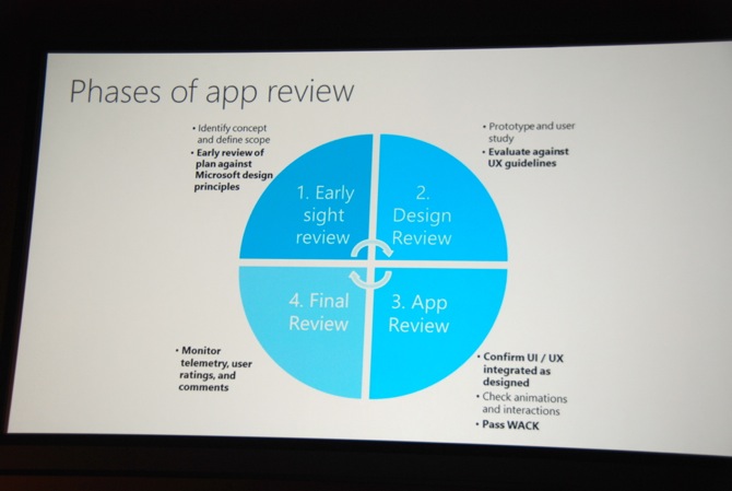
Another tip by the team is to start the design review process early, even before one line of XAML or HTML is written. In the planning stages of the app, a single sentence should encapsulate what the app is “best at” which will help scope the application and inevitable feature trade-off decisions.
This “best of” sentence will also help later on in the process such as in the app review stage to confirm the UI and UX actually delivers the experience set out to do, as well as writing the Windows Store listing description to promote the app.
Some of the other significant recommendations were:
- Only use the wide tile if there is live content – otherwise app should only have square tile
- In-app grids should use size and shape to differentiate content – there’s no rule the grid-structure in the apps have to be implemented in uniform, different blocks can be different sizes and also can be circular
- Top app bar buttons are for navigation and should not be round buttons – contrast to the bottom app bar buttons which should always be round
- In pages or apps where the snap view is inappropriate to display content, it’s acceptable to just display a logo – like the Windows Store app which has no functionality in snap view
- Being a good search charm citizen (both receive and send content) is highly valued
Although the Store team will take many attributes into consideration when shortlisting apps to feature – downloads, ratings, functionality, compliance with the UI guidelines is one factor that might be holding an app back. This is also a difficult one since there’s no quantifiable measure of compliance with the UX guidelines like a checklist even for self-review.
You can watch a recording of the presentation in full on Channel 9 here.
From a personal perspective, I think one of the reasons why MetroTwit for Windows 8 has not been featured yet is the fact that we disagree with the UX guidelines in a couple different areas at our own discretion, especially when prioritising content over form.
On a similar note, my friend Rafael Rivera brings up a good point that even Microsoft’s own inbox apps like “Weather” purposely breaks from the UX guidelines too for functionality (ex. content should not pan both horizontally and vertically, Weather pans horizontally and has a vertical list by hour).
I would really like to know who is responsible for overseeing these apps. Are there UI designers that make these kinds of decisions.
A well designed app will not just take the same UI layouts from the templates and just recolour them. They will produce a UI layout and design which is fit for its purpose, performs well on ARM hardware, and is competently designed with adherance to usage patterns and conventions in the UI, such as margins and font sizing.
Are those that decide which apps should and should not be featured, have any competence in these areas? Is it too much to expect that those making the decisions, be qualified to understand these concepts.
Guidelines, should be guides, not laws in stone – and this shows there seems to be a disparity to the intention of these UX Guidelines, and the practice of how they are judged.
Not just Weather.
This summer I had a dispute with one msft engineer, who did not let my app in preview store, because my “navigation model” did not meet the principles of the metro design.
Funny that, my “model” was completely identical to the model in the native Calendar application.
So I was able to publish app only in October.
I’m seeing three featured apps right now that don’t follow the guidelines at all. Wide tiles with no live functionality, not implementing charms, disregard of the grid, etc. I think compliance to UX guidelines is a much smaller factor than you’re making it out to be.