
Disclaimer: The following post is based on pure speculation with historical references. It may or may not represent the final outcome of Windows Vista. I, and many, pray it is.
Brandon LeBlanc (Sidebar Geek) writes about his high expectations for Windows Vista, and how Vista RC1 might fail to meet that expectation. So is Windows Vista going to be a flop like Windows Me?
I don’t think so. And here’s why.
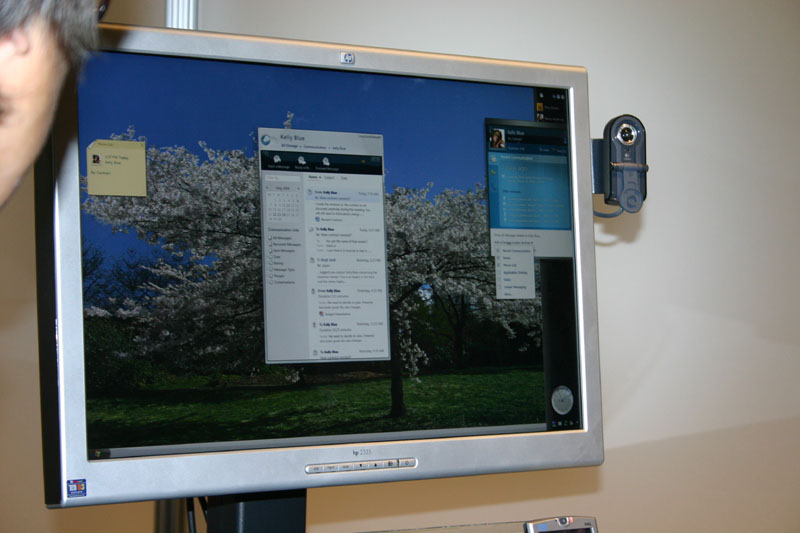
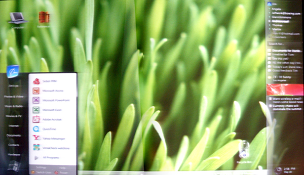

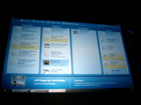
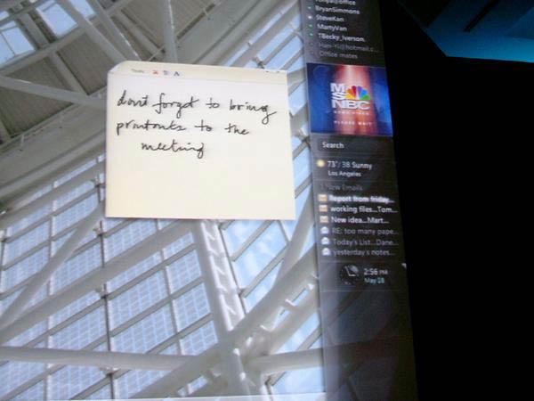
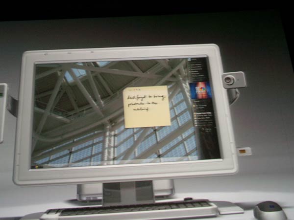
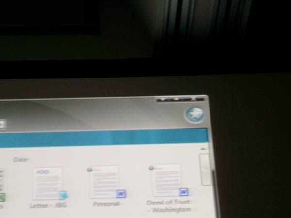
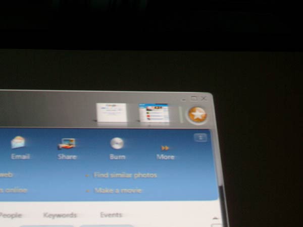
(Credit: All images comes from Paul Thurrott’s Winsupersite)
You’re thinking, “well, these are all concept screenshots back from the Longhorn days.” And you’re right, all of them were (fairly) cool Photoshop screen-mockups or Macromedia Director demonstrations shown during WinHec/PDC 2003, 2004 or 2005. But there’s an important point to remember here, that all of these concepts were made by Microsoft, made by the Microsoft Design team, and made by the same people who are now designing Windows Vista. I’m going to let you think about that for a few seconds. *thinking music*
*Ding* If they can make concepts that look pretty cool, then why can’t they make the real thing look pretty cool? Sure there are technical limitations when you bring a Photoshop or Director concept into a real Win32 application, but they know at least what works and what doesn’t.
Brandon talks about inconsistent UI styles in the default Vista applications, and probably anyone who uses the current betas would find them disgusting, so there must be something going on. If the Microsoft design team find the styles disgusting too, and hasn’t changed them in the past 10 beta builds, then there can only be two explanations. They either don’t really give a damn or are working on a big visual update (not Aero Diamond). From the feel of their attention to detail in the concept screenshots, it must be the latter.
If you remember from a few months back, they’ve even got Robert Fripp to compose the ‘soundtrack’ to Windows Vista. That’s attention to detail. Sure, they’re probably wasting a lot of money just to compose some startup sounds, but if that’s their goal to create such a unique and perfect experience, you can’t help think that they’re not only focusing on the sounds.
My guess is, a highly polished and consistent version of Aero Glass is in the works. It may or may not make an appearance in RC1.
I think many don’t understand the consistency MS is aiming for (at least if consistency == color scheme). I think the consistency they’re promoting is mainly in the app model, and native services. Basically all apps should try to follow the standard “templates” they’ve laid out such as deciding between using the standard form or navigation architectures, using the wizard framework, follow the HIG for text use, notifications, the standard services for commands, install, acessibility, etc.
Basically, consistency comes from the app model, services, and non-client area (glass, navigation, etc.). MS views the client area (the area between the glass)like a web page. The developer can create their own unique experience in that space. You aren’t bound to a specific color scheme or layout. You use the power the platform gives you to build the experience that best suits your application’s needs and your vision.