Web designers rejoice. The jaggies are gone!
Fonts in Chrome on Windows no longer look like they’re from the XP-era. Thanks to a new experimental flag added to the latest version of the Google Chrome beta (35.0.1916.27 beta-m), Chrome is finally rendering fonts with the advanced DirectWrite font rendering engine.
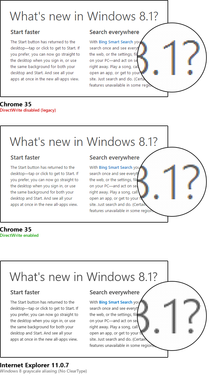
For a before and after comparison, here’s one I compiled with the Windows.com website. The effect is most noticeable on big curves like the “a” and bends of the question mark.
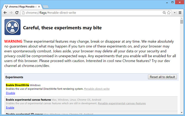
Simply open the Chrome experiments screen chrome://flags/#enable-direct-write and “Enable DirectWrite“, then relaunch Chrome for the change to take effect.
Couldn’t resist that jab at XP could you? Many users actually hate the blurry text rendering of IE9-IE11 and prefer the sharper GDI version of ClearType. Read this for example: http://stackoverflow.com/questions/8612266/why-cant-directx-directwrite-direct2d-text-rendering-be-as-sharp-as-gdi IE does not even give you a choice. Thankfully Chrome does.
Chrome won’t give you a choice forever. This is just a testing flag.
You can’t seriously tell me that the larger fonts’ jaggyness didn’t bother you. Yeah, it may have been marginally sharper on small fonts, but the big ones… ugh!
I will rejoice when it’s enabled by default.
Now if IE11 in Win8 would only let users choose what type off font smoothing they want.
I can’t use a browser without ClearType.
This is awesome. Finally have the nice font rendering like I do on my Macbook. 🙂
On my Windows 8 notebook, Chrome 35 with DirectWrite actually appears a bit more readable because body text is darker. However, heading text is more readable and looks nicer with DirectWrite enabled. Image 3’s setup is what I am using right now.
Finally, I wish Microsoft would us to re-enable ClearType on IE and Office and not force grayscale anti-aliasing.
Typo: missing “allow” between “would” and “us” in the last sentence.
DirectWrite disabled is actually more readable in that screenshot and the differences in the zoomed-in text are minuscule, not to mention the Windows 8 greyscale version looks more ‘correct’. Wake me up when Windows font rendering is as good as OS X.
What John said! +1!
Screw all of you. I for one, will never give up my green crt. Lynx 2.8.7 is the only browser anybody needs.
It’s aweful. Can’t read small font text anymore. Disabled.
enabling this apparently breaks chrome’s pdf plugin, at least on win 7.
This new rendering mode is now on my default (final 35 release). Problem is, it’s breaking some sites’ menus. In these cases, DirectWrite is adding one or two extra pixels of width to the text of menu elements, and is doing so after any padding is applied. For example, if there is an anchor tag (My Index) which has a padding value of 12px, the words “My” and “Index” appear on their own lines.
Apologies, I did not know that the “My Index” would become a link in the comment. It should be My Index
Oh lol, it’s done it again. Have opened a question on StackOverflow to demonstrate. http://stackoverflow.com/questions/23842637/chrome-35-directwrite-on-by-default-breaks-my-site-menu
DWrite ClearType adds y-direction antialiasing, resulting in smoother horizontal curves at larger sizes but fuzzier rendering at text sizes for many fonts. DWrite also applies CT to CFF PostScript fonts, not just TrueType. DWrite rendering uses sub pixel positioning for more natural glyph spacing, at the cost of less consistency in glyph representation.
I’m not sure whether MS classifies the greyscale rendering in the Win8 Metro environment apps (incl. IE) as technically a flavour of ClearType or not. It uses asymmetric scaling and sub pixel positioning, like DWrite CT, but not sub pixel colour rendering; again, this affects consistency of glyph representation.
Haha, it’s confusing to see these three examples on a MBP Retina because all of them look like shit.
This is a tangentially related question. Does anyone know how Google gets the fonts they display on their Google Fonts site to look decent, even in Chrome (without DirectWrite enabled.) I used some fonts from Google Fonts, on Google’s site they look great, on my site they look jagged. I had to resort to the SVG trick and am patiently waiting for Chrome 37 to be released and get a decent adoption rate.
I have no doubt that DirectW and ClearType have both positive effect and drawbacks. Cleartype appear to be noticeably better for small fonts, while DW appear better on large fonts. In my humble opinion users should have a CHOICE. I actually prefer ClearType much more, because all pages are rendered consistently as they are supposed to be. DW produces some “strange” artifacts both on eBay and on Facebook, that i really dislike. So… bye bye IE11 where this settings is unavailable, i prefer Chrome with DW disabled.
“As they are supposed to be” – you don’t seem to understand how the web works. ClearType or any other font rendering will never be the one true way. I’ve seen bugs with ClearType that were gone with DirectWrite (in particular with bold fonts in small sizes).
The point is that DW is better with keeping the font’s shape intact, and ClearType is very aggressive in trying to squeeze out legibility. In this day and age, the former is more useful because we don’t need Verdana 7pt anymore. In other words: increase your font sizes.
This is a horrible implementation of this. Chrome hasn’t been able to display fonts like Arial Black since they did this. It’s insane. It’s insane that I have to check IE to confirm the display of my site fonts. Dont’ know where the blame lies, Windows or Google.
You seem very confused. First, this implementation can’t be called “horrible” if it looks so similar to Firefox, Internet Explorer and Opera (or the opposite, in the case of Opera). If everybody is doing it it’s standard, average maybe, but not horrible.
Second, Chrome can display Arial Black just fine: http://jsfiddle.net/t73yLnLv/
But Arial Black is actually the same font file that Arial is (go check it if you don’t believe me), so it counts as weight 900 of the Arial font.
Third, if you use Arial Black you care jack shit about how your website looks anyway.
Fourth, you should be using web fonts if you care about fonts. Properly cached, they load instantly after the first visit.
Fifth, if your website only looks as intended in Internet Explorer, you didn’t confirm anything other than bad design that needs to be fixed.
Sixth, if you don’t know who to give the blame to, you can probably keep it to yourself.
I totally agree with you – “horrible” is the word. Looks like it may work on some machines, hence the crowd of Google supporters around here.
Could you post screenshots? What OS are you using?
Who told you they’ve fixed it? Some fonts look as jagged as before in Chrome, and beautifull in Firefox or IE.
Windows Registry editing fixed the font thickness issue for me completely, we can tune the font thickness/darkness by calibrating FONTSMOOTHINGGAMMA value to between 150 and 190 hexadecimal( 336 to 400 decimal )
– START -> RUN -> REGEDIT
– search for FONTSMOOTHINGGAMMA by keying ” Ctrl F ” ( will automatically take us to CurrentUser\ControlPanel\Desktop path)
– double-click mouse on FONTSMOOTHINGGAMMA enter anything between 150 and 190 hexadecimal.(the Lower the value, the thicker the fonts.)
– close the REGEDIT tool
– LOGOFF and then LOGON
Now all the fonts are very thick & very dark in Chrome Browser.
But we must make sure that ClearType smoothing is enabled in Windows( controlPanel -> personalization -> appearance -> Effects -> ClearType smooth check [ ticked box ] )
OR alternately in RegEdit …
FONTSMOOTHING=2
FONTSMOOTHINGTYPE=2
FONTSMOOTHINGORIENTATION=1 for LCD-screen, 0 for CRT-screen
Nice blog. Thanks for sharing. Looking for any suggestion on android app please visit below link
http://www.xlapp.io/xlapp_io/mobileapp-development-tools.php