Office 2013’s smaller close button which stuffs up the placement of minimize and restore is a far worse atrocity than this one.
shallow
I feel your pain! Its just a tiny bit frustrating every time you have to chaise down the button.
Very nice, I have visited your website.It is very interesting and impressive.Thanks for sharing with us such a brilliant article.I want to come again.Keep updated. thanks you for sharing this post with us.
Comments are closed.
Long Zheng
User experience entrepreneur
Melbourne, Australia
I'm a person and stuff. Mostly person, sometimes stuff. Proud introvert.
I make/made stuff people love to use: MyPal: unofficial Melbourne myki mobile app, Omny Studio: enterprise podcast hosting, PTVGlass: Melbourne bus, tram & train timetable on Google Glass, Map2Glass: type and send addresses to Google Glass, SoundGecko: text-to-speech web reader, ChevronWP7: Windows Phone community unlocking, MetroTwit: Twitter app for Windows, Speedo Plus: Windows Phone GPS app, Bing Image Archive: browse daily backgrounds and Windows UI Taskforce: crowdsourced bug tracker.
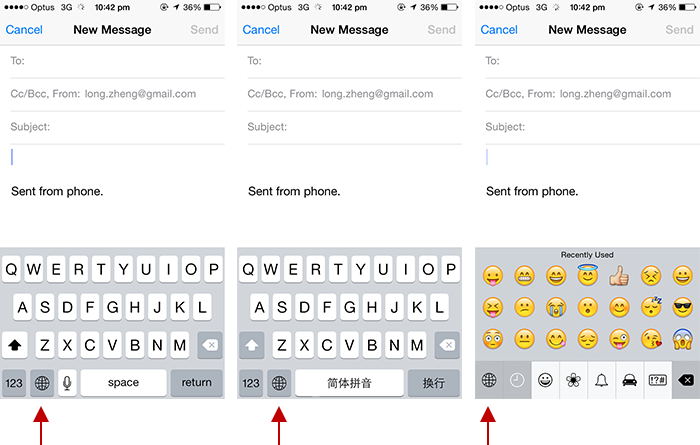
Consider that it was made for Japanese market.
Here’s Japanese keyboard: http://i.imgur.com/U1xySyA.png
And here’s emoji keyboard: http://i.imgur.com/7qRLYc4.png
Also you could throw in a Chinese hand-writing keyboard too, just for fun: http://i.imgur.com/b4J0aM7.png
you’re right, I never thought about that
Fix: get a Lumia 😛
Office 2013’s smaller close button which stuffs up the placement of minimize and restore is a far worse atrocity than this one.
shallow
I feel your pain! Its just a tiny bit frustrating every time you have to chaise down the button.
Very nice, I have visited your website.It is very interesting and impressive.Thanks for sharing with us such a brilliant article.I want to come again.Keep updated. thanks you for sharing this post with us.