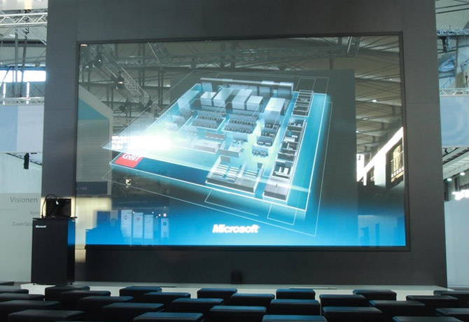
Size doesn’t matter, unless you’re at a trade show. To prove this point, earlier this month at the annual CeBIT Germany technology fair, Microsoft Germany and long-time partner Stereolize, who specializes in elaborate interactive presentations, had an interactive screen that would even make Minority Report jealous.
In what can only be described as an XXXXL-iPad, the “Microsoft Cinema” is not your average PowerPoint presentation display. The single-piece reflective screen at 234 inches, it is claimed to be the largest touch display in the world and appears to support hand gestures such as flicking, panning and tapping, at least for where a normal person can reach anyways.
Of course the screen is only half the presentation, the slides (if you can call it that) were equally impressive. With a subtle hint of Metro styling, the content animated and transitioned like a scripted screen visualization straight out of Iron Man 2. Check out the video below.
The Microsoft Surface, PowerPoint team and these guys should definitely swap notes.
Amazing.
Once related note, every time someone mentions minority report and Microsft, i always that the first consultant at it was Microsoft Research.
on a related note. damn typo. too bad i cannot edit in this comment track.
Awesome.
Headline should have been: “Microsoft changes the weather report forever”
All joking aside that thing is incredible.
Microsoft is great at developing things in the lab. I just wish that the company would/could push this stuff to the retail channel prior to others doing similar things. Clearly, Microsoft’s business model is outmoded and they are being put to shame by Apple, Google, and others. Too bad, they have the “stuff,” just not the leadership, focus, or vision.
I think Windows Phone 7 and their delayed show off of Windows 8 show this new direction. They are keeping to themselves more. And working on stuff more. Windows Phone 7 was a complete redo of their phone buisness plan…we can expect Windows 8 to be a similar turn around with tablet support etc 🙂
Erm, pardon my cynicism, but perhaps the key word is “appears” to support hand gestures. Genuine? Or just a carefully scripted video with presenters choreographed swiping in front of it? My suspicion is the latter.
There is a tracer on the screen, it clearly shows it recognizes the hand. I wrote “appears” because I don’t know how comprehensive the gesture support is.
Ridiculous. What everyone who compares these types of UI’s to Minority report fails to realise is that although in the movie that sort of thing “looked cool”, in reality they are hopelessly unusable.
Nobody wants to perform massively exaggerated gestures to do the simplest of tasks. Those guys on stage must feel like fools, and are probably longing for a simple button press of a blue tooth controller to switch slides – which I might add IS a much easier way to control the presentation. Plus you don’t have to be physically in touching distance of the screen which aside from being a constant annoyance could also easily throw the momentum of your presentation/speech.
Not only that, given how close you have to be, it would be hard to know exactly which slide you are on (unless there was some obvious visual clue in your own FOV), so you would have to stand back to get a clearer view, and when you realise you’re on the wrong slide walk back over to the screen and swipe again, repeat ad-nausium.
This trend of prioritising bling over usability is worrying.
Usability fail.
PS: the slides are nice though.
I believe they can also control the slides from the podium display.
Well, in my opinion, with my Carpal Tunnel Syndrome from too many mouse clicks, typing and small repetitive “easy” movements, the use of my full hand or limb would be a nice change for my failing body parts. Plus, it incorporates interactivity to the presentations, a lot less boring to watch and more energy filled.
Furthermore, I’m sure there is a way to see what is on the screen without doing the ridiculous movement back from the screen to see what you are doing as you assumed. If that isn’t already integrated, it will be one of the first things to be upgraded since it’s pretty obvious that you would want to see what you are doing on the screen without some exaggerated effort that took away from the usability of the technology.
I just watched the video again and noticed that there were monitors embedded in the stage floor in front of the large touch display screen. I am guessing that this is where the presenter can view was is being displayed behind them. Check it out at 1:22.
Ok, it’s confirmed, if you look at the few seconds before the end of the video, it has a shot of a monitor that is showing the stage from above the presenter. You can see the two monitors embedded into the floor and how they are displaying the same thing that is on the large touch display screen. This is how they can see what is behind them. Ridiculous assumption debunked.
Good spotting, though I stand by my point of being unusable when having to use the exaggerated gestures to move from slide to slide. If it can be controlled another way (and I believe it probably can) then it begs the question: what’s the point in doing it the hard way?
This reminds me of the Kinect (my biggest technological regret). It’s fun for a few minutes, but you quickly realise you’ve wasted your money on an high latency, inaccurate unusable gimmick. Nothing beats the simplicity and ease (not ot mention accuracy) of using a physical controller, much like with that massive (although impressive) screen a physical button press from a remote handheld device (like a bluetooth controller) is always going to be a much easier and usable option.
Kudos to MS for continually trying new things though.
It is nice to see Metro UI very well done. I hope MS is taking note here. I have been getting tired of it on my wp7 phone – really the way it’s done on the phone is rather boring. It’s too flat.
However, Long’s MetroTwit is also a really good use of it. It doesn’t feel as dark (and I don’t just mean color). I think you need a blend of the Metro “flatness” with some UI widgets that are more dimensional (like the actual buttons in Zune or MetroTwit, and the dropdowns). In the video above, blending phone imagery, or the postit notes, really make it pop.
Interestingly I find the Flipboard app on the iPad to be in a similar theme as Metro (actually a lot of iPad apps are metro looking). They balance that well with drop shadowing of popups and more dimensional UI widgets.
I think it’s important that the UI doesn’t look dull.
Stereolize uses the software Ventuz to create all these stunning, interactive, realtime graphics and animations. It is not an inhouse Microsoft thing. Check it out on http://www.ventuz.com!
this screen is not at all the biggest. This one is 50% (!) bigger http://www.rug.nl/cit/hpcv/nieuws/touchscreen1. Check that one out. Its even super multitouch as it can handle over 100 touches simultaneously