
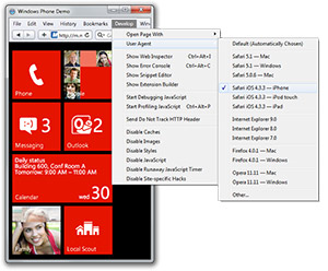
A new Microsoft mobile site has been making some noise today that allows users of Android and iPhones to test drive the Windows Phone experience with nothing else but their browser. To idea to educate and entice users through an interactive demonstration that can be accessed with just an URL sounds great on paper, but how does it stack up? I decided to put it to the test, next to the real thing.
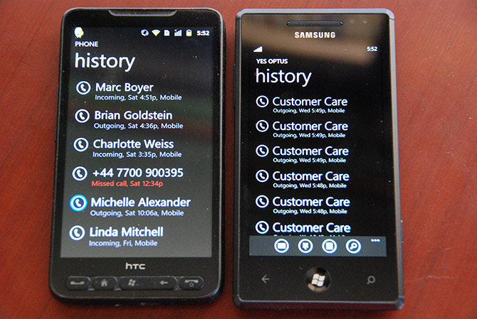
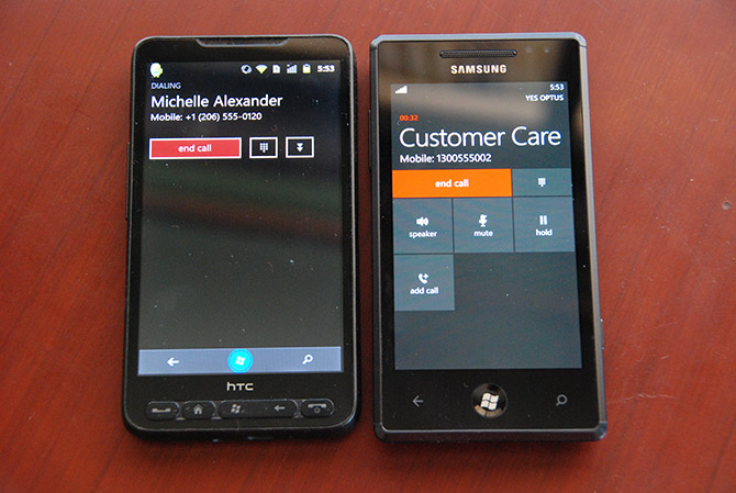
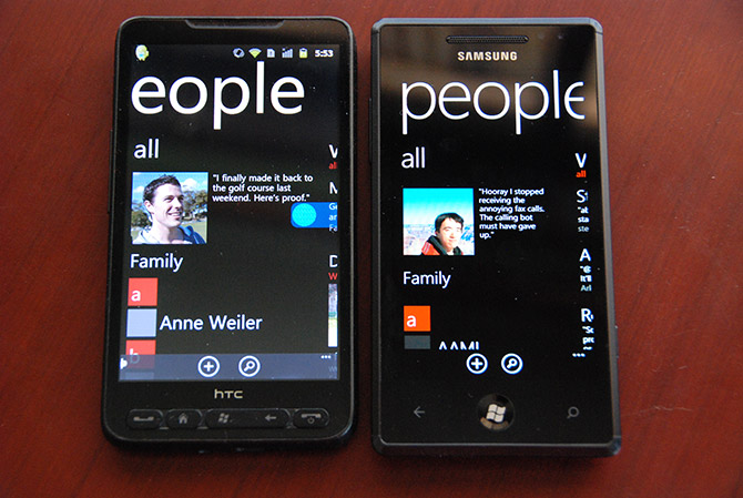
 Testing both on a modded HTC HD2 phone running Android 2.3.7 and simulated iPhone browser via Safari, I’m impressed by just how much of the motion-driven user experience they’re able to replicate with some fancy CSS3 animations.
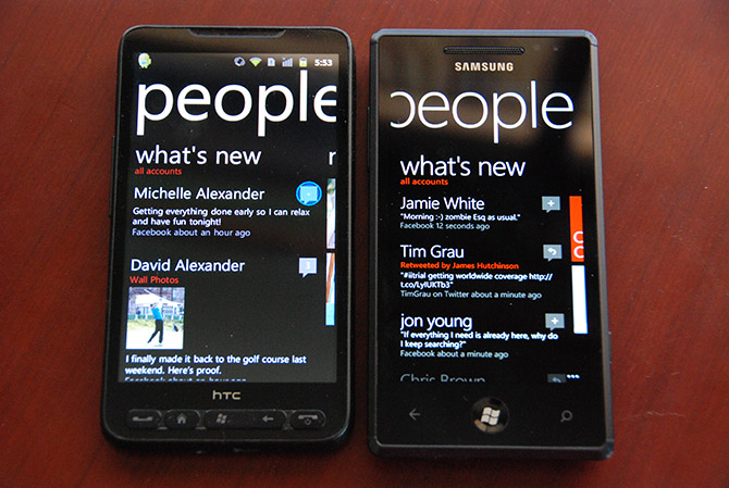
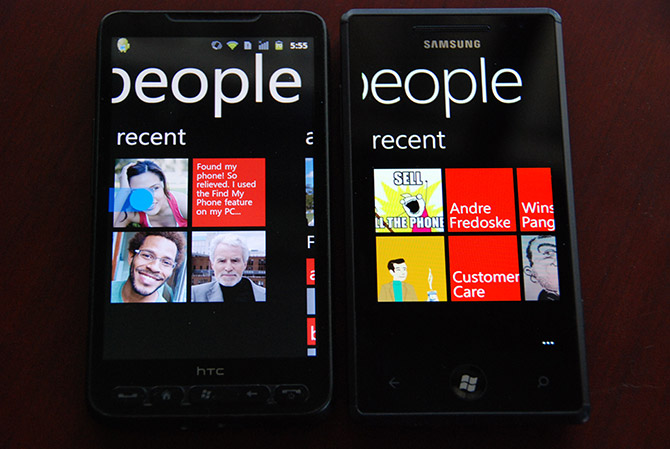
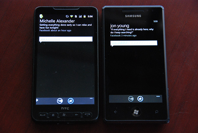
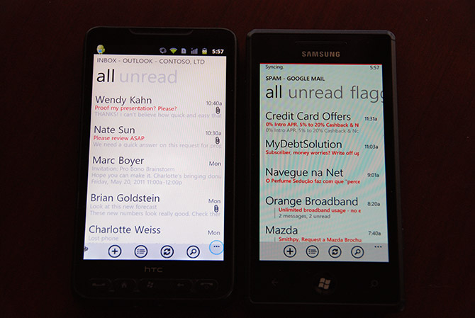
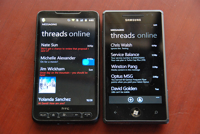
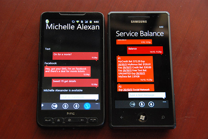
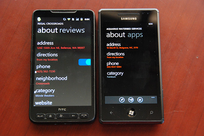
Side-by-side, most of the screens and functionality is simulated perfectly or extremely close, there were a few subtle differences. For example on the messaging screen in the demo, a picture message shows a preview in the list. On Windows Phone, I’ve never seen MMS messages display a thumbnail, instead it says “Media content in this message”.
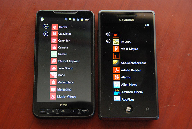
Between Android and the iPhone there’s also some differences, notably only iPhone can replicate the tile flipping animation whereas Android only slides (due to a lack of CSS3 support I’d imagine). Incidentally this demo also proves it’s possible to design a Metro-styled yet cross-platform mobile web app.
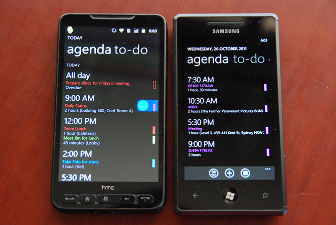
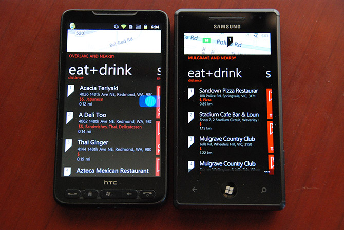
In conclusion, this is a pretty smart marketing idea which has been executed very well. I’ve included a comprehensive set of side-by-side comparisons below for an afternoon fun game of “spot the difference”.
 In a
In a  It’s a concept for a futuristic hotel room and you could book it for your 2012 Paris holiday.


