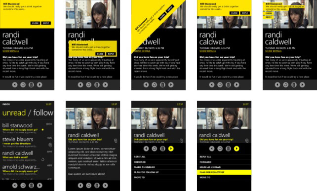
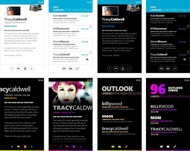
A number of concept screenshots of early Metro concepts for Windows Phone 7 Series was published in the slides of the “Windows Phone UI and Design Language” session at Microsoft MIX10 this week giving us a rare peek into what Metro could have been.
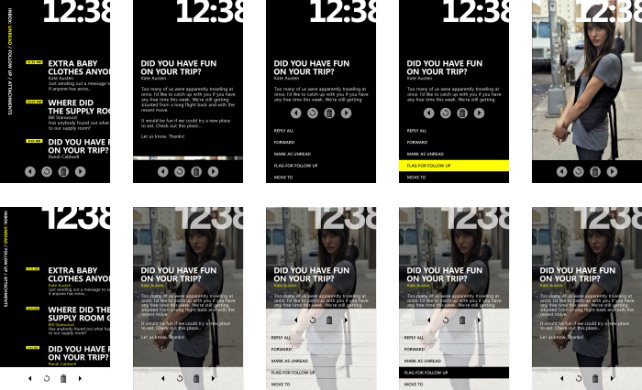
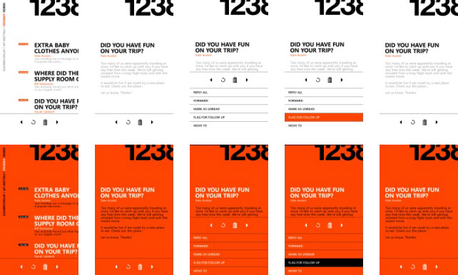
If one thing’s for sure, large fonts and a text-driven layout was a sure-thing since the beginning. It appears they experimented with a much larger time display and diagonal-placed controls which look kind of cool but one could imagine to be a usability nightmare. Take a look for yourself.
Very interesting! Thx for sharing.
2nd row from the bottom doesn’t look bad. Hopefully there is a plethora of ways we can customize as to how Metro looks on the phone.
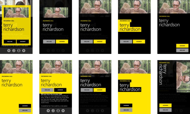
Wish they would have kept the big buttons like they did for the Terry Richardson shots, as they would on the call screen on WP7S.
I like how most of these shots show the times in the top, where there should normally be some type of status bar, but haven’t really seen that much of it in WP7S. I wonder how you get the status bar to show up ‘contextually’.
The yellow screenshots look a lot like the Courier UI concepts we saw… fits with the theory that the Metro UI is going to be showing up more in Microsoft products.
I kinda like the two last rows. To bad they didn’t make it.
They all look really good.
I think the main reason why they cannot do a large photo like this is, that there is no way (or would be a waste of CPU) to tell where the face is in a photograph. Even with automatic face detection, there will be chances that a photo has a lot of faces in it. Also, unless the contact uses Facebook, Outlook photos won’t stretch that large.
Sucks they cant do that, since it’s a technical impossibility. Nevertheless, the final result looks good enough.
It’s also interesting how they went from a super-bold clock, to a smaller clock, to no clock at all today.
One screen they have yet to show is the finalized Incoming Call screen, since in the MIX demo they had a problem receiving the phone call.
This blog is impressive. It might be a good idea to use lighter colors and improve on the design in order to increase your visitor retention
how much lighter do you need it it has a white background, istartedsomething has had my visitor retention for years 😀
Imagine this on the Courier! Oh my the beauty, the functionality and the form factor. This could be the defining product for a new Microsoft! I love the purple color. Will make my tiles purple!
Somebody help, I can’t stop saying ‘I love this’ right now!
is this functional at all when people on move/walk to use this ui, content too small to read, button too small to tap.
This looks absolutely delightful. A great project to have worked on and completed. Cant wait to see it in action.
Wow, looks more like a magazine treatment than a mobile phone OS. Good questions raised about suitability for the mobile screen (more suitable surely for a tablet device) but impressive nevertheless especially if it works as impressively as it looks
I just noticed. The Metro UI is already on Windows 7, in Windows Media Centre!