The first layer of wrapping on the giftbox that is the Windows Phone 7 Series development platform is being teared down today as Charlie Kindel on the Windows Phone team revealed some ever-slight details on what developers might be able to do on WP7S and how.
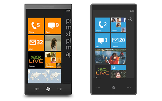
One detail that caught my eye was a picture attached in the blog post that at quick glance might pass as a general comparison of all the current-generation smartphones with WP7S, but on closer inspection, it’s not the WP7S we’ve come to know and love since Mobile World Congress.

As both images are presumably mockups, the right one resembling the build shown at MWC, I can assume the left one comes from an earlier concept. The striking difference between the two is the way the “start menu” is conveyed. The build at MWC had an arrow in the top right corner which when clicked on revealed a long list of applications that were installed on the device.
In the alternative concept however the menu is “peeking” in from the right hand side which one can assume opens by swiping to the left. The way applications are grouped are also different, as the top five items are the hubs “people, music+video, xbox, photos, marketplace” leaving “apps” in a class of its own.
Personally I actually prefer how the menu peeks in the start screen – it’s much more consistent with the teasing that occurs in the rest of the UI. Which is the “real” start screen, guess it’s one more thing we’ll have to find out at MIX.
Update: Charlie Kindel implies the screenshot is an older mockup.
nice find mate..
I’m not sure which came first, really. The one with the orange tiles is reminiscent of the Zune HD, but it puts more focus on the text, something it seemed they wanted to get away from in Windows Phone 7. I previously thought that they wanted to eventually do away with the text menu, but now I’m not sure. Maybe they thought it was better after doing studies
I learned at MWC the color of the start screen is user customizable.
Oh, I was just talking about the text, not the colors. But that is good news that you can change colors
The start screen is for tiles, the rest of the UI is for hubs. Live Tiles shouldn’t act like a hub, it doesn’t stylistically fit right.
Thinking about it some more, it looks like this concept was borrowed from what the Zune HD does today: dual screen with one containing big text buttons and the other one containing tiles.
Still, I’m not a fan of bringing that dual-screen UI to Windows Phone.
Good find Long! I *really* hope they change the “Outlook” tile back to just Mail… I understand why they’re using the word Outlook but I think just Mail or Email would be better.
I agree too. I can understand they want the feature-association with Outlook, but as a consumer device, people just want their “email”.
That’s not really the same menu of programs like what they showed at MWC.
It looks like just links to all the hubs (could be customizable though)
People
Music
Xbox
Photos and Videos
Marketplace
Applications
And it is confirmed its an older mock up…
http://blogs.msdn.com/ckindel/archive/2010/03/04/yes-it-is-an-older-mockup.aspx
You make it the real start screen.
Haha, the older mock up looks much better.
Looks like I am the only one who liked WM 6.5.1’s UI better than WP7S. It was fully touch based, stylus was optiional and looked great. WP7S like Windows 7 looks oversimplified, dumbed down to look clean.
Wow cool find. I much prefer the arrow, it looks cleaner.
Wow, much much cleaner, worthy of a mention.
The start screen on the right is much better.