Windows Mobile 6.5.1 screenshots courtesy Patrick/OSNN.net
Most of you probably know by now that Windows Mobile 6.5 is not the be all end all Microsoft mobile operating system. However, what you might not know is that Microsoft has already up its sleeves another revision of Windows Mobile 6 – unofficially dubbed by the enthusiast community as 6.5.1 – that’s faster, sleeker, more touch-friendly and in my opinion, a much better upgrade than 6.5.
Those familiar with the Windows Phone modding scene might have seen since late August, builds numbered 23xxx and up started surfacing on the web. Those brave enough to have installed these builds began noticing a slew of updates to the user-experience of Windows Mobile that is arguably necessary but missing from WM6.5.
For example, the “Start button” and “Close” button have all been moved to the more accessible lower toolbar, freeing up the entire top row for status icons which is now thinner. Tapping on this row now expands a tray-like widget with large icons that provide quick access to system notifications and settings.
On the UI side, controls including buttons, checkboxes, radio buttons and the like have all been remastered, finally replacing the Windows 3.1-like graphics with modernized anti-aliased equivalents. Tabs have also been replace with a new “pivot” control that sits at the top of the screen where users can flick and toggle between.
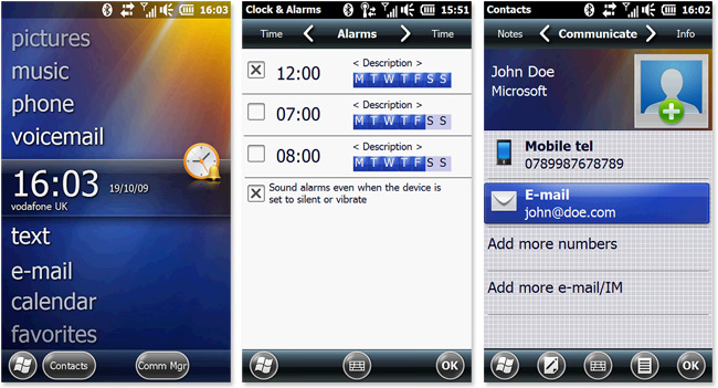
Finally, even more recent builds include a new contacts application that is much more touch-friendly with larger buttons (albeit with a few bugs).
With all these changes and more already implemented and polished, I have to wonder why faced with inevitable criticism that WM6.5 is not enough of an improvement Microsoft didn’t hold off until all these changes were implemented for the official Windows Phone relaunch.
Until Windows Mobile 7, this is probably as good as it’s going to get on Windows Mobile 6. If you too are feeling a little adventurous, take a look over at XDA-developers forums to see if there’s a 6.5.1 ROM for your device already.
Some of the icons look quite plasticky (especially the ones on the bottom)…
It’s about time they moved things the way all other Windows O/S’s are!
Good review Long.
I’ve been using these builds for some time now on my touch pro and refuse to install the older style builds now. The touch improvements are are so prevalent that i too wonder why MS didn’t just wait.
This looks like it’s gonna be sick, I can’t wait for Microsoft to release more information about it. I’ll upgrade my Tilt in a heartbeat once it’s released.
Some of the icons do not illustrate their function well. I just tried a 6.5 device yesterday for the first time. It was a nice device (the screen resolution was incredible!) and the UI has definitely improved. It’s still felt somewhat unrefined (kind of stutters and acts wonky at times) and busy, though. Keep working at it, MS. I hope 7 gets us there.
Imagine they wanted something out of the door prior to Windows 7 release tomorrow, and also the opening of some Microsoft shops?
Nice! Heading off to Rhodium’s ROM area on xda-developers now 😀 I’ve flashed mine with one of the custom ROM with Manilla 2.5 2 weeks ago
Graphic != user interface
That was proved for a decade, especially by those crappy PS2 games boasted to have superior graphics. Given those pretty devices out there, it will only make them on par with the others. Its a shame to see them mess up something that have so much potential back in 2001. Can’t they realise that skin deep enhancement will not make it a great product?
Hate to burst your bubbles, thats not 6.5.1, thats a custom ROM found on XDA. Microsofts 6.5.1 has no start button, and also does not have the nasty looking bottom menu. Do research before posting bullshit.
Ah.. I thought that’s the official 6.5.1 ROM that’s been cooked by the people at XDA. Can you confirm that, Charlie? How do you know that 6.5.1 will not look like that?
@Charlie: Please do share what 6.5.1 really looks like then 🙂
Smackdown!
http://community.winsupersite.com/blogs/paul/archive/2009/10/20/windows-mobile-6-5-1-on-the-way.aspx
“No real news here (they do quote Long Zheng, after all)”
All I want, is the return of the normal Start menu of 6.1. The Start “thing” of 6.5 is nothing more than a GUI for GUI sake. I mean, if I wanted an iPhone, I would own an iPhone.
Though I must admit, 6.5.1 moving the “Start” button itself down to the lower left corner is intriguing.
@Wait: You can enable the old start menu (you mean like: date, appointments, mail) that has been around since wm 2002 🙂 if you really want.
Looks OK….but whats with the crappy blobby misaligned bottom menu buttons….looks amateurish….they definately need looking at.
When will MS get their act straight? Titanium is actually a step backwards from the classic today screen. Atleast the old Today showed whatever info *you* want in just one screen. Titanium on the other hand, is difficult to navigate, shows only one item at a time, and offers very little in terms of utility. The whole idea is ridiculous. It’s lightyears behind other UIs like HTC Sense, SPB Mobile Shell 3.5, or even the good ol’ Manilla.
Of course, because I still have the choice of choosing my shell, I’m sticking to the WinMo platform. Until Android gets mature.
Try using it. On my Touch HD it is fast and excellent.
Everything (other than old apps) is quick and precise without a stylus.
It took MS a long time – but in my view, this is a real step forward in terms of usability.
@MSR:
I did. It is fast. But excellent? That’s pretty vague.
Now *you* try using SPB MS 3.5 or HTC Sense and see the difference for yourself.
@deXter:
You’re saying SPB MS is faster/better than 6.5.1?
I’m still at 6.1 using SPB MS 3.5, but considering flashing up to 6.5.1. Maybe it’s not worth it.
@rfarrah:
Most certainly. 6.5.1 isn’t worth it. It’s actually dumb in many aspects.
For example, in the device info tab, in 6.1 you could just jump to any tab you liked, but with 6.5.1 you’re forced to scroll through all of them. wtf? The same “need-to-scroll-thru” idea is repeated throughout the system – like the today screen. It’s so stupid, I don’t even know where to begin.
Plus, 6.5.1 is also a drain on the resources (RAM, CPU, and therefore, battery) so from that perspective, it doesn’t offer any unique features that are worth the juice. (Unless you’re really into finger-friendly
Heck, even Manila is better than this.
I actually use 6.5.1 with MS 3.5. It is a little redundant messy, but for my purposes, I have yet to find a homepage as functional as MS3.5 (Calendar, tasks, apps,. mail, status, etc).
I am not sure what ROM or phone you are using with 6.5.1, but the latest WM 6.5 builds with up to date oem natives and up to date drivers are faster than 6.1.
Most importantly, I can do everything that I want to do quickly and easily (a few presses and no real need for precision). The improvements in VM memory architecture allows your to store all of our modules in upper memory which has a significant impact on latency (not unloading, paging etc)
I am happy with it, but my primary uses may not be typical: Outlook, Phone Camera,, Office 2010, GPS/Maps, IE and games.
@MSR:
What phone and which ROM are you using, if you don’t mind my asking?