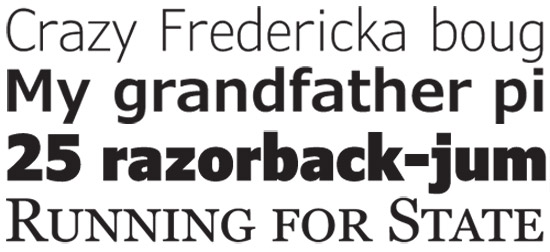
From top to bottom: Verdana Light, Verdana Semibold, Verdana Black and Georgia Small Caps
In a timely announcement, Microsoft and its typography partner Ascender Corporation has announced updates to the infamous Verdana and Georgia font families coming early 2010. Of course this comes just after IKEA made the surprising switch to Verdana for its corporate typeface that has upset many font-conscious designers.
The project started a year ago is said to address at least one major criticisms of IKEA’s use of Verdana that it is not optimized for large print since it was originally designed almost exclusively for web use. Other improvements for both Georgia and Verdana will include “new weights and widths beyond the original four fonts in each family, extensions to the character sets, extensions to the kerning and OpenType typographic features for enhanced typography”.
Hopefully both the updates to Verdana and Georgia (already at version 5 in Windows 7) will be available to Windows users for free download when they’re available. Anything that could expand the default arsenal of fonts in the PC is good news for web designers. Even Comic Sans.
Update: Ascender’s current plan is to sell/licence the new fonts to Office users and creative professionals, however the project is in its early stages and licensing plans has yet to be finalized.
Microsoft seems to be a bit name in terms of fonts. They created some of the most widely known fonts, like Comic Sans. 😛
Even Linux users can’t help but use the Microsoft Core Web Fonts (just for Verdana alone). They are such hypocrites.
Anything, and I mean ANYTHING, that angers font snobs is worth it.
RC, I hope you’re not applying that brush to anyone who feels strongly about font design.
Font design may not seem like a big deal, but it is. It’s similar to logo design: from the outside it probably looks really simple and easy. It’s not – it takes many, many man hours to create fonts and perfect designs. Think about all the different character sets required, being able to make it readable at all sizes and for those without excellent sight, etc. (I’m not in the industry, I just find it fasciating)
Sure, some people take arty snobbery too far, but the criticism of IKEAs choice is hardly unreasonable.
Things like “something had gone terribly wrong”, “stop the Verdana madness!”, “Words cannot describe my disgust”, “horrific”, “it’s a sad day” and “the design community feel betrayed” are “hardly unreasonable”? Wow.
Hyperbole like that aside, I can understand the criticism that they lose a bit of personality by using a font as widely used as Verdana, but on the other hand, I can also understand IKEA’s position that they needed something they can freely use all over the world. Design matters, sure, but it’s not -all- that matters. Something the “font snobs” apparently refuse to even consider.
Look the picture above. It looks like there will be Verdana Light.
Let’s hope IKEA will switch to Verdana Light once it’s available.
Fred, of course it’s not all that matters, but Verdana just isn’t a particularly visually pleasing font (in my opinion, but one I think is reasonably shared).
Yes, some of those comments are slightly extreme – but the rest of the article explains it pretty well. Hell, half those “extreme” comments are what I’d say too. It’s a bit like using Arial or Times New Roman for a presentation – it shows pretty much no thinking about design. Sure, it’s functional, but if you’re a company centred around design, what on earth are you thinking?
(That being said, the Verdana Light version shown at the top is fairly nice.)
Maybe they’re thinking that their money and resources are better spent on the design of the furniture they’re selling than on the design of their letterhead?
Also: claiming that some company has “betrayed” you because they changed their font is only “slightly” extreme?
A friend of mine has the latest IKEA catalog that user Verdana, and also a copy of the previous catalog that uses that Futura font.
Without even analyzing, the Verdana version looked unprofessional than the Futura one. It proves that Verdana was really meant for on-screen use. (I’m with Kirkburn on this one — IKEA being centered on design chooses a typeface fit for screen-viewing but clunky-looking on-print.)
Now I am glad that Microsoft and Ascender Corporation will extend Verdana and provide variants for use in print. Verdana Light comes into mind here. Can’t wait for their On-Print version of Georgia!
QUESTIONS: What exactly are the reasons why IKEA chose Verdana again? Complete UNICODE Character Sets? Doesn’t “Arial Unicode” have that, too? Why can’t they just use Tahoma?
hangon IKEA dumped Futura (awesome font) for Verdana (only looks good as tiny text) !!!…wow they must also have complete plonkers onboard like M$ seems to have.. oh well its not like I bought their flatpack stuff.. only now I’ll just have one more reason not to ever shop at such noob company that makes stoopid decisions.
@Shi7e: LOL’d at “n00b company”
@Shi7e: Awesome parody.
In fairness I like their iStove <– The stove so flat and shiny-black with 4 white circle lines.
I seriously hope they expand the Unicode character sets. There are very few good fonts today and no Arial Unicode MS sucks compared to Arial (doesn’t even look the same besides having other issues.)