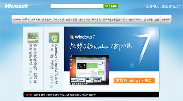
It looks like Microsoft China is really putting in an effort to make sure absolutely everyone knows about the new Windows 7 logo before it is, and if ever, officially confirmed by the Redmond mothership. Besides plastering a slightly different variation of this new logo all over its Windows 7 RC launch event, the flare-abounding logo is now featured front and center on the homepage of Microsoft China. I guess it’ll only be a matter of time before they put up the boxart too.
Speaking of the logo, some people are going to great lengths to find a “meaning” behind the logo. Whilst I don’t dispute some people’s suggestions the negative space resembles the top-right corner of the Windows logo, I believe it was designed to be just a “7”.

You’re kidding, right? The negative space doesn’t just ‘resemble’ the top right corner, the whole shape is -exactly- the corner of the windows logo.
Hey…yeah it is the corner of the Windows logo. I didn’t care for it before I knew that….but since I had to have it pointed out to me and I didn’t like it beforehand, eh.
Isn’t the Windows 7 logo that counts, that smaller one to the left. I imagine that’s what people will be seeing 75% of the time, instead of that big swoopy seven.
it could also represent an arrow moving towards the light?
I’m paying too much attention to my English Communication class
Got to love that lens flare…
Welcome to the 1990s Microsoft artists!
I didn’t notice it before, but yes, I’d have to say it looks to be EXACTLY the same shape as that corner. Which would explain why they’re doing the face-out on the edges instead of hard edges, since it’s a snippet of the logo. Anyone care to run it through PhotoShop or something to verify it’s as specific as it looks?
Honestly, though, I’m pretty well convinced. Yes, it took you mentioning it (and poo-pooing it) for me to see it, but honestly it looks pretty darn clear, ESPECIALLY due to the fade-out.
@TurboFool: Using the official Windows logo, it is not an exact match. It requires you to rotate either the logo or the 7, and even still, the degree of the curves do not match perfectly. I do however agree it looks like close enough from a side by side comparison.
From first sight, it always looked to me like the corner of the Windows logo and then noticed it was a supposed “7.” I don’t like it because of that; since I keep feeling like it’s missing something.
nah, its 7 in heaven innit
I like this one much better:
http://cid-01ca34b674d84900.skydrive.live.com/self.aspx/.HomePhotos/2872168542%7C_480e0e4f16%7C_o%5B1%5D.jpg
What is a negative space?
That is so incredibly corny and unprofessional. GUI team must be really angry at promo team!
Hey, Long!
I believe it has been taken off.
even this page got some updates to the background header
http://windows.microsoft.com/en-us/Windows7/Personalize