
Ever since the Windows 7 demo with Steven Sinofsky and Julie-Larson Green at PDC 2008 where they showed off the new “superbar” taskbar, there’s been a lot of questions about how the new taskbar will work, customized or tweaked.
Unfortunately because the pre-beta build did not contain the new taskbar, it’s been hard to answer those questions. Fortunately I met up with Chaitanya Sareen today who took me through a better tour of the new taskbar on one of the demo machines with the new build. Here’s a few facts about the new taskbar.
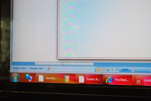
If you like text in your taskbar, labels can be enabled for taskbar items in the “taskbar properties” panel. Text however will only appear for active applications.
The way the taskbar handles overflow (in this build) is still the same way it is in Windows Vista – with a scroll. They did say however this is one feature they are looking into addressing which may or may not change.
The size of the new “superbar” is actually not much larger than the Vista taskbar, 10 pixels to be exact. Enabling smaller icons will reduce this to the traditional taskbar size.
Ungrouping the button which separates the individual windows will still retain its “groupness” by applications. Thus by dragging one window will actually move the entire group of windows, for example, Office Word.
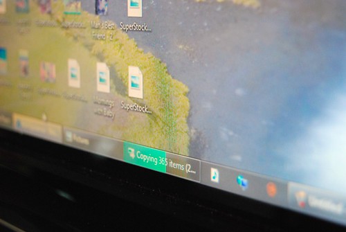
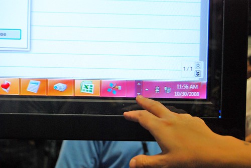
This is how the progress bar looks on the new taskbar which comes with the new API that developers can tap into for display progress right in the taskbar.
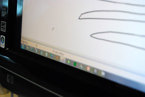
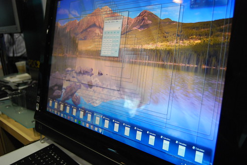
This is how the taskbar looks on top of the screen.
With Aero Classic.
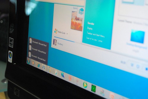
If you open the jump list with a lot of instances of the same application, it will display just one row of thumbnails before switching to a text-only list.
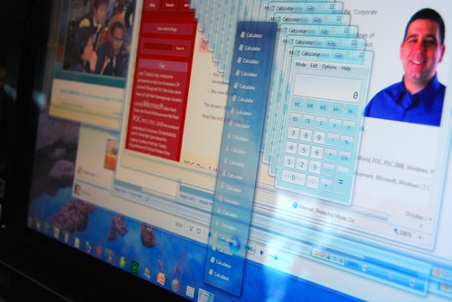
Here it is with only one row of thumbnails. Aero Peek is also featured where the selected instance is shown where the other windows are all transparent.
Very informative, thank you. 🙂
Will Peek also make the selected window transparent too?
looks great!
Hot!
So… this solves the last remaining objection people had to the new taskbar?
I give it 50/50 odds that Microsoft eventually finds a reason to drop all the UI improvements and ship the same ol’ thing again. BTW, anyone see if Flip 3D changed at all? IMO, they should drop it since it’s so useless.
if you can create something better,create it mr know it all
That progress bar improvement looks awesome! Now, the taskbar feels much more intuitive and useful.
Tony, it certainly doesn’t solve my objection. It’s a horribly ugly-looking monstrosity. Big icons that are the same size as the orb with lots of odd spacing just doesn’t work. Toss in the glass panels (and what looks like multiple panels in places) and you have a visual mess.
Do you know how to enable the superbar in build 6801? There’re a lot of superbar looking resources in the msstyle of build 6801!
Also, what happens to the progress bar when large application icons are turned on? How would it show the progress if it is just a small square?
@Rob: I’m sure it will look much better when you are using it (or get used to it). It’s hard to tell form videos & pictures & you have to sometimes get your own feel with your own settings, icons & personalisation.
Ah … Informative.
Unfortunately, still doesn’t answer one question I have (the text is nice though)::
How will Windows Classic Theme display with this new taskbar? (My original question was for Win7 PDC demo build, but thanks for showing the Classic theme for the Vista-styled Win7 from the demo disks 😉 .)
The Windows 7 Taskbar looks awesome! I think the W7 Taskbar looks better w/out the icon labels but others will find it useful being able to enable them.
And speaking of awesome, so was this post, Long! Excellent stuff!
Oh, and sorry, I need to ask one more question.
Open a app. Minimize that app….
Does the taskbar show any differentiation on the icon showing that it is active and being used? (I’m emailing E7 about this asking them for some color differentiation, bolder or self-customized color.)
Ahh yeah, good point:
What happens when the application in the taskbar has a new ‘event’ (like someone sends a message on an IM Window) & also what happens to the square on the selected Window (like in Vista, it indents)?
Interesting stuff. I’d like to know 🙂
Awesome, one of my big worries is taken care of. I don’t know how much I’d end up liking a thicker taskbar as my gut reaction is dislike. With the option to use smaller icons and make it more like the Vista taskbar, I don’t have to worry. I always thought the way the orb sticks out on the VIsta taskbar was a really great look.
Also, I wasn’t worried too much about lack of text labels, but again it’s really nice to know that we can have those if we wish. I hope MS produces a bunch of videos pointing out these things for users.
I also like the progress bar and other things. I’m curious though, is all the icons really just an adaptation of the quicklaunch icons we have now? I gather that when a program is active, these icons become each instance of the running program, then? Because I usually have only a couple programs on my quicklaunch (IE, WMP, etc.) instead of having every program, OSX like, on there. So with Win7, I could also just have a couple icons, and load up an additional program, the icon for it would appear next to them and look just like them, and when I closed it, it would disappear from the taskbar?
Opening an app and minimizing it will result in it having the ‘glass’ border around the icon that you can see in the screenshots. Icons for apps that are not currently open don’t have the glass effect and border.
As for events, there’s the new API that lets the app display an overlay icon, although that doesn’t really replace the taskbar flashing that you have now in Vista and previous (which can be really annoying at times).
What does that new Progress Bar look like when text labels are disabled and large icons are enabled?
I have some questions about the new Taskbar…
How does Aero Peek work in Windows Classic or Windows Basic, where glass is disabled?
How do the Taskbar, Thumbnails and Jump Lists look in Windows Classic?
Also do the Ribbons change in Windows Classic in the PDC build, because in the screens shown on this site of Windows Classic, the Ribbon stands out in a horrible way. Can Windows not have a built in custom chrome like Office 2007 Apps do in Windows Classic?
(that last question was mostly rhetorical)
Wow, wow, wow … I LOVE the new taskbar!!!! Thanks, Long … you’ve been the best PDC blogger all around! Thanks a million. Now can you get us a copy of that build …. 😉
And, I also would like to see what in the world Windows Classic would look like with the new taskbar. Did they ship a legacy “traditional” taskbar that would run when you switch to Classic? Not like I would ever want to use it myself, Aero is 1000 times better. Just curious. 😀 I was really glad to see that text labels is still an option; I LOVE icons and recognize them instinctively (as most geeks must 😉 ), but I know some people really can’t figure out what the icons stand for and rely on the text lables.
Ok, and I also want to see flip-3D in action on Win7. And is there any word on # of editions?
Thank you again, Long, for your site! Keep up the great work!
Answered half my question @ Arstechnica (http://arstechnica.com/news.ars/post/20081030-more-on-the-windows-7-ui-new-taskbar-will-be-mandatory.html) – there will be no legacy taskbar. Neat! 🙂
My understanding is, the person with so many calculator windows or explorer windows open is either the most unproductive person in the organization or basically ‘clueless’. If you have that many Word documents open, please stop whatever plagarism you are doing. If its Excel, check out this feature in it called ‘sheets’. I wouldn’t mind if the scroll list became a Jump List to help those persons out in the need.
Flip3D hasn’t changed.
Here’s an extremely informative video for everyone:
http://uk.youtube.com/watch?v=ipg6ltIZRw0
It seems like the UI that they showed for taskbar has been finalized. Do we know if the look and feel of the actual windows will remain the same as Vista or will it also change?
Is the glass for taskbar better than the glass in Vista and does it look better in person vs the videos / pictures we see?
Looks gr8 for me, specially that progress bar thing, well for all other MacOS people like address one thing…if mac os is so gr8 why don’t it is availabe to all pcs i mean why should one buy an apple pc for a unthrilling MACcy thing. Make it open and chck that out!
I want it NOW!!! lol…it looks so well thought out!
Any idea on whether it still supports more than one row of taskbar items? I ask because, given whats shown here, its starting to seem unlikely.
Waw ! So many new interesting things from a user point of view… I really want to get my hands on this build !
Any news about beta 1 ? I hope that it will based on that build and not the PDC one.
I’m not so keen on the Aero Peek, I like the idea, but I don’t like how they show window outlines, looks dirty. I prefer in Mac’s Expose how it flies the windows to the screen edges leaving a clean desktop
Long, thanks a TONS for that post.
Quick question – let’s say I have two instances of calculator open. What will happen when I left-click the calculator group icon on the taskbar? Will it display a group menu (much like XP) or restore/minimize both?
@Stan – the active (ie. “being used”) application seems to have the same “glow” that hovering does.
http://uk.youtube.com/watch?v=ipg6ltIZRw0
@cJr – the progress bar with no text and large icons looks like this
http://www.flickr.com/photos/longzheng/2981892895/in/set-72157608456355218/
I’m still a bit confused with the taskbar, I mean, they have icons there, that represent the task button, but if I recally correctly, in a video where they dragged WinRAR on the taskbar it also made a short cut right? So what actually happens, is the taskbar now integrated with quick launch?
If that’s the case, then once you have a short cut on the taskbar and also apps opened up, how do you know which app is actually a running app, apart from hovering over the button?
Great post, thank you for that.
Love the progress bar updating on the taskbar itself and the customisation of the taskbar is immense. But the real seller for me was being able to reduce the size of the bar by enabling small(er) icons! Wasn’t really sold on a larger taskbar.
@Winston – a running app has a border.
@Stan: How will Windows Classic Theme display with this new taskbar?
It looks pretty much the same but not as glassy. The extended UI (thumbnails) are also not available so you get more of the Vista style vertical menu.
@Stan again: Does the taskbar show any differentiation on the icon showing that it is active and being used?
The active application does have a different highlight then non-active apps. In the most recent builds it is lighter but that is open to change if necessary.
@cJr: What happens when the application in the taskbar has a new ‘event’ (like someone sends a message on an IM Window) & also what happens to the square on the selected Window (like in Vista, it indents)?
We have retained a similar flash animation but it has more flare 🙂
@RC: So with Win7, I could also just have a couple icons, and load up an additional program, the icon for it would appear next to them and look just like them, and when I closed it, it would disappear from the taskbar?
Yes, if you have pinned applications like IE or WMP when you launch them the button turns in to the switcher. If you launch an unpinned app we append a new button to the right. If you close the unpinned app’s window the button goes away.
@Cuppa: What does that new Progress Bar look like when text labels are disabled and large icons are enabled?
Sorry, no screenshots but it basically looks the same just not as wide. Progress will fill up from left to right.
@Martin Anderson: How does Aero Peek work in Windows Classic or Windows Basic, where glass is disabled?
Aero Peek is disabled if the DWM is not on (aka classic or basic). Peek requires the DWM window redirection to work so no DWM no Peek.
@Martin again: How do the Taskbar, Thumbnails and Jump Lists look in Windows Classic?
Taskbar: Roughly the same but not as glassy.
Thumbnails: We can’t show thumbnails when the DWM is off.
Jump Lists: Roughly the same but without the glass border.
@Blair McBride: Any idea on whether it still supports more than one row of taskbar items?
Yes, multirow is still supported and is independent of other settings like auto-grouping and text labels.
I think the new taskbar looks quite interesting, and will wait to see it for real before deciding if it works or not!
I think MS should have changed the icon placement to the middle of the taskbar, working their way out to each edge as it filled up with more application/icons.
Most people only run a few apps at the same time, and now due to grouping and jump lists, I think there will be even less taskbar items than before. I think having the icons centred would have looked much better, as having a mostly empty taskbar running along the bottom of the screen is a waste of space and looks odd.
Anyway, that’s just my opinion
Thank you very much Bret Anderson 🙂
That has cleared up a lot for me! 🙂
@Kevster: I do agree with that, I think it looks odd to just have a few buttons on the new taskbar (from the screenshots at least) – it makes more sense to have them from the centre, if implemented right 🙂
I was just going to fill my taskbar with icons of programs I use regularly – then, when I open a program it will just change each button to a switcher 🙂
@Blair McBride – yes, it does support multiple rows, as demoed by Sinofsky during the keynote
http://www.flickr.com/photos/longzheng/2981948107/in/set-72157608455048160/
Sinfosky also showed a top-aligned and vertical left-aligned taskbar.
@Cuppa: the progress bar with large icons and no text can be seen here
http://www.flickr.com/photos/longzheng/2981892895/in/set-72157608456355218/
Any chance they’re going to let us have a top and bottom taskbar?
Instead of one or the other.
Two of my comments are “awaiting mdoeration” due to the inclusion of links, however if you’re dying to see a screenshot of
– multiple row taskbar
– progress bar with large icons and no text
then check Long’s flickr photostreams (“PDC08: Keynote 2”, “PDC08: Welcome to the Windows 7 desktop”)
I just SO hope this isn’t Longhorn UI fiasco over again… Remember in 2003 when we were promised all kinds of wonderful UI elements which looked like real implementations (not Director mockups), and what did we get? Ever so little evolutionary Aero in Vista. Oh well.
Very cool, looking forward to this & thanks for the write up Long.
That screenshot of ‘classic ‘is actually Basic, as you can see the cyan glass border. Now I really wonder whay classic would look like, and whether you can mount it on the right or left sides..
What happens when you “show desktop” and you get that mess of transparent windows? Does it all come back when you move the mouse out of the bottom right corner?
Show Desktop isn’t useful because it SHOWS the DESKTOP it’s useful because it’s a MINIMIZE ALL button.
Getting rid of Minimize All would be very annoying.
I really like the new taskbar though.
Couldn’t they make the text lables on rollover like in the Dock?
As of many windows: Text list is as unintuitive as in grouped tasks in Vista – not sooo cool. Hope that I will never reach the limit….
Man, no tabs in Explorer, embarassing 🙁
@Dentaku I would guess that actually clicking the area, rather that just mousing over it, would minimize all windows like you said, and that clicking it again would restore them to their previous state.
Can’t wait for that super bar to arrive!
Don’t exactly get it so the icon turns into a taskbar buttons
I really look forward to getting the public beta with this fantastic taskbar onto my HP 2133 Netbook ;-D
While the new taskbar is certainly also designed with saving horizontal screen space which is scarce, the rectangular buttons waste it again, they should make the buttons square, chipping off bits of areas to the left and right of the icons. Will also look neater with square icons and rounded “corners”.
What build is this?
Is there any possible way that we can please get rid of the ellipses in the taskbar labels? I hate those. They just take up space and don’t add anything of worth. I’d rather that the label just cut off (either in mid word or at the end of the closest word) than have ellipses. I guess the switch to a purely icon taskbar kind of makes this an obsolete discussion point but I imagine that the ellipses still show up in the lists and such. Its like throwing away screen space.
PLEASE just keep XP alive indefinately.
@Kevster: I think MS should have changed the icon placement to the middle of the taskbar, working their way out to each edge as it filled up with more application/icons
One of the major design influences for the new taskbar was muscle memory. If you pin Outlook to the first spot on the taskbar it will ALWAYS be in the exact same spot. You never have to search through your taskbar trying to find the outlook icon. It doesn’t matter if it is running or not. We did discuss middle aligning the buttons during our initial brainstorm sessions but we feel muscle memory is a much better user experience.
@Bret Anderson (ms): what happens if you have two Word instances running and you left-click the icon on the taskbar? Right click gives jump list, hovering will show two thumbnails, but what about left-click, am I missing something?
Clicking on a group button also opens up the extended UI but in sticky mode aka they don’t dismiss until you give focus to another window. If you simply hover to get the thumbnails they dismiss when your mouse leaves the extended UI. The reasoning behind this is that some people don’t like waiting for hover to get to their thumbnails and also to provide a way to access the extended UI on touch machines since some/most do not support hover.
I don’t know how much Chaitanya/Rob touched on any of the advanced clicking techniques at the PDC but there are definitely a few available. Your grandma will not figure them out but we didn’t add them for your grandma. Ctrl+click on a group button will switch between windows in the group (think contextual alt-tab). Shift+click on a button (even if the app is already running) will attempt to launch a new instance. Ctrl+shift+click is launch elevated. We also recently discovered there is this strange third button on most mice so you can also middle click on a button for new instance.
Since we changed right click to bring up the jump list we added shift+right click to bring up your classic context menu. If the button is a launcher shift+right click brings up a menu similar to right clicking on a shortcut. If the button is a single window switcher it brings up window’s system menu with the usual move/size/close options. Finally if the button is for a group it brings up the menu with restore all/minimize all/close all.
Moving in to the extended UI if you middle click on a thumbnail it will close the associated window similar to how middle clicking on a tab in closes the tab.
Apparently this strips out angle brackets 😛
That last line was meant to say “clicking on a tab in (insert your favorite browser) closes the tab”
Bret,
I would guess that would also give an easier way to drag something to a window. Where otherwise you’d have to drag to the taskbar icon, wait for the thumbnails to show, then drag it to the thumbnail, this way you’re able to click on the taskbar icon, and then drag directly where you want.
Is DirectWrite enabled in the build that was distributed at the PDC. Do the fonts look any better with DirectWrite?
Wow, this is what I wanted to know when I saw the new taskbar. Thanks for asking for me :).
@Bret Anderson:
Thank you very much, you obviously work for Microsoft & so even though this is off-topic, I was wondering:
are Microsoft ever going to update the pie-chart in the disk properties dialog? That pink & blue is horrible & not modern! How about a chart with nicer colours & a gradient perhaps? Or even something else maybe? Could this be updated for Windows 7?
A lot of other UI inconsistencies have been updated in Windows 7 so far, it would be nice to see this one too.
Two things, I’d love to see in the new taskbar:
1. Ability to pin the thumbnail, sometimes I like to watch tele in Vista and would just love to pin a thumbnail above all windows so that I can keep a eye on it.. This would also be helpful with things like wizards too..
2. A la iPhone, have like the red indicators (i forgot the name) for the count of mail etc.. It would be nice, and helpful..
Genuine Windows 7 Activaction in livebetas.net
@Bret Anderson (ms): Why maintain the classical context menu? Why not integrate it into the new menu?
very interesting, looks like this could be a very well tuned feature. i do hope that they let peopel choose the classic taskbar as i believe that many will not be able to adapt immediately.
There won’t be an option to use the classic taskbar, if you let people use the old one, they will never try the new one. That’s why there is no classic menu/toolbar UI in Office 12
+1 @ Ork.
I believe OS X does this when you minimize video, you can see it play albeit alot smaller than the potential ‘pin thumbnail’ feature.
God damn that’s horrible 🙁 There are some good features in it but mostly it sucks.
The classic taskbar is way more accessible.
> There are some good features in it but mostly it sucks.
Way too constructive for me
>Way too constructive for me
It’s not like they’d change it anymore so I see no reason to give any constructive critique, instead just state my honest opinion 🙂
Any chance this will be ported to Windows Vista?
Hi Long,
Here’s a registry hack for the superbar to enable program labels. I have no idea if this feature will be in RTM.
http://clifgriffin.com/2008/11/08/hidden-windows-7-superbar-feature-registry-hack/