
Besides Windows Classic, another popular question when a new version of Windows is announced is whether or not the “Add Fonts” dialog is there. In fact this is such a quirk it’s the first and one of the top problems on Aero Taskforce. Well, I’m both glad and proud to say that the “Add Fonts” dialog is no longer there. In addition, there are also a number of font management improvements in Windows 7 worth mentioning.
As you see from above, the fonts folder now actually previews font live from the thumbnails. Each font’s thumbnail has 3 characters of it’s alphabet displayed on the icon. This is a great way to quickly glance through the styles of fonts available without resorting to furiously scrolling through Photoshop.

Fonts in a combined set will also no longer take up five different slots, instead, appearing as one font (for example Calibri) which you can double click to dive into.

Windows 7 is also intelligent about toggling off and on fonts when required. By “hiding” fonts, they are still technically installed in your OS but not enabled to applications, this reduces the number of fonts to scroll through and also memory. First, Windows 7 will automatically hide fonts based on regional settings, but it will also allow you to show and hide them manually.
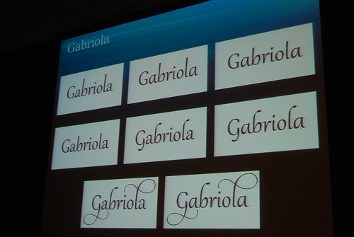
There’s also a new font in the pre-beta build of Windows 7. It’s called Gabriola and it’s a beautiful script font with support for a wide variety of advanced OpenType functionalities.
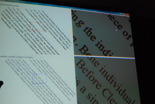
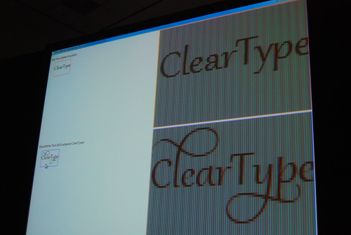
Technologically, with the introduction of DirectWrite there is also better support for text rendering in terms of non-pixel-bound fonts and YDirection antialiasing.
Will somebody at PDC put this up for download quickly before A-Team kills it?
You would be right Direct Write will pretty much end up solving all rendering issues there were left in the transition to vista. Gabriola is really cool font indeed. I think Aero Taskforce will be a perfect way to reference things in Windows 7.
Does anyone know when we’ll be able to apply for the beta program.
I really hope Office 14 will support advanced OpenType features. Any word on that?
What happens when you double-click/open a specific font? Does it just open the same window as before?
Hiding fonts is a dream come true. As a designer, all that useless clutter of system fonts in Vista drives me nuts, and you can’t delete them. This is a great solution. I’d upgrade to Seven just for that.
And just wondering, why not a Font Library? Font libraries can take up a lot of disk space, plus it would be cool to be able to plug in a USB memory stick with fonts on it, and have those automatically be read. Public computers can then default their font library to include the root directory of the memory stick, so that people can use their own fonts.
Ummmm…. how would two of those crazy Ls look side by side? Would the ‘loopiness’ just overlap? i.e. if I wrote “Lollies” would I get overlapping Ls?
Nice job Windows 7 team. I think they really are responding to user’s feedback. And to themselves as well.
Next question: does the clock.avi still exist?
I hope they get rid of this ridiculously ugly bar (the one with “organize”) in fonts. it’s also in add/remove programmes). why cant they put the main bar across a la explorer?
Still, i’m happy they are finally addressing the font stuff. It’s great – and i wouldnt be suprised if your taskforces hasnt been highly useful for them!
The blog entry linked with ‘DirectWrite’ is extremely interesting – the new Direct2D api looks good. It would look great if they were able to backport it to XP, but I doubt this is going to happen.
Hm still has the typical problems with Windows design:
http://istartedsomething.com/wp-content/uploads/2008/10/w7fonts3.jpg
Why have they put Advanced options with just one tickbox below it? Why not just put that tickbox below the tickbox in the area above?
Perhaps they’ll add more advanced options, but I doubt it. Its just typical windows design though…eugh
The rest: THUMBS UP
“Features removed from Windows Vista and Windows 7?:”
It is not possible to list fonts by similarity based on PANOSE information or hide font variations such as Bold, Italic etc (which was possible since Windows 98) in the Fonts folder. I hate such needless random removals and I WANT THEM BACK!!!!! GRRRRRR!!!
They seem to be looking at your Aero Taskforce… 🙂
Word 14 *has* to support advanced OpenType features. There’s not a single word processor on Windows that supports this and Microsoft dominates word processors and doesn’t add crucial features. No wonder they’re blamed for “hampering progress”.
I’ve been wanting these features since the last century 🙂
> Features removed from Windows Vista and Windows 7
Panose classification was cut as very few fonts set the Panose values correctly.
> They seem to be looking at your Aero Taskforce…
Absolutely! Everyone at Microsoft thought the font handling was perfect until Long highlighted the issues. 😉
> how would two of those crazy Ls look side by side?
The contextual OpenType features are coded to avoid such collisions.
Cheers, Si
Since there is DirectWrite, does it mean that tablets running Windows 7 would finally have decent anti-aliased text when they are in portrait mode? Currently Cleartype produces a lot of artifacts due to the subpixels being horizontal in rotated mode rather than the vertical orientation that Windows Vista expects.
@redfish:
Regarding the font library, I think it’s a rather good idea to let non-admin users use their own fonts! I don’t really agree with the implementation though. Windows currently “temporarily registers” the font when you open the Font Preview dialog, and while the dialog is open, if you reopen your programs, you find that you can use the font. I’d suggest a cleaner interface to allow users to “temporarily register” fonts (at least, when you want to use 10 fonts, you don’t have to open 10 windows), or allow non-admin users to install fonts to their own user folder.
>>It is not possible to list fonts by similarity based on PANOSE information or hide font variations such as Bold, Italic etc
As Si mentioned, the PANOSE feature wasn’t well supported. As for hiding style variants, Long shows above how the default view collapses families into a single tile.
(Hmmm… I don’t see Arial Black as a separate tile in that screenshot. Removed from Windows, or merged into the Arial family?)
Never mind my first comment; I just loaded Windows 7.
It seems that, in Word 12 running on Windows 7 M3, if you enable paragraph marks and other hidden formatting symbols (Ctrl + *), Word will use OpenType ligatures (‘fi’, ‘ff’, etc). I’ve tried this with Calibri and Adobe Garamond Pro.
It’s not perfectly consistent. It seems to depend on the order that you type things (eg, whether you type a space after the word in which the ligature should appear or hit enter). It should work if you open Word, create a new blank document, press Ctrl + *, and type ‘Test: fi’.
Is the hide font feature operational?? I am beta testing Windows 7 and the hidden fonts still appear on Word 2007’s font list. (Deep sigh). I love the concept, but wonder why it doesn’t appear to be working. Is this a feature that won’t be implemented until the next version of Office?
Word provides its own font dialog. Even though fonts are hidden, all the fonts are still installed, and Word is getting a list of all installed fonts. Any app that uses the font common dialog or the new Ribbon controls (as in Wordpad or Paint) will pay attention to which fonts are hidden; hopefully Word will do so in a (not too) future version.
Microsoft hasn’t implemented the Windows 7 hide font feature in Word 2010. Unbelievable! WordPad’s drop-down font list excludes unusable foreign language fonts, but Word 2010 still hasn’t implemented this basic feature. Boo! Hiss! The “improvements to fonts in Windows 7” are a bad joke if Microsoft doesn’t implement the featues in Office.
Thank you, Peter, for your informative reply. I’ll keep my fingers crossed and hope that the next version of Word takes advantage of the ability to hide fonts. (Man, that Peter is some kind of a genius!)
Not a genius; just a MS program manager who knows a bit about the font-management features.
The font rendering, or sub pixel rendering whatever, is a PAIN IN THE ASS in Windows 7, my eyes a sore!!!
Hello,
Weird, but when I write with Gabriola font, it seems quite a regular font to me – it doesn’t have those nice calligraphic lines.
Why?
@Radu
Agree completely! The font rendering gives me a splitting headache. I miss XP style fonts!
The default fonts under windows 7 is really ugly in simplified chinese, I just installed windows 7, and now I want come back to my windows xp.
I would like to use 宋体, pls set it as default if windows 7 in simplified chinese mode.
font smoothing sucks
simsun.ttc sucks, simsun.ttf of windowsXP is much better. I wanna delete that ugly font, but system doesn’t let me do it.
Windows 7 font issue. I have a bunch of Alberta fonts of different varieties. When I open the font group there are only 3 displayed. If I delete those 3, 3 new ones appear. If I add new fonts of the same type to the group, it says they are already installed even though they do not show in the folder, and when I say reinstall they show for a few seconds and then go away??? I’m not sure they are there or not, I can’t use them in any applications, but they are already installed?
Hi. I’m a MS program manager and worked on this area in Windows 7.
This sounds like it may be an instance of an issue we’ve had reported by one font vendor: there are some not-so-common situations in which a font developer doesn’t create the name strings for fonts correctly, and the symptom that results is that the font UI elements (font-picker common dialog, Fonts control panel) as they interact with GDI get confused about how many font families there are, and what all the styles are. Apps that interact directly with GDI to get a list of fonts and create their own font-picker dialog (e.g. MS Office, Adobe Photoshop) should not be impacted: all the fonts should still be listed there even though they don’t appear in the Fonts CPL. If it’s that issue, I wouldn’t expect a typical user would encounter many fonts with this issue.
Hope that helps.
Thanks for the post peter. Should I get a new Alberta font? if so do you recomend a source? Can I edit the Name String correctly and how do I do that? This happens with lots of fonts on our server. I am working in Indesign and the fonts that are available are the same that show in the font folder.
(FYI) Windows 7 has the same 100s of registry errors, and it is not faster. It’s too heavy with all of those unused tools, fonts, media files, and help files. All of these little unnecessary things–makes Windows 7 worse then the previews versions. It’s the same crap, nothing has changed.
You are a moron
you clearly didn’t use Vista
Peter – Since I got my new laptop with Win 7 I have not been able to see ANY fonts in the Control Panel or Windows Explorer, except for a small handful of what look like system fonts. So it’s not just a few fonts – it includes all the fonts that come with Win 7 as well as a few others that I installed. I know the other fonts are there because I can see them in various apps’ font pickers. But I need to delete some fonts and there is no way to do that if they aren’t listed anywhere! I’ve been all over other forums and other people have this problem too. As an MS programmer, perhaps you could provide some guidance. This is an extremely frustrating issue that appears to affect more than just an occasional user! Thanks.
JoAnn: This is the first time I’ve heard of someone having that kind of a problem. If you’d like to contact me at , I’ll follow up with you to see if we can figure out the problem.
Hmmm… it dropped the address I gave. Try again: fontguy at hotmail dot com
Peter, my response to your hotmail address just bounced back.
Sorry about that. The account wasn’t fully initialized. Please try again.
It is really too bad that Microsoft trumpeted the new “font hiding” feature in Windows 7 but in fact, neither Office 2007 nor OpenOffice.org 3.3 use it.
While Microsoft may not be to blame for OOo not being able to “hide” fonts, there can really be no excuse for Office 2007 not having been updated yet to employ this innovation.
@fontaholic
Can you point me to where Microsoft has “trumpeted” that feature? I’m not aware of any places where MS has called out and promoted this feature.
(Knowing the limitations of this feature, it’s appropriate to keep the caveats in mind when discussing it.)
You mention Office 2007; I assume you must mean Office 2010, since Office 2007 shipped well before Windows 7. Even so, your point is valid.
You can’t really blame the application developers for not taking advantage of this feature since there were no new programming interfaces (APIs) published in Windows 7 for them to leverage this functionality. Thus, applications that make use of the CHOOSEFONT common dialog and the font controls in the Ribbon automatically get the “show”/”hide” font behaviour, but applications that interact directly with GDI to enumerate fonts that are loaded and then present their own font-picker user interface do not. This is one of those known limitations that I referred to above.
It was certainly a desire to make the functionality available to such applications, but there were some valid reasons why it was not done in Windows 7. A key reason is that Windows was transitioning to new graphics/text infrastructure (D2D and DirectWrite), whereas this functionality is built on GDI and legacy frameworks like CHOOSEFONT. It wouldn’t have made sense to add programming interfaces that get started on a path to deprecation in the next release.
In the mean time, existing third-party tools for font management should still work. So, those that need advanced font management functionality still have the same good solutions they are familiar with and have been relying on for years.
Peter, you seem to know a lot about font stuff! I have a problem which only occurs in Windows 7 (32 and 64bit) where I cannot see printer fonts from within e.g, Wordpad, which appears to use the Common Font Dialog but can see them in Word 2007 which clearly still uses it’s own fon dialog. The printer in question, btw is a Datamax I-4280 which has built in barcode font which I need to access from my own application which uses the Common Font Dialog. If I enumerate the fonts (with EnumFontFamiliesEx) I see all the fonts (including the printer fonts). Does this mean I too must write a Font Picker dialog?
Apologies to Long Zheng if this comment is out of place here but I’m getting desperate and Peter seems to be the guru!
Are you needing support in Wordpad or are you using the dialog in your own app? Have you checked out the CF_PRINTERFONTS flag? (See http://msdn.microsoft.com/en-us/library/ms646832(VS.85).aspx)
Peter, thanks for a quick response. My reference to Wordpad was simply to note that it doesn’t show my printer fonts whilst Office apps such as Word do. The latest documentation states that the CF_PRINTERFONTS flag is obsolete except to persuade the dialog to show the font type description (such as This is an OpenType font…).
I can certainly see all of the printer fonts by enumerating them “manaually” via EnumFontFamiliesEx – my question is why can I no longer use the Choose Fonts dialog to see these fonts with Windows 7, whereas I could with the same app running under Windows Vista (and earlier)?
What I would like to do is hide (or delete) those fonts that are not required in English, such as Indian, Arabic, Chinese, etc. I have nothing against these languages, but they clutter up the drop-down menus of my applications such as InDesign, Coreldraw and even Word. I have ticked the box “hide fonts based on my language settings” but they still show up in drop-down menus. The link above just made my eyes glaze over…
Any suggestions would be appreciated.