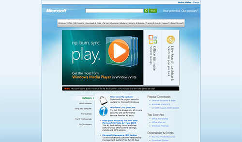
MIX Online wasn’t the only website getting a refresh this week as Microsoft.com’s own frontpage is experimenting with a little redecoration. “tfraser” from the Channel9 forums noticed he was randomly redirected to a new page at Microsoft.com where they’re testing a newer itteration of the homepage.
Currently there’s not that much different except the instant fly-out navigation tabs which makes diving down to sub-sites much easier compared to the current “live view” solution. Search and the recognizable green Live Search search button also receives more attention on the header. Other than that it’s still fairly uninteresting.

Still like their old one. I dont get why they seem to like lighter, washed out colors. (windows.com, windows live, windows 7 etc) This seems like a step back with drop down menus with text. The other one showed previews, and felt more web 2.0, even 2.5. This new design seems to me more web 1.5 or the early stages of 2.0.
Sorry microsoft, but this is an epic fail…
This is definitely a step backwards from the current design. WTF are they thinking?
I have to say it looks more open at very least.
I wonder what else will change…
And Microsoft has also made new logo for Micorosft .NET as you can see here: http://www.uxpassion.com/2008/10/new-microsoft-net-logo-and-branding/
Rebranding all the way 🙂
again? this time more apple-like
“rip. burn. sync. play” sounds a whole lot like Apple’s old 2001 slogan of “Rip. Mix. Burn.”
//k
I posted about this on my own site, but I really feel like this design is a step backwards in terms of usability and creativity. The top navigation looks like apple.com and the alignment is all over the place. The site is too top-heavy and don’t even bother looking at the source. Horrific.
WHAT CAN WE DO TO CHANGE IT BACK!!!
I loved the previous one, I even tried to imitate it tsj2007.110mb.com
THEY CHANGED IT BACK!
Ugh, the drop-down list items would really benefit from increased line height. As is, the bullets are vertically super tight and make it hard to scan product titles.
And… they changed it back.