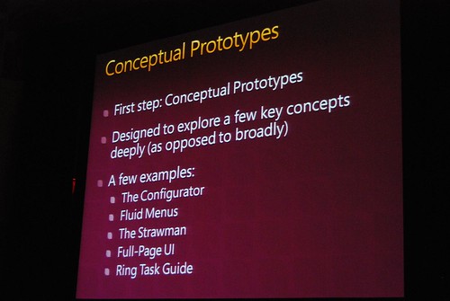
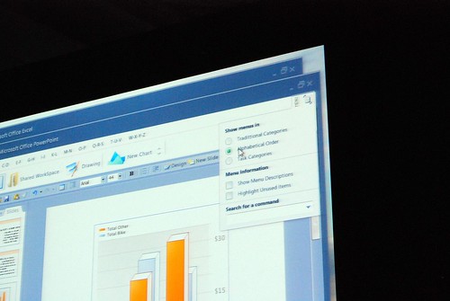
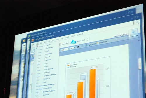
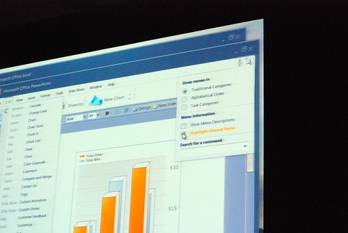
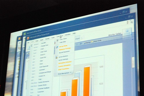
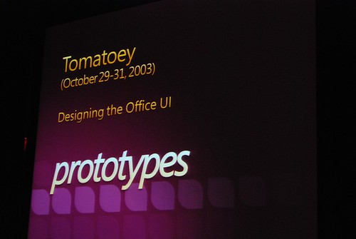
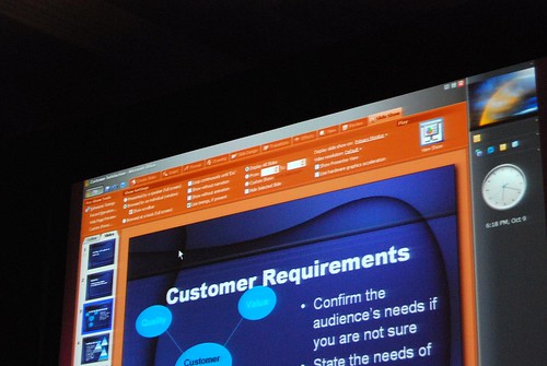
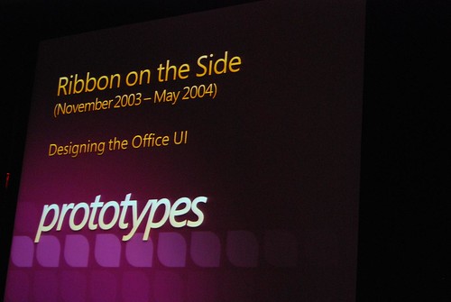
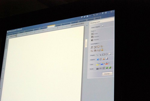
Jensen Harris from the Office 2007 design team gave a very rare presentation at Microsoft’s MIX08 event today about not what the Office 2007 Fluent (Ribbon) interface is about, but instead how it came to be and what other concepts they tried.
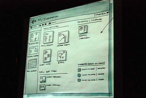
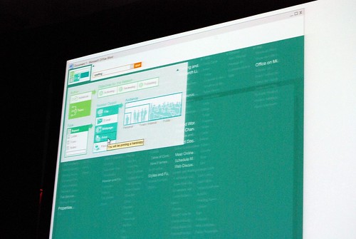
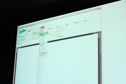
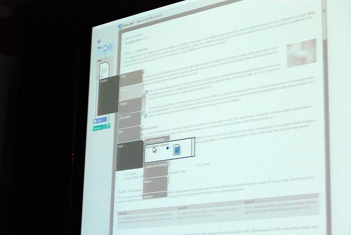
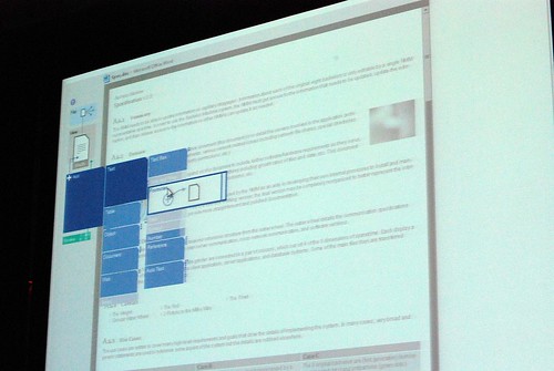
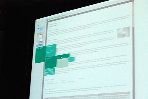
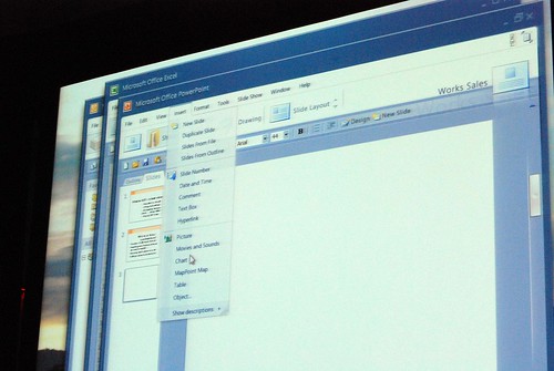
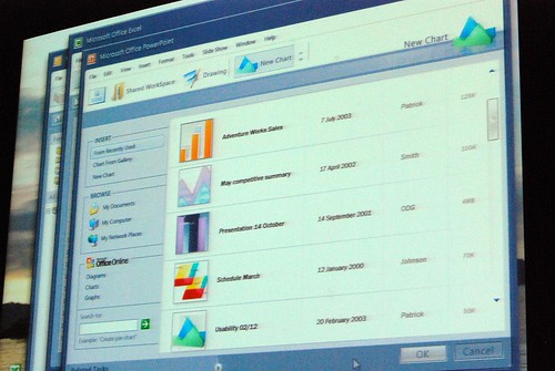
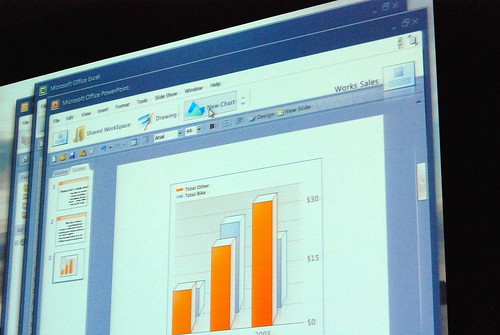
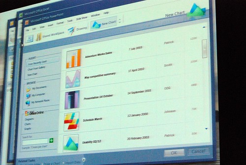
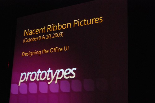
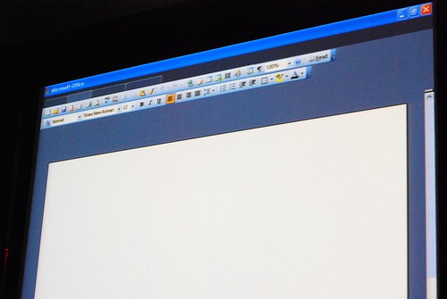
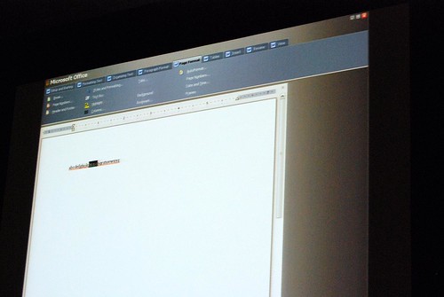
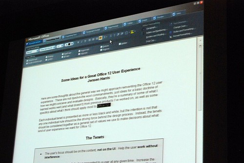
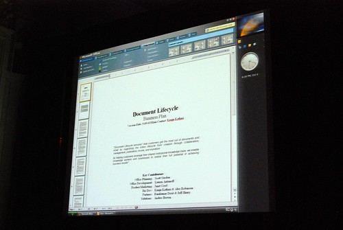
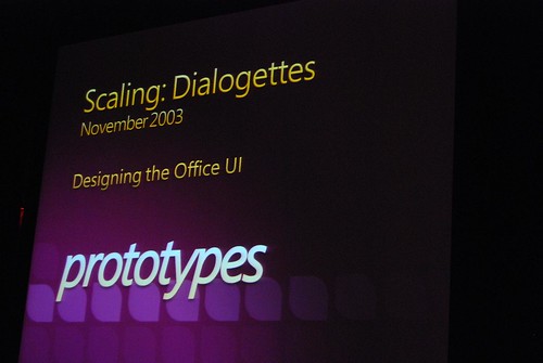
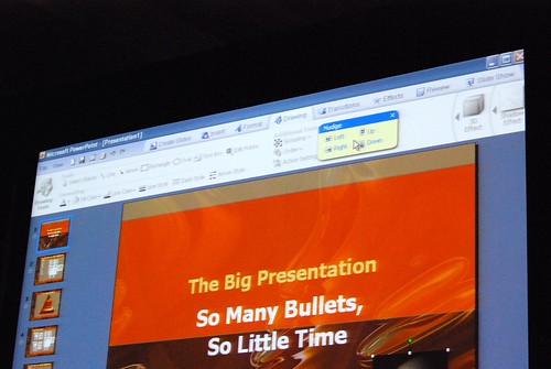
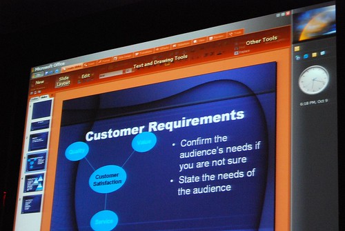
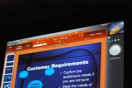
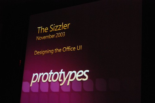
He admitted himself it was the first time ever in a public venue where they’ve shown these never-before-seen prototypes of what would become Office 2007. It was great insight into the development process of Office which frankly may not have been very interesting except the last release. Having said that, it was still a very small selection of material out of the 50-60GB worth of prototypes Jensen claims have been archived.
Most of these were presented in sequential order so it was also interesting to see how the design evolved.
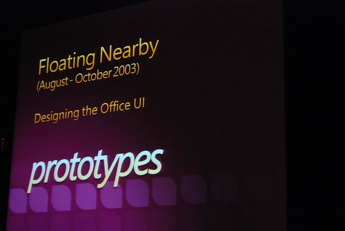

It will be another 24 hours before the session recording will be uploaded to the MIX website, but I highly recommend everyone to check it out when it is available to hear Jensen had to say about each slide.
Very interesting stuff! 🙂 So thank you. There are a lot of smart ideas that they could hopefully implement in some way or another into other products (I think of a new Paint and WordPad for Windows Seven)
Wow… I’ve submitted this to digg, so those with an account, please digg it.
@tino – I believe that this team is in charge of coming up with a new Windows Explorer for Windows 7
http://digg.com/microsoft/Pics_Office_2007_interface_prototypes
some of those they dropped along the way look better and easier to work with… but learning that the current ribbon ui that i’m using is coming from a lot more effort than i thought makes me appreciate it more…
WOw some of the ui accurately reflects the look from early longhorn builds. I do hope Windows7’s experience and development will be as practically and systematically thought out like Office12.
Great stuff 🙂
by the way, records of the sessions (prototypes demos included) are already available:
http://msstudios.vo.llnwd.net/o21/mix08/08_WMVs/UX08.wmv – Beneath the Surface
http://msstudios.vo.llnwd.net/o21/mix08/08_WMVs/UX09.wmv – The Story of the Ribbon
Being able to follow a creative process of such size is always nice! I wonder what kind of methodology they follow in developing UI. Anyone has a clue?
i still prefer the brushed metal look for Office.
i wonder if they’ll ever release a visual style for XP or Vista with that appearance? i can’t be the only one who’d want to use that. especially if they put the various colours in there too. like the Word blue, and the Excel green, and the Powerpoint orange….
The Apple people come here to steal our ideas!
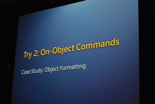
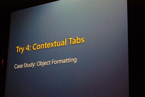
Where’s ‘Try 3’?
It was interesting to note at the end that Jensen Harris made reference to ‘Scout’ (http://istartedsomething.com/20070907/office-search-commands-demo-jeff-scanlon/) possibly showing up on Microsoft.com in the future. The relevant section of the video (linked to by Raiker above, UX09.wmv) is at 1:25:18 onwards. He talks about some of the problems including a search function (language issues, etc.) – it’s worth listening to.
This is precisely something that opensource fanboys will never understand – that the cruel “micro$oft” spends lots of time and money on UI research. MS ideas get copied by opensource geeks five years later, as they try to catch up with Windows XP (yes, KDE introduced the “new removable media insterted, what do you want to do with the files” dialog six years after XP and they marketed it as an “exciting breakthrough”).
Also presentation itself is available for those, who are excited: http://msstudios.vo.llnwd.net/o21/mix08/08_PPTs/UX09_Harris.pptx
Я ебу чо напридумали! Ужоснах!!
хотя привыкнуть можно.. гыгы
@sdf
Ти с кем разговариваеш?
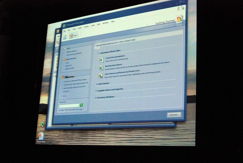
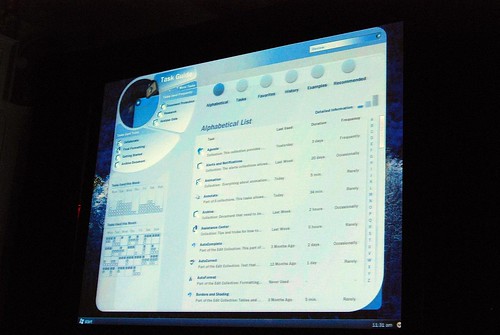
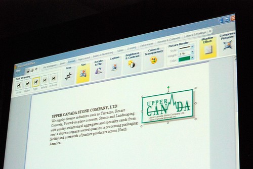
The last picture was the one I get on beta 1.
Very interesting, thanks!
The ribbon stinks big time, and these stupid designs show why it stinks big time…
they wanted to make something different just for the heck of it and failed so bad its funny.
The ribbon is an abomination of design, they should at least lett a fall back option for classic toolbars (something that a 3rd party had to build and sell!).
This ribbon along with the vista start menu and the new interface for windows explorer I can say without regret, that they seem to be build by monkeys….
Hot tracking is not enough… good idea but you should have tested further with other ways… sigh…
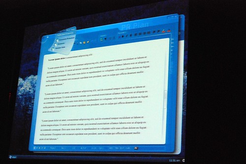
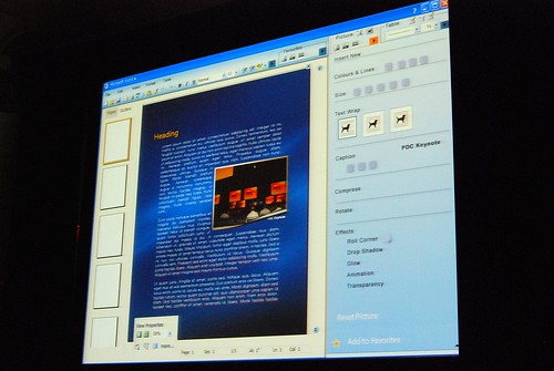
Very nice screenshots. Last foto is interest for me. Very nice graphics possibility
In some steps, it looks like Lottus Symphony.
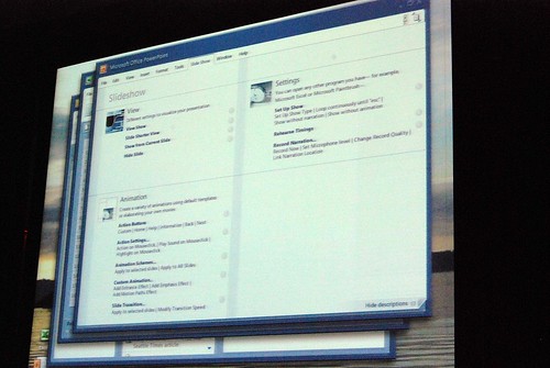
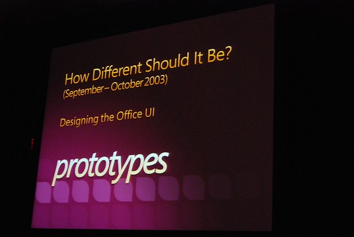
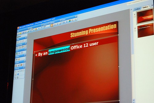
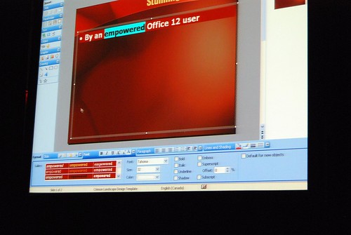
Good pictures!! I really like those prototypes, specially does before the “How different should it be?” slide. Thanks!!
@unbreakable: Personally, I like the ribbon interface over the classic toolbar option. My reasons why?
Simple! I can fit a lot more functionality that’s easily recognizable and dynamic in the ribbon toolbar setup than I can in a classic toolbar setting. I can also hide and show the ribbon, thus maximizing my usable screen real-estate without a whole lot of fuss. It was a real pain to try to do the same thing in the toolbar setup. Now it’s the press of a simple hotkey and BOOM!
Another benefit is the dynamic nature of the ribbon – another aspect that has proven to be very helpful to me versus the classic toolbar of old.
I too hate the Ribbon. There are those that have accused me of being resistant to change, but that isn’t the case. I don’t mind change when it is a true improvement, but when that change makes things more difficult and confusing to use the software, that is NOT an improvement.
I use software to get things done, and after nearly a year of trying it, I still cannot be nearly as productive as in previous versions, or in OpenOffice.org. Notice how much effort they seemto have spent trying to make a different user interface? I want useful, stable features, not to have to spend time figuring out where they hid things on me (and because any new things they add in the next version of Office will need to be in you face, they’ll doubtless shuffle things around in the ribbon again, and you’ll have to find them all over again — what a time waster).
The Ribbon is completely counter to the way I work. If they would allow switching to the old interface if users prefer, then people could still get things done AND use any new features added. So far, I haven’t seen any USEFUL new features added.
My $0.02.worth
The Ribbon is awful, and represents change for the sake of change, rather than the sake of increased functionality. The problem seems that Microsoft’s focus was to make it look prettier, instead of just improving some of the stupid interface and functionality bugs that existed in previous versions. In fact, it appears that many of the old problems still exist, which means that more money was put in the art department than was put in the underlying functionality department. The fact that they didn’t offer a way to go back to the old UI is just mind boggling.
Also, to respond @Kolgoth, if you want full screen in Word 2003, just hit Alt+V, then U, or just make your own shortcut.
OK, guess what?
I think some of the UIs up there are better than the Ribbon.
(My dad is complaining about not finding the worksheet function…)
Maybe it’s an era for “UI custom changing”,
just like how you can change the skins of an app.
This is a terrific video that describes the long development process that went into the Office Ribbon, which leaves only one question: how long will it take Microsoft to admit that it is a very bad interface, a bigger mistake than Clippy, and how long will it take to get it all back into real menus that can used, ordered, modified and added to by users. In other words get back to usability and user customizations without a wasting space, and user accessibility time (Excel stops every 15 seconds). The only good thing I see in Excel 2007 is that the built-in context menus were improved because the interface is so bad.
The Office Ribbon is a logical and timely step forward in MSO usability. Once learned users are encouraged in “Exploratory Learning” wherein one explores new more efficient ways to undertake a new task, just prior to tackling that specific task as well as quickly finding many new features which were previously hidden.
I do however confess that migrating from one known application or “style” to a new style can be daunting. This has been widely presented as a “new learning curve’ which may impact productivity.
I have created a tool that everyone can use to ease the fear and learning curve of migration “Mhelp for Microsoft Office” (including video-clips for both Office 2003, 2007, Vista IE and Media Player). In this I have created thousands of brief video-clips (30 seconds to two minutes each). One video-clip demonstrates with animation (screen-shots), narration and text a step-by-step method of learning the new Ribbon interface (or the XP toolbar). We have even included the valuable Microsoft built migration tools (2003-2007 emulator and etc.) that makes migration a breeze. Mhelp integrates directly into Office applications.
Our product is not by any means perfect but its a start and you can download it for 30 days free. Enough time to get you up and running and thereafter available by subscription at our Mhelp website.
http://www.MhelpICT.com
Please send us your critical (good and bad) feedback so we can improve our product.
Regards,
Shayne L. van Vlerken
Shayne wrote:
“one explores new more efficient ways to undertake a new task, just prior to tackling that specific task as well as quickly finding many new features which were previously hidden.”
Sorry… Have to disagree here.
Requiring three clicks now when it used to take one or two is NOT an improvement in efficiency.
Additionally, in Office 2007 I am NOT interested so much in finding new features previously hidden… I’m more concerned with finding the features I actually need, which used to be right in front of me but are now hidden.
There’s no new features in Office 2007 that I feel are worth the cost of the upgrade (or downgrade IMHO) , especially when you factor in the cost of lost productivity.
If you want to waste valuable time trying to figure out the Ribbon, go ahead, but I’ve got better things to do.
Mike
@Mike:
And Office 2010 is coming soon! I think it’s time to upgrade and leave that old ideas behind 😉 Support for Office 2003 ends in 2014 😀
http://support.microsoft.com/lifecycle/?LN=en-us&p1=2488&x=12&y=17
BTW, I really love the Ribbon and now I appreciate it much more after having seen Jesen Harris presentation. Once you figured out how to use the Ribbon (which takes a few days to get used), it becomes a powerful tool. I followed up the Ribbon since the early betas of Office 2007 (mid 2006 I remember), and at the very beginning I refused to give it a chance, but now I really do love it! Even I see menus and toolbars like tools from Stone Age. Sorry but time goes on!
Best regards,
Jorge
@Jorge:
Sorry, but I still have to disagree with you about the Ribbon.
I have to use Word 2007 regularly for work, including the part of it that Outlook 2007 uses to edit emails. I still cannot come close to the level of productivity I used to have when using the previous versions of Office. Things that used to take only one or two clicks using a toolbar/menu interface now take three or more clicks…. and that’s once I figure out where it’s been hidden. It is a colossal waste of time to have to constantly hunt for things.
I used to be able to make custom toolbars that I could load up with my most used commands, and then float that near where I am working. The addition of that capability back in Office 97 was a huge boost in productivity and usability. Now that we have lost that ability, the closest thing is the Quick Access (ha!) Toolbar at the top left…. but you can’t tear it off and put it near where you need it, so you always have to move the mouse pointer all the way up, click, then all the way back down. Again, big waste of time. Yes, I know about keyboard shortcuts, and I do use some, particularly the Copy, Cut and Paste commands, but if I wanted to memorize all those different key combinations, then I may as well go back to the old WordPerfect on MS-DOS and forget about a graphical user interface.
Now, I am not a computer-illiterate person. I’ve been using computers since my first TI-99/4a back in the early 1980s. For a living, I am an Access and VB application developer. Note also that it is because of the terrible Office 2007 user interface that we are still using Access 2000.
You seem to imply that I am stuck in the “stone age”. I’m not. I am all for change when it is a change for improvement, but I have yet to see the Ribbon as an improvement. It adds nothing of value to my use of the software, and if anything, it hinders my use of it. I’ve had to use it now for two years and I still find myself cursing it nearly every time. I literally start to become angry at the software, because I find myself fighting it just to try and get the job done.
Just because it’s new, doesn’t mean it’s better. Look at Vista as another example of something Microsoft released, proclaiming that it was new and shiny, so it must be better, right? It’s widely considered one of the worst OS releases ever.
I installed OpenOffice.org on my personal laptop and so far I find it does everything I need, cost me only the few minutes it required to download it and install, and there’s NO RIBBON 🙂 Nor will there be, because it would not be permitted under the license requirements for the Fluent (or is that Effluent?) interface.
Sorry, but as far as I am concerned, it’s still a big thumbs down on the Ribbon. I’ve given it two years to win me over and it has failed miserably.
Mike
The Office 2007 Ribbon SUX. It takes me about 30-50% more keystrokes to do things in 2007 than it did in 2003. The added functionality in 2007 is nice but I would like the option of going back to the 2003 UI. Also, I had written NUMEROUS macros IN 2003 which I have finally been able to get working in 2007; however, the VERY limited choice of icons and NO Icon Editor is INTOLERABLE!!!
Ben
You know, even Bill Gates, when he first saw the ribbon interface said “Where’s the classic interface option.”
Well it’s now THREE YEARS LATER and guess what? I’m still not able to come close to the same level of efficiency I had before.
The one and only thing that made Word a usable word processor was the highly customizable user interface. Aside from that, it was shit. Now it’s shit without the interface.
And I can’t believe some of the dumbass bullshit reasons people are giving for why the ribbon is good.
Like “Exploratory learning?” What the fuck kind of bullshit buzzword nonsense is that? If you have to hunt for stuff, you are going slower. Period. There is no argument possible, unless you are batshit fucking crazy. There’s no twisted take on reality in which having to hunt for things in the interface is an improvement in efficiency.
The ribbon interface as a tool for novices to learn about features makes some sense. Forcing every user, including those who’ve worked with the product for a decade or more to suddenly have to go back to kindergarten is just stupid. Please introduce me to the fucktard who made that decision, so I can call him a fucktard to his face.
I personally think the ribbon is an amazing improvement, and it actually takes fewer keystrokes for me to do the things I want (since everything is accessible from the ribbon, and not menus). If you do want custom commands, there is a Quick Access Toolbar too :).