If you thought you knew all there is to know about Windows 7 Milestone 1 Build 6519, think again. TGDaily and ThinkNext may have broken the news, but both have done a pretty sloppy job of uncovering what is exactly in Windows 7 M1. This is where the trusty Russians come in.
Microsoft enthusiast “Raiker” has recently posted his own findings of this infamous yet mysterious leaked build of Windows 7. Surprisingly weeks after the first screenshots were published, he’s still able to uncover some small gems the other guys missed. The article was written in Russian, but Google Translate helps get most of the ideas across. (via UX Evangelist)
First and foremost, Raiker discovered during the initial setup, Windows 7 also asks you to set up a HomeGroup.
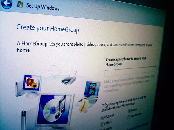
Whilst there’s no explanation what HomeGroup is exactly, but it doesn’t take a rocket scientist to connect the dots between the all-too-familiar WorkGroup and HomeGroup. As far as I know, WorkGroups doesn’t support passphrase security on a network level as HomeGroup seems to suggest it does. I only wish he had clicked on “Learn more about HomeGroup” at the bottom of that dialog box.

Raiker was also sharp enough to point out that they’ve made changes to the appearance of the translucent taskbar. Looking at either individually, you might not see a difference, but when you put them side by side it’s rather obvious. The Windows 7 taskbar (left) is far more glossy but far less transparent than the Vista one (right).
Raiker also noted that maximized windows remained translucent, not the color-filled background some Vista users have complained about. However he speculates this could be simply be an unintended bug, and I concur because filled-backgrounds still makes sense from a usability point of view.
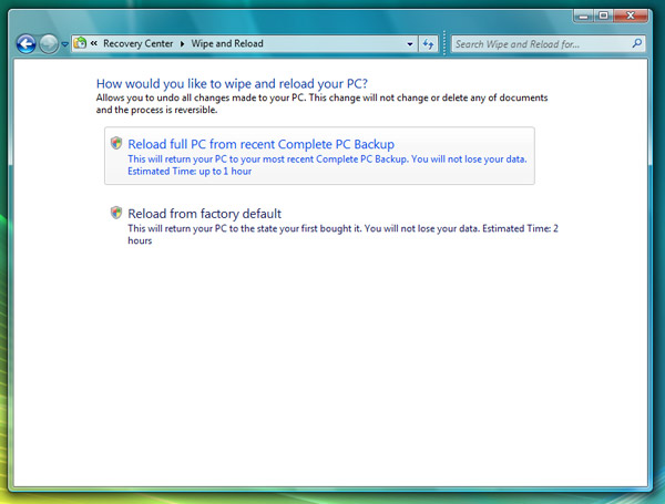
The other fascinating feature Raiker uncovered was “Wipe and Reload” in the Control Panel. Now this is extremely fascinating and potentially game-changing for both OEMs and end-users because what it describes it does is what most people waste a hell-of-lot of time doing anyway, that is formatting their hard drive and reinstalling Windows to get that fresh new smell. Imagine doing that without juggling discs and scourging for that Windows license key.
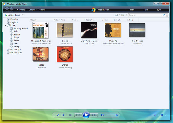
Windows Media Player is also in for a small update. From what we can see, only the menu bar has been modified so far with some of the items relocated around. Also some of the mini icons on the bottom right corner has been changed, but that’s nothing compared to what’s coming up next.
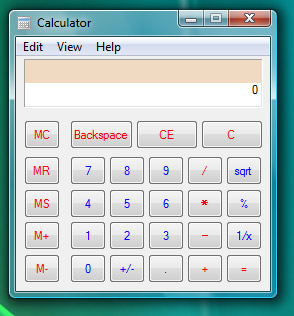
Last but certainly not least, the new calculator. Low and behold this incredible piece of software engineering and revolutionary user interface. With now two lines of numbers, it’s pretty much game over OSX and Ubuntu.
Head over to Raiker’s “Whats Next” blog for the full details and the entire screenshot gallery.
Great findings, Long.
Thanks for posting this
All of these features are meaningless. What we want to see is the new Paint!
All interesting stuff! Clearly there will be massive changes in the UI between now and Windows 7 release, but it is still cool to see what they are up to.
Do you remember “Castles” from early Longhorn betas? They were some sort of network entity. I never really knew what they did though.
This is Windows Vista SP2
Thank you, Long, for this nice post 🙂 I would only like to provide a direct link to the gallery of screenshots, which is independent, as screens in full resolution are always make an better impression, especially for not russian-speaking users 🙂
http://whatsnext.ru/e107_plugins/autogallery/autogallery.php?show=Windows%207%2F1.Build%206519.winmain.071220-1525
Again, thank you for providing this info here, we are appreciate it.
Whahaha da calculator roxorz 😀
This truly rocks!
This is only an interim build, and the product is at-least a couple of years away. Keeping that in mind, whatever is being showcased here is really impressive. If they do build on all this, polish this OS well and include a hell of meaningful, useful features, windows7 will definitely earn a lot of respect.
“Low and behold this incredible piece of software engineering and revolutionary user interface. With now two lines of numbers, it’s pretty much game over OSX and Ubuntu.”
LOL . .. .
erm can it be that this is a complete fake?
the wipe and reload picture shows a wierd number of writing mistakes, as if its written by an enthusiastic russian.
“any of documents” and “to the state your first bought it”
plus i doubt that ms would use the term reload. reload sounds not very sexy from a marketing perspective.
your thoughts?
hey Long !
I could make a site “www.youforgotsomething.com” .. to complete your article ;).
I have found something in the screenshots that I have never heard about Windows 7 modification :
When you search through the start menu, the result are taking the WHOLE start menu and not a part of the start menu (talking about the width).
I think that it is interesting to note, even if I’m not sure that it’s a really good choice (it could be better to have “more width” but not the whole width .. because you lose all the buttons).
What do you think about this?
“… The Windows 7 taskbar (left) is far more glossy but far less transparent than the Vista one (right) …”
Have you ever turned off the transparency in Aero??
@Woongbin Kang: Yes, that’s a completely different look.
@Marco, at this stage, I doubt marketing has their hand in the game yet. I’m sure they are planning what the different product names will be, different descriptions, etc, etc — however, this is M1 and it was probably the name the team that thought this up gave to his/ her product. As for the grammar error, probably someone wanting to just get the actual code done before worrying about the front-end 😉 After all, this is M1 and wasn’t meant to be critiqued by the public 🙂
@Jay, you can’t expect all the UI decisions to be made at this point. I’m sure they are trying to find out what start menu is more appealing.
Looks like there will be new folder icons as can be seen by the user folder on the Start menu panel icon in one of the Gallery 2.
Long,
I have been a big fan of yours and wants to thank you for some fantastic posts – once again you have exceeded yourself with this Windows 7 post which I am sure avid readers will enjoy, I know I did! Nice one.
They also changed the colors in the command bar and status bar in the Explorer windows to more bluish colors.
And for the taskbar: the new gradient could be because of new technology used in the Aero version of that bar (maybe they are using WPF?)
Great finds, great improvements and new features and a great article. Thx!
tragic really.. is Win7 the further decline of MS
wmp11 looking shiter than ever..hell every screenshot shows just how incredibly crap progess is on win7.. I can only imagine the sort of idiot noob feedback they must be getting from those product testing this junk.
2/5 stars for everything from me.. go back and sort it out
I really like the recovery options, i mean you can reinstall everything without losing your data
@elgook: Take a closer look and don’t be a troll! They improved some major ui things in WMP: while playing media, you now can browse (the path is now in the black bar) and show/hide the sidebar (new buttons in the lower right corner).
the All Programs window reminds me of Program Manager from 3.11.
now if only they could bring back something akin to File Manager….
wow tino.. that some major improvement lol.. unfortunatly its UI stinks and remember WMP10 could at least go black background with white text.. Winamp with a decent SUI crushes WMP11 into a pulp really
and whats next every freacking window is transparent.. MS Design team.. hey everyeone lets just make every goddamn window transparent and then we won’t have to do any actual design work! lol at you guys sucking it up like a bunch noobs. No real improvement in anythin just here medioca rubbish
Great article title 🙂 :p …
Nice UI changes … But since Windows 7 will have a likely very different UI, I’m guessing these changes will find their way in Vista somehow.
@elgook:
i guess that’s what we can expect now that Tjeerd and Jenny aren’t there anymore.
Very interesting. I have read about this Windows few week ago. It must be cool product. But from this pictures I don`t see serious changes
@elgook: It is a Player and nothing more. So putting the file path on an always reachable place is a major change in ui IMO.
I hope that’s not where they stop with WMP. I love WMP 11 for it’s neat downloads, and UI, but there’s still much more needed. I’m waiting for more native codecs support, Podcasts, Zune Marketplace, better web-based version, more ways to visually view the data, better burn/rip feature that actually does the WHOLE job, and ways to actually somewhat edit the media within WMP.
And the Calculator could always do more advanced functions, like the one in Microsoft Math.
yes file path.. oh wow real improvement there
maybe they will allow proper skinning of the whole SUI, including the library views.. so you can have different colour background for all areas of the UI. White text, on a black ground for example(WMP10 // remember “Use black as Player background color” ) friggin idiots removed it from WMP11 probably due to lazyness! and having so much white for a library view on a 2nd screen is majorly distracting.
piss poor customization for all versions of WMP really
Interesting indeed!
@ PREDATOR
No, this is Windows 7 ALPHA 1, ALPHA, much diferents to final version!
Those are all minor updates if you ask me. What really counts is if they improve performance when compared to Vista.
Hey! What the hell? Why does the headline say SOVIET Russia??? We’haven’t been Soviet since 1991!
It’s such a pity that the admins of this website have actually been living in a cave without any access to the outside world as it seems to me. They would have known about the Russian current political system otherwise.
What a shame!
Bogdan Zyryanov,
Kamensk-Uralskiy, Russia.
this looks sick!
In Soviet Russia, this blog post reads YOU!!!! =D