Manager: I want the website to stand out as much as possible. I’m a big fan of orange and robots.
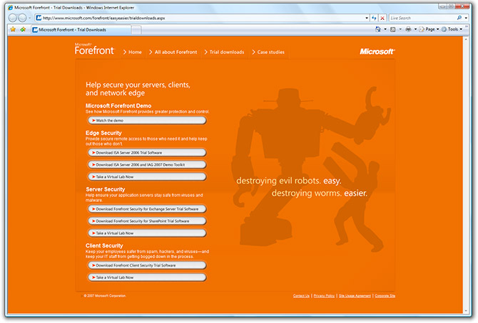
Designer: Get this. First, the whole page is pure orange. Then a robot will appear, but not for long. It will then fade to reveal more orange. My inspiration is the sun.
Manager: Is your last name da Vinci cause that’s brilliant! Implement it right away.
brilliant xD
You make an excellent point.
Holy Haruhi… O_o, theres so many good designers on deviantart ie. and they spend money on somethin like that! ARGH!
Valve`s propagation :p
LOL xD
The new Microsoft Orange Box, only for Exchange Server 2007.
You crack me up!
I wonder why they didn’t try something brown… oh yes, already did that with a Mac product 🙂
Yay, orange!
Me gusta mucho la naranja! (that was propably wrong, wasn’t it?)
anyhooo, purdy kewl.
The Forefront homepage is one of the best flash sites from Microsoft.
I think it’s quite nice…
http://tech–info.blogspot.com/2007/10/google-partners-with-ibm-on-cloud.html
MS designers have a lot more to learn about design. Whatever good designs/logos/eye candy we see in MS products is all “hired”. Most, but not all in house design sucks.
If you are CIO buying ForeFront for your IT infrastructure, I think the last thing you are gonna care about is the color of the product page. :s
In fact, I think orange puts emphasis on the content instead of the page itself, the first thing I recognized when I saw the screen shot is the brand name. Next the Robot, and text: “destroying evil robots: easy, destroying worms: easier”. Instantly, I am curious to find out what it does, so my mind is not focusing on the aesthetics, but the information on the page which is security.
Result: success
I think you are complaining a tad much there Long… Not enough colorful bunnies for ya? 😛
@Andre Da Costa: It didn’t hurt your eyes?
If you turn off the red on your monitor, the site color turns green. And that’s better for the environment.
lol priceless…this is why I subscribe to your blog haha, the hidden gems!
No long, it does not. If the entire page was just orange, it probably would. But there is a combination of elements to avoid this, the Robot silhouette, the white text and feature modules. There is contrast, which makes the page ok.
Well we’re rolling forefront out to all of our casino’s and properties here over the next fortnight
The orange didn’t slow us down 😉
So there’s people nitpicking about every last little thing micro soft.
Maybe someone graduated from the University of Tennessee… “Go Big Orange!”
Perhaps the designer is from Holland? 🙂
At least it’s not that anemic Vista Aurora crap that can’t be changed.