Update: Microsoft Mac BU marketing manager Sheridan Jones has replied with a much more detailed and accurate description of the packaging than my image analysis. Please check the updated description.
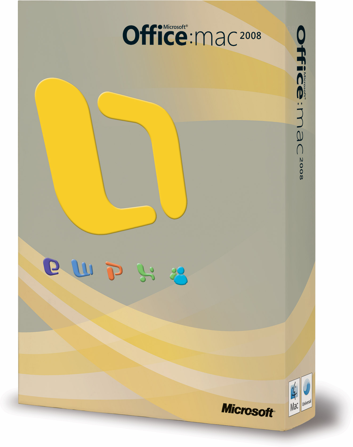 It’s hard to believe the same people who released Office for Mac 2004 in an innovative and stylish round plastic case that the rest of Microsoft has only just adopted, is packaging the upcoming Office for Mac 2008 release in a brown box carbon-dated to some time during the stone-age.
The Microsoft Mac BU have known to be much more innovative and risk-taking than the rest of Microsoft. So either this is has to be Pandora’s box in disguise or they got drunk with the Windows 3.1 guys one night.
Seriously, only if this box was designed by an intern I’d give them some credit for trying. On closer inspection of the high-resolution image, you can see the stunning special three-dimensional visual effects on the logos and icons otherwise more widely known as bevel and emboss, a layer effect that only advanced Photoshop users can master. And what’s with those curves? It looks like someone needed to fill some blank (brown) spaces but it was 4:59pm on a Friday, so created one textbook curve and copied it a bunch of times.
I had high hopes for how cool and innovative it could have been, I really did. Let’s hope the product features can withstand the competition from iWork ’08, because the box sure isn’t. At least Apple’s box isn’t depressing.
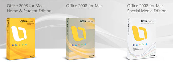
Thankfully the rest of the product lineup have marginally better color schemes.
Update: Microsoft Mac BU marketing manager Sheridan Jones has replied with a much more detailed and accurate description of the packaging than my image analysis. Please check the updated description.
It’s not that bad. Clean, professional and matt like the new Adobe CS3 style
it’s just a box …
Was not just a box. It was different, it’s the whole Apple philosophy.
Looks like a box to me. And doesn’t look like the Vista/Office boxes either.
You ever read those MacBU comment threads? Bunch of whiny idiots.
Looks grey and yellow to me…
The boxes viewed separately and compared to the previous ones are…brave. But viewed together, they seem nice. Maybe Microsoft MacBU is trying NOT to grab shelf attention from Vista’s boxes?
One other thing: I’m trying to find the Bunnies TV Ad mentioned in the previous post. The videos on YouTube are low-res. What i want to find and DOWNLOAD is a hi-res version. The bravia site doeasn’t have a download option.
How did you get it, Long?
iLike the design.
iLike it to!
Me likes it too
oh man this looks soo cheap!
Too bad. I admit, the Office for Mac 04′ box was much more cooler.
I think the actual program icons are the worst culprits… god, how ugly!
big box of “O” corn flakes.
anyway, too ‘plastic’ and too simple for me.
Simple box. That’s because the average mac user won’t be able to open the original 2007 boxes. 🙂
I must agree that it looks ugly, there’s no comparison when you look at the 2004 version!
When is it coming out?
Yuk! Flat and gradientless, bad color (scheme-is there any?), looks like a badly made duplicate copy, but no wait, this IS the original…packaging is clearly a step back from Office 2004.
I too was hoping that the MacBU would adopt the new product box design introduced with Office 2007/Vista, but I think I know why they hesitated. If you own a retail copy of the Office 2007 box, you will find it actually difficult to open and tamper with. Its actually tamper proof packaging to prevent theft and piracy. This is something I think the MacBU thought would be a bit too drastic for their product line although 20 percent of Office sales are Office for Mac. Mac users like simplicity and the 2008 design is traditional, familiar and simple. Even Apple continues with it although in a smaller format using a smaller foot print. Then again, its just a box, the software is what matters, if you are a Company you won’t care since you will probably download it through Volume License or receive it through your media kit. They probably could have stuck with the 2004 design, but I don’t consider 2008 design to be stoneage, since Microsoft themselves continue to employ it across a vast majority of their products. The Office 2001 box was also a very innovative design.
I think what Long is trying to suggest here is that out of the 2004 and 2008 box designs, both portray a sense of simplicity but everything about the 2008 box looks like it was indeed whipped up by an interm on a Friday evening. Heck most people familiar with Photoshop can create the same look within a few minutes.
Why didnt MacBU showcase or incorporate the new look of office into the box design instead (such as achieved through ‘iWork 08 box graphic)
All in all a huge embarrasment as they’ve done so much better in the past.
I think you’ll find the boxes are really beautiful in person, and very Mac-like – for example – the brown color you see is actually metallic silver. The white boxes are actually a deep pearlescent. The blind emboss of the logos adds depth that is hard to show online. The design is very simple, elegant, with more attention to user experience and detail than you can really pick up from the RGB images shown. We’ve tried to take out everything that was superfluous (you won’t find flap after flap of extraneous information on these boxes.) The size will fit perfectly on your bookshelf – the boxes are about the same size as a mid-sized book.
MUCH more important, and what I’m much prouder of, is how much more environmentally friendly these boxes are than our previous boxes, which were thermoformed plastic. Our new boxes are much smaller, and made from recyclable paper rather than the plastic of Office 2004 or Office 2007 for Windows. For every 1000 boxes, we’ve reduced our carbon footprint from Office 2004 substantially. I’ll be talking about this is a future blog posting on http://blogs.msdn.com/macmojo.
For those who aren’t loving the new boxes yet – check ’em out when they’re in stores on January 15th – you may change your mind (or not, we’re all entitled to our own sense of design. 🙂 For those who already like them – I think you’ll LOVE the finished product.
I like the new box better than the old plstc, LHONGH!