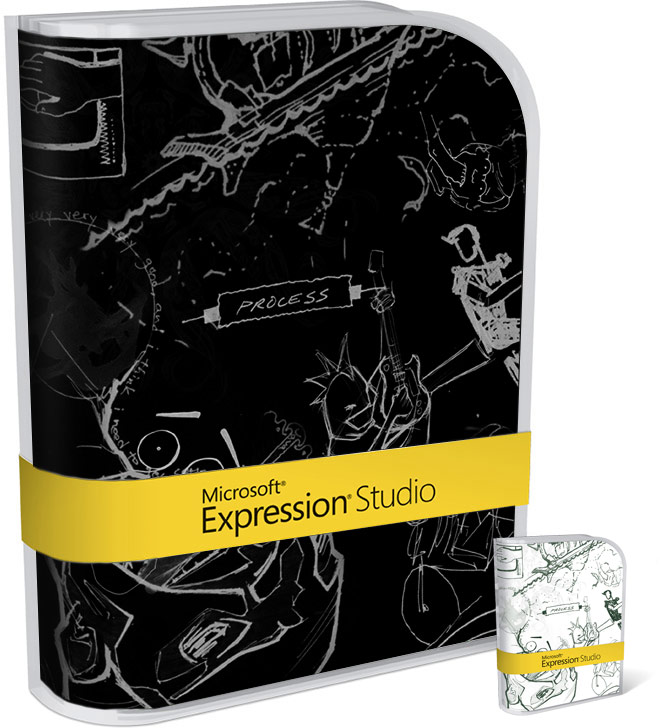
My good friend, and editor, Oscar suggested the Expression Studio Commemorative Edition design should have been inverted to look even cooler. I thought it was an interesting idea, so I mocked this together in Photoshop to see what it would have looked like. It turned out pretty good, surprised actually Microsoft didn’t do something like this since they’ve gone “white-on-black happy” with Expression.
Probably saves a bit of black ink and help a tiny bit for the environment =P
Looks nice, the real one looks unreal and “inverted”. But Expression Studio is getting so little press compared to Windows and Office and other MS products. Not many people seem to know it has already RTMed.
@some1: It’s RTMed? 😮
Actually when you have the box in your hand the black/grey sketch on white looks pretty good. I think they were trying for the sketchbook looks which is traditionally pencil on white paper. The greys do a nice job of giving it a pencil lead feel. Interesting idea about the black box, but personally I like how it turned out.
I guess, Microsoft wanted to tone down on the many products with black designs, we already have Vista Ultimate and Office for Mac 2004 Professional Edition. 😛
erm when did it RTM? :O
http://blogs.msdn.com/expression/archive/2007/04/30/expression-studio-rtm-silverlight-news.aspx
seems to have RTMed
The ‘sketches’ look amazingly similar to the graphics/representations used in EA Sports’ ‘SSX on Tour’. Cool game, too.
http://www.easportsbig.com/games/ssxontour/
I actually preffer the original. That black one looks slightly… scary. I don’t want my software to scare me.