 In 1981, the GUI as we know it today was born out of the Xerox Star – an unfortunate investment by Xerox that only ended in legal turmoil, yet 26 odd so years later we’ve progressed only as far as the capability to have windows overlap each other instead of tiled. During these years, we’ve mastered the ability to open, close and move them with all known combination of genie and transparency wizardry, but every application still resides in a window and objects are still represented by icons. Today, we can’t even live with a cellphone that’s months out-of-date, so why are we stuck with something invented 26 years ago?
To put 26 years into context, below is an example of 26 years worth of difference in the field of graphical user interfaces compared with advancements in video game technologies. How little things have changed and how far things could have changed.
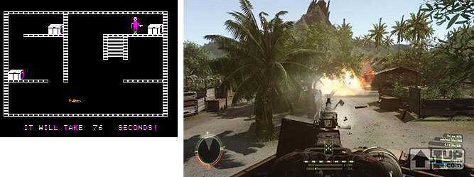
Left: Castle Wolftenstein, released in 1981, is a steal-based action game for the Apple II.
Right: Crysis, to be released in 2007, is a first-person-shooter PC game by EA Games.
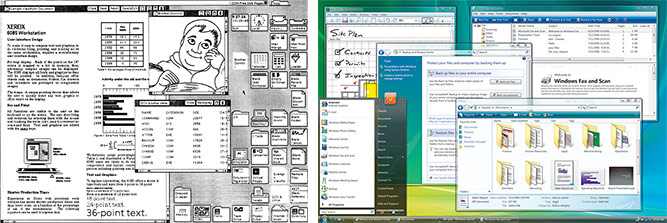
Left: The graphical user interface of Xerox Star Workstation (image credit Neovis), released in 1981, an operating system by Xerox. Right: The graphical user interface of Windows Vista, released in 2007, an operating system by Microsoft.
The reality is, “a window is really an artifact from around 1979, when we had character mode, not graphics. Every application assumed that the screen was 40×24 characters.” Then the graphical user interface stepped in, and introduced “virtual screens to run multiple applications at once.” In the beginning, “they were just tiled. Eventually that became Windows”.
Creative Director for Microsoft’s Advanced Technology Center in Beijing, David Vronay hopes to “get rid of overlapping windows all together”. Dave is a researcher at heart, but he has an abundance of experience working on retail products such as Windows Vista. He is leading a new design team in China to come up with new solutions to some of these decades-old problems.
Like me, you must be wondering what’s wrong with overlapping windows. It works doesn’t it? Dave notes it is not so much of a problem in itself than it is what it was originally designed to solve which no longer applies. “Overlapping windows are really a work-around for small screens. If you had enough space, you wouldn’t have a window. You would have the actual object that is in the window.” The concept doesn’t make sense at first, but when you think about the context of documents, it makes sense to have a letter appear as a piece of paper itself than enclosed in a virtual box.
Then you start thinking, how would I open, close, edit, sort and delete these ‘real’ objects? If you get rid of controls, there’s no buttons and no dialog boxes. The answer to that isn’t entirely clear, but a lot of concepts will have to change as Dave points out.
“Why do you need to open a document?” Dave asks. “You need to open a document because it isn’t already open.” This is where Dave’s years of research really shine. This of course is not a problem by nature, in the real world, everything is ‘open’ in the sense that it exists and does not have a ‘closed’ and ‘open’ state. But it is a problem with computers.
“There is the document on disk that is a different beast than the document in memory (if it exists at all), and the application can only work with it in memory (in most cases). The idea that a document is a stream of binary data that is saved in something known as a ‘file’ is also historical and outdated.” To find an alternative solution, we have to “get rid of this idea that a file is a good way to store data”. Dave also points out Microsoft is already acting to change this, “that is what WinFS was/is all about”.
“The window UI was just one of several solutions at the time. No one thought it was the best. It was just the best one possible with the hardware constraints of the day, constraints that don’t exist anymore.” What is it going to take to change this 26 year old legacy? “If we were starting over now, with today’s powerful hardware, windows are not needed. Outside of the computer, you survive just fine with stacks of paper, drawers, file cabinets, book cases, bags, etc.”
No one knows the answer, but Dave points out some of the constraints we still face today. “You have a certain percentage of your field of view that is consumed by the monitor, what is the proper percentage to allocate to different items? I have something that I am actively reading – that needs to be fairly large, then I need the context around it, and I need navigation points to other items. Finally, at least in the current UI, we need control elements – targets for the mouse, stylus, finger and etc. So – if you take those requirements, you can imagine many different solutions besides overlapping, resizable windows.”
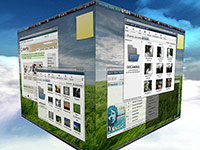 Ideas are already beginning to spark. Many of today’s UI concepts experiment with the ideas of tiling, zooming, etc. Dave points out even “those crazy rotating cube desktop demos” are stems to a better alternative. I asked whether or not Flip3D was considered part of that experiment, Dave replied “Sure! In fact, on my Tablet PC, I run with all windows maximized the whole time, and flip between them with Flip3D. But windows themselves are still part of the problem.”
At the heart of the thin-client phenomenon, “another alternative is the page-based UI”. Dave points out lots of people do nothing on their computer but use Internet Explorer in full-screen mode. “In fact, they don’t even know the computer can do anything else, and don’t care, because web functionality is sufficient to justify the acquisition cost.” A browser window, in full-screen? Sounds like Google’s utopia. “The web of course has no (useful) windows, it is all just pages. You click links, you go back, or you go to favorite sites, or you search, of course – a real UI breakthrough.” This is one just one practical example of “a good number of users operating a windowless computer”.
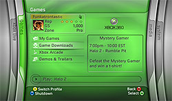 Even with all this fantasy talk, alternative user interfaces are not all that far-fetched. Some great products a lot of people use everyday already come without a windows-oriented UI such as the Media Center, iPod/Zune and most cellphones. But it doesn’t have to be all windowless for example, the XBOX 360 has a very basic simplified window manager named the ‘Blade‘. In effect, each window is represented by a tab which you shift to. Even the iPhone has no windows.
Speaking of Apple, Dave is suspicious that Apple could beat Microsoft to the market with an operating system without windows. “Apple, with its smaller user base and less concern for backwards compatibility and training costs, is in a better position to deploy large UI changes than Microsoft.” If that does happen, it will certainly be a shame since it will fuel another round of mindless Microsoft ridicule at future Apple conferences.
Even if we do come up with a better solution tomorrow, a graphics user interface so advanced it boosted productivity by ten folds with minimal learning curve, we still face one other problem. A problem that existed since the creation of Windows. A problem that Microsoft hopes to never deal with. Can you really take the ‘windows’ out of Windows? Wouldn’t that kill the brand?
To which Dave replied, “I am sure that the Microsoft branding people can come up with something to take the place of Windows. Like Microsoft Zoomy or the Microsoft Tiled Productivity Surface”.
If you’re feeling creative and want to be part of the solution, Dave says he’s hiring. A passion for Chinese foods is a plus.
Apple used to publish a beautiful 2 volume book series on Interface design which in my opinion was quite ahead of it’s time. The last edition I saw was back in 1995. It meticulously detail the dos and donts as well as well as whys of interface design for the Mac OS pre OSX. A lot of the theory behind it was easily application to any application.
At the time the best Microsoft had to offer was Windows 3.1 with Windows 95 on the horizont. I think Vista is certainly a step in the right direction but for some reason they managed to pack in more complexity than you find in Mac OSX. Somethings which can be done in two steps on an Mac require aimless digging around in sub-menues on Vista. Some feature in my mind where a lot easier to manage in Win XP than they are now in Vista and I am not alone with that opinion.
If think Microsoft missed the boat a little in truly simplifying the computing experience simply buy adding to much bling. As they say sometimes less is more.
Apple is somewhat guilty of the same mistakes. While the philosophy of OS 8 and in some ways OS 9 was to keep color schemes and interface as neutral as possible to distract from what’s important (the content you are working on) they left that philosophy for a more glitz and glamor approach to real in consumers.
If you take a look at Adobe Lightroom I believe you see an application which is more focused on providing photographers with an interface neutral approach to get the job done. I am keen to see how they improve the experience in version 2.
As for outsourcing interface research to China I take that with a little bit of skepticism. I believe truly good interface design requires only a few brilliant people that can think outside the box. Without wanting to soun racist or coming across with prejidous, history of recent years hasn’t shown China as a source of innovation…
FYI, the interface design for the Xbox360 wasn’t developed by Microsoft or Microsoft research. It was actually farmed out to a small external company which somewhat proves my point.
Will Windows ever change in it’s current form? Unless Microsoft manages to find a replacement for it’s Windows/ Office cash cow that is hardly going to happen in the near future. Too many legacy application, to much back end integration… maybe applications as an online service might be a work around but I guess only time will tell. Perhaps this is one of the reason why Microsoft desided to release Silverlight. Although with the current lack of protection for you application source code I don’t think this will happen quickly either.
Excellent read, Long. Though the second to last paragraph, dont give the marketing folks ideas…
😛
@tom
Microsoft is making billions of dollars from it’s advertising/web business and it’s business backend systems are performing brillaintly for the company. Their home/entertainment division is making progress, but the future is uncertain for many of those products.
They don’t need to find replacements for Office and Windows because they are already the most diverse technology company in existence. That’s a fact that can’t be disputed.
Very cool contrast… I had never thought before about how old are windows, however, when I think about futuristic OS, I don’t think about windows but objects.
Things are moving into three dimensions, cause there’s “not so much” to do in 2D… We are starting to be able to render 3D complex objects in real time, so why do we have to stay with our plain 2.5D images?
This is a nice topic to talk about.
Why are you comparing Castle Wolfenstein to Crysis? MazeWar came out in 1972-73 http://gnomeslair.blogspot.com/2006/12/history-of-fps-pictorial.html
@DosFreak: Because that came out in 1981. I agree with you there are some ‘better’ looking FPS at the time, but nothing that came out exactly in 1981 to prove a point.
Just for fun the other day I was running Windows XP with Windows 98 in a virtual machine and Windows 3.1 in DosBOX. So many things are exactly the same as the old days. The colour picker, classic mode control panel, paint, Explorer… so many things are so similar to the way they were 20 years ago. It’s really incredible.
It’d be suicide for Microsoft to change up the formula too much, but seeing all these Win3.1 holdovers even in Vista is really disturbing considering the outrageous price they ask for that software.
Taking your name and making it more “Microsoft”, here is what it would be called:
Microsoft Tiled Productivity Surface Professional Plus+ 2015 Human Input Edition with SP1 for Students.
Microsoft Tiled Productivity Surface Professional Plus+ 2015 Human Input Edition with ultimate extras SP1 for Students 😀
Ha… laughable Long, as cool as you are. Bit late for April Fools?
What a load of nonsense. Hmm… wheels, why have we stuck with them for so long? – they’re thousands of years old! What could we universally use for a replacement for wheels? Well, we have no idea, but hell, we only used them in the first place because they were strong and went around easily.
Opening a document, terrible! Clicking on it! Very inefficient. The real world is much better. I just have to get up from my desk, walk across the office, open the cabinet, thumb through the folders, pull out the document… then I have it right there… no stupid window around it! A4 size, and I can zoom in by pulling it closer to my face. Plus, it already just exists! If I lay it on the desk, I can see other documents around and under it… oh, wait…
Overlapping windows are just for small screens… nonsense. I have quite a few apps that can be full screened – but I rarely want them to be. You know, it’s useful having some other data on the screen. It’s more convenient to “put a document away” by clicking on an ever-present X than any other conceivable means. Even talking to it is going to be inconvenient a lot of the time. OS’s without windows are nothing new – you highlight cell phones and consoles. If anything they counter his theory – small screens want single views. You can’t handle more than one thing on a phone screen – but on my PC I can have a movie playing in one window, my phone dial on another, and still be surfing the web in another. Yes, I do want all of them on screen at once, and hell, behind them all I even have a movie playing. I can full-screen it instantly when Thora Birch takes her top off. Even on consoles, they also attempt to resolve very simple problems – comparing selecting between a game and a movie pane is hardly comparable to the infinite complexities of a desktop OS. As for 3D cubes…
WinFS has never “got rid of files” – it just exposed the data therein to a unified catalogue of sorts. Sorry, files are a good thing. They’ll never go away. The only alternative is a massive set of data permanently sloshing around in some kind of ocean of memory. Of course, you’d need a means to delaminate it all to know what is what. Name parts of it. Select the bits you want, and only the bits you want. Something to describe what kind of data it is… hmm…
Obviously interfaces will evolve, but the guy’s a fantasist who’s playing with semantics rather than technical innovation, or even being visionary. To really have any credibility, he’s going to have to wait a long time before data is manipulated by thought, viewed on the retina, and is retrieved intuitively from a mass of wet slush.
Disclaimer: Comment tone dictated by article’s merits.
I think the only way new types OS’s are going to be accepted is when the way we view them changes. Flexible plastic screens that you can roll up and put in your pocket. Glass that you touch like Minority Report. As long as we are stuck with a desk and a monitor sitting on it, we are stuck with window style operating systems. You can evolve the way we retrieve our data, but the experience won’t really evolve until the technology does. I think that’s why the examples above (xbox, phones, etc,) apply is because they ARE on different technologies to some extent. It’s still pixels on a screen, but the location and function are totally different. Anyway, to piggyback on Midnight, don’t reinvent the wheel, reinvent the mode of transportation.
I know it’s coming, I watch Discovery Channel 😉
Midnight: You’re an idiot. “Sorry, files will never go away.” From the programmer’s point of view, sure. From the user’s point of view, the difference between data in memory and on the disk is quite possibly the #1 source of confusion and lost data for novices. It’s a holdover from the days when RAM was expensive and disks were slow, and totally unnecessary with today’s tech.
tom: Nice to see somebody remembers the Apple Human Interface Guidelines, even if Apple doesn’t. The original Mac OS interface was a marvel of HCI. Most everything since then has been two steps back for every one forward.
Where’s Jef Raskin when you need him? Oh, he’s dead. 🙁
Seriously, as usual MS is 20 years late to the party. Check out archy for the latest iteration of Raskin’s life work on the post-Mac interface.
Alex, you called me an idiot without any support for your point. Propose a way that people can interact with all their data as they do, that never uses files? I’m fascinated.
Your point is as strong as this: Lots of people die in car crashes, one day we’re going to replace them with a better vehicle with an engine. The closest one can get to your point is that people don’t save their data, or they otherwise lose it. That has nothing to do with there being files or not – as soon as you delimitate data (which is essential) it’s a file, or an object if you insist on playing with semantics. If you want a better way to find your data, or have it in a permanent robust state, that’s different, and something tech can already resolve. Nothing to do with not having files though.
Media player is a good example. You don’t see song.mp3, sure, you just see a database of songs. That may be a cool way to go for many apps. As soon as you move a song from media player to your usb, you will need to think of the data as a file. It’s very simple. 🙂 In that sense, the interviewee may have something, but it’s extremely irritating to have it expressed in some kind of sensationalist tabloid speak that clouds the reality rather than elucidates the potential techs of the future. It’s just hot air.