 Iconfactory, the small design company who holds a near-monopoly over the design of some of the most delicious icons in many commercial Windows and Mac software titles has come out claiming some credit on the design of Windows Vista’s icons.
Building on the groundbreaking work we had done for Microsoft’s Windows XP icon suite, the Iconfactory once again worked hand in hand with the design team in Redmond to help design the look and feel of the Windows Vista icon suite. Over the course of two years, style proposals were created and refined in cooperation with Microsoft’s creative team, to match and express Windows Vista’s Aero vision and styling. Once the final concepts for the icon style were completed, Microsoft’s designers expanded on this visual language and used it to internally create the full suite of icons you see today in Windows Vista.

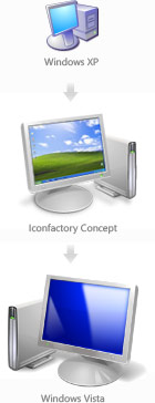
Assuming the icons above are samples from the final concept, its interesting to see how they differ from the final Windows Vista icons. For example, the concept icons all face rightwards and are lit from the top right corner (like XP), whereas in the final they all face leftwards and are lit from the top-left. Much of the detail on these particular icons have been carried over to the final design, right down to the assortment of paintbrushes in the Paint icon. These guys clearly nailed the concepts.
But they are not the only people who deserve recognition for this massive overhaul of icons in Windows. Taking into account Vista refreshed about 10 times as many icons as XP did, as well as the introduction of high-resolution icons, many design agencies and designers at Microsoft all deserve a round of applause. While they did miss out on some detail here and there, it certainly marks a new milestone for Windows.
Sweet! I always thought that the vista icons were so much more professional than XP’s.
Definitely appreciate the attention to detail in Windows Vista. You mentioned the parts that were skipped I’ll cut the team some slack, but I hope they go all out on the next release. (WINNT, WINDOWS, SYSTEM32, SYSWOW64) just a mention of the folders that have some legacy icons.
I think icon factory also did the really, really, really, photo-realistic icons in OS X, those icons are definitely worth mentioning, I read somewhere they are going for 512 by 512 for icon in scaling in Leopard which is just insane.
One thing I was hoping for though is a bit more personalization according to hardware form factor, for instance, the Computer icon throughout the UI in Vista would be a laptop or Tablet if Vista was installed on such a form factor. I also wanted the Fast Food restaurant Recycle Bin icon I saw in the Hillel Cooperman Longhorn Aero Experience demo at PDC 2003, now that was a cool icon.
Well, if Leopard is resolution independent, wouldn’t they vector art and have no inherent resolution? I might not understand the concept correctly, though.
Possibly because they want to have a limit, come on 512 by 512, thats terribly huge. Desktop/Dock Icons I believe is the least of the resolution independent problems. The focus is to have the application UI support better scaling without looking awkwardly minuscule on future humongous resolutions.
I’ve always wished that the “My Computer” (and in Vista, “Computer”) icon would automatically change to a laptop or tablet icon depending on the machine you’re using.
@Andre Da Costa
I’ve just checked 512 x 512 resolution in Paint. Well… huge it is… but you should also consider that “in the not-so-distant” future we’ll see displays with 400dpi and above. And we’ve already got displays that have densities in excess of 600dpi for medical applications (such as people with partial blindness), abliet expensively. 512 might seem huge now, but eventually… well…
Hmm, for me this icons aren’t a real design milestone. I really loved XP’s icons because of the strength and clarity.
The new icons aren’t real icons but beautiful pictures. They did not work as well as the old ones did: an isometric projection works a lot better than this perspectice projection (MS now has the same “perspective issues” as Apple has, just take a look at the “my games” folder icon). It just looks ugly when there are a lot of icons side by side.
The next big design issue is contrast and shape. The most important thing in designing icons. Windows Vista loses completely! In XP every icon has an easy to read silhouette with the exact same shadow. The new folder icon just work well at large scale. The small version (like in the start menu) looks like a yellow cloud (compare this with the small icons in Media Player or Photo Gallery – which are perfect). Same for a lot of icons in the new Explorer menus (exapt the “View” icons – they are the only small icons with a shadow in the whole system! …?).
And why is the My Computer icon (with a BSOD-blue display!) that small compared to the Recycle bin icon? (choose very large icons to have some fun) Oh yes: orange flowers, anyone?
Sorry, but for me this is the worst icon design for an important interface since ehm… DOS ;P Please MS, learn from Office 2007 and the designer in me can sleep well once again.
Icons are done by illustrators not designers.
Icons good
There is no rules that only Illustrators can do icons. 🙂
Just vista icons
Windows XP icons lacked clarity compared to the previous Windows 98/2000 style. The always present drop-shadow blurred the outline of the icon’s shape, especially on lower resolution monitors. The shadow also blended with the grey background color of the classic theme. If an icon has a well defined border, then it can fit more backgrounds. Most icons in XP were only readable at 32px or above and not, for example, in the Start menu or compact file listings.
Vista icons were mostly an improvement, because they returned sharp lines, and usually provided a hand-drawn 16px version. In few cases NT6 icons had degraded, such as the pale vertical folder on white background.
Who was the designer or author of the original concept used in Win98/Me/2000? Those icons can still be seen under Administrative Tools in XP. The limited 256-color palette and dither used to work around it isn’t all that bad. Often it adds sparkling texture and sharpness. I liked the change between Win95 and Win98 when the user selected “all possible colors”. The overall style was mostly maintained, and because of that there was no obvious clash with older 16-color icons.
From modern choices, ReactOS icons are the best. I think they are based on Tango/Gnome, and are the best polished part of this software project. They sit between Vista and Win98 in style and clarity.