Danyel Fisher, a Microsoft Researcher at Redmond has developed a tool that allows him to visualize and study the behaviour of online maps users to better understand what they are looking at and why. Today, Microsoft Research has published his paper “How We Watch the City: Popularity and Online Maps” with his theory and findings, which he will also present at the ACM CHI 2007 Conference.
One way of conceptualizing physical spaces is to look at where people notice, remember, or note them. Computer-assisted methods give us new tools based on implicit, rather than explicit, data about how users have examined and travelled online through cities. “Hotmap” is a tool that visualizes how people have used maps.live.com, an interactive mapping service, looking at what parts of the maps they find most compelling.
His tool, “Hotmap”, generates a heatmap overlay over Virtual Earth imagery with areas most viewed represented by brighter spots. He can look at an entire country, region, state or even down to a specific city. At first sight, it might look like the United States is covered in lava, but I assure you it’s just a trick of the mind. That is, until the apocalypse.
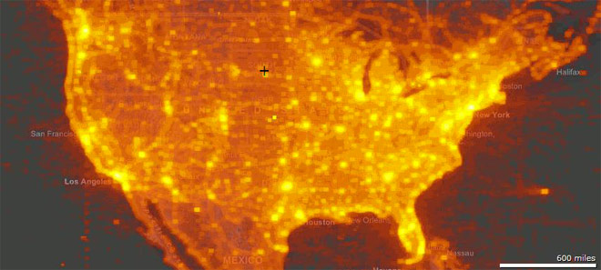
A heat map of popularity of tiles over the US at level 12 (approximately 40 meters per pixel scale). The brightest points have on the order of half a million hits, while the dimmest visible points show closer to a thousand hits. Note that usage patterns at this scale seem to follow population.
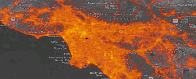
Picturing the City. The greater Los Angeles and Orange County area, at zoom level 17. Note that while the population of the area is very broadly spread out, social focus is far more limited. Interest follows population and coastlines, and points of interest, including Disneyland.
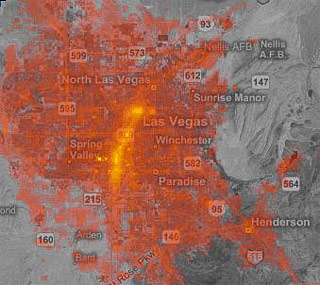 The greater Las Vegas area, at zoom level 18 (0.6 mpp). [Long’s note: Interest follows the strip] |
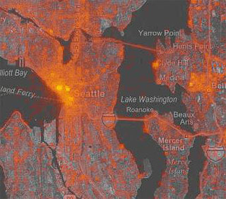 Seattle downtown and suburbs at zoom level 19 (0.3 mpp). Interest follows local popularity. |
Danyel comes a conclusion of,
We have seen several apparent motivating factors for the use of maps. Collectively, users seem to look at particularly unusual imagery, at roads, borders, and edges; and at homes and neighborhoods (presumably their own). The vast majority of hits are focused on a fairly small area, following population, suggesting that largely, users currently find use of the tools for looking at natural scenery less compelling then they do city imagery. Last, the tools here suggest that visualizing the use of online spaces can provide valuable insight into the space.
What benefits might such fun tool provide? Well it should gives satellite imaging providers a much better understanding of areas that require more priority for high resolution imagery, or places to generate 3D map data for. So you can see your house, quicker.
Pure information can be that beautiful 😉
honestly, all that orange looks really pretty.
would look sweet on a 3d model.
Looks like lava. “Hell is hot!”
First thing that came to my mind : Neo’s vision in Matrix Revolution, it’s neat 😀
Flu… bush flu 😛
Someone email me an explanation of what exactly the hell this article is trying to explain.
this is a temprature map