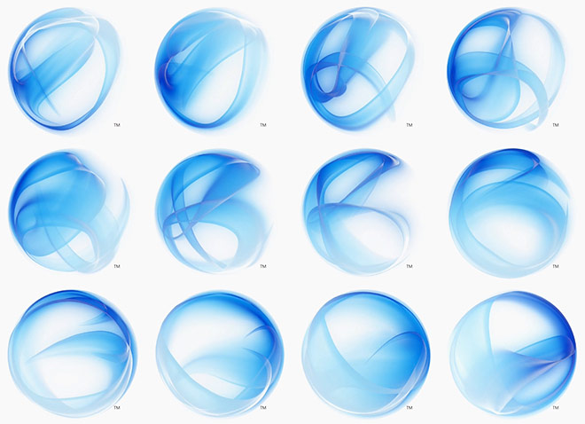
 Amid the re-branding of WPF/E, Silverlight introduced a new name (still with me?), a new website, new theme and probably the most visually prominent, a new logo. Being a (self-proclaimed) designer, this is probably the most interesting of all the changes introduced. It’s hard to put down exactly what the logo is, but it looks something like smokey ribbons enclosed in a sphere-like shape. It’s outright abstract, somewhat blue for Silverlight and reminds me a lot of Strepsils’s logo.
What’s most interesting is how it animates and creates new variations of the same logo as demonstrated in the website showreel. Here’s a compilations of the Silverlight logo animating and creating new variations. Some of them I think even look better than the original!
It’s not even worth guessing what the ‘loading animation’ for the release-version of Silverlight might look like. 😉
Sexual.
yeah… sexy; viagra smoke 😛
What the hell are you guys smoking? 😮
Smurfs!
They good?
Is that not the PDC 2005 music in the background of that showreel, only remixed to sound cooler.
Check about half-way down this page http://www.winsupersite.com/showcase/winvista_roadtogold_02.asp and have a listen.
@Michael Mc
I was going to say the same thing. You beat me to it!
Might want to mention this:
Microsoft PlayReady content-access technology delivers a single solution for digital rights management support on both Windows-based computers and Macintosh computers for content providers (coming in Fall 2007).
There are also some nice backgrounds on the downloads page: http://www.microsoft.com/silverlight/downloads.aspx
Fairly easy to remove the Silverlight branding too, if you so fancy: they put the logo on a solid color background :).
I loved the music, too.
Microsoft’s been using it for a while now, probably part of their Longhorn media archives. The teaser page for the (then) upcoming new Windows Marketplace used a variation of it as well.
Anybody got a clue what is the song or the artist or any info?
Microsoft is trying to be cool – with shabby results for me. Insofar Sliverlight logo looks fresh and somehow Web 2.0 Pro (lol) – video is awful. I like blue, but i dont wanna live in flat, glassy world without walls and horizons :P. Ah, and Tom Cruise in Minority Report is faster in managing windows ;P.
But, Silverlight would be good alternative for Flash
Im in love; Apple iPod ad with The Fratellis is ~~wheeyaah lol.
End of transmission; Smurfs are good and sweet and so-oh fresh; sorry for english guys ;p.
@sb.net: He he, sorry. 🙂
Will MS rebrand WPF now? Maybe back to “Avalon” or what about “Silverlight/Somewhere”? ;P
Does anyone see a similarity between the buddy list (around 1:00) and the folder browser in Iron Man?
I’m late to this discussion—but your site was first in the Google search for “Silverlight Logo”. Ya know, as a [self-proclaimed] designer, I gotta say it’s interesting, but not really a logo. I can’t even imagine trying to reproduce this thing at 1/2″ on a black and white sticker. But I’m not even sure it _needs_ a logo.
It looks like an animation of electron decoherence to mee…
Look at about 5:30 in this video: http://www.ted.com/talks/joann_kuchera_morin_tours_the_allosphere.html