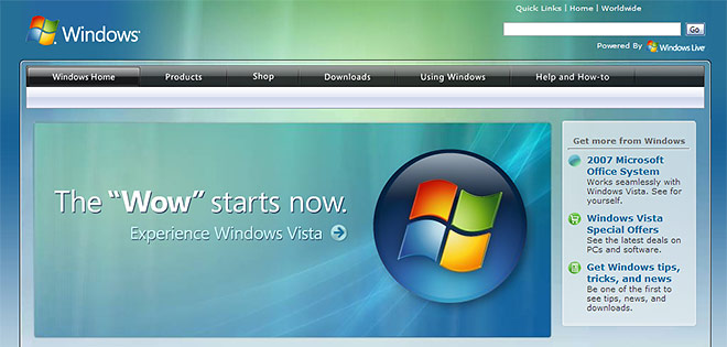
The guys over at Neowin noticed the Windows Vista website has been refreshed for the ever-imminent launch in under 24 hours. In fact, the whole “Windows Family” sub-site has adopted a new Vista look-and-feel with light auras, glass and a black toolbar.
There’s an abundance of new information and multimedia content that will take at least half an hour to appreciate. It’s also nice to see some friendly faces on featured blogs and communities section of the website. Microsoft seems to be doing a lot recently to empower communities. Credits to them!
Some people have drawn the similarities between it and the Apple OS X website which also uses a center-aligned wrapper, oversized banner graphic and a grid-based layout. Nevertheless, the two are still obviously different with the OS X website far more polished and consistent. The Vista website has different fonts everywhere, three different types of navigation on any one page and a pretty confusing color scheme. Hopefully it’ll improve over time.
However, one thing in particular on the site that disturbs me very much.
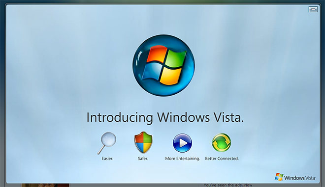
What the hell is that! It’s like someone tried to create a pseudo-glass effect with actual reflections and refractions, without actually making it look anything like a glass orb. Millions of people are going to see this. I wouldn’t even be surprised if some people will believe that Frankenstein-thing-some-might-even-call-a-logo is actually the logo for Windows Vista. Ugly would be a compliment. Get it off!
I’d have to agree that that orb looks scary.
Yes scary orb but the site is very well done and its huge, by the way!
This is the OS X section. The icons need to look shiny so they are attractive to the mac users.
The orb looks even more horrible if you see it in the JPEG image and not in Flash (just head there in IE x64 to see the JPEG version).
I fully agree that the orb is completely fake..
and overall fit and finish is not that great..anybody can notice raster images (vector graphics should have been used within the flash)
i guess my critical eye is turned off, cause i really can’t see what all of you are apparentlyi seeing. whats the big deal? looks fine to me.
Some clouds are in that Vista orb…
Let’s imagine that maybe it has mirrors all around it.
The Orb is surely imported from Jobs 😉
bad design
i don’t like it any more
I like it 🙂
Argh. It’s all so blurry and stop’s you changing tabs in Firefox.
And what is that blue mushy stuff at the bottom for? Is it some kind of cushion for when you fall out of the squidgy soft comforting world of Vista that occasionally makes very bizarre ping noises?
Want to have fun with someone. Fake them out with this Vista Upgrade prank: http://www.rjlsoftware.com/software/entertainment/vista/
I really don’t know what the big deal is, I think it just looks realistic
Oh god…the game of marbles has been taken over by M$!!!