It’s been a while.
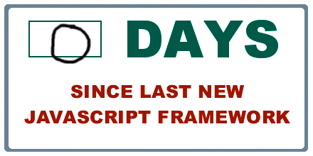
Earlier this year, I started a hobby project to design, develop and publish a mobile app using the Ionic 2 hybrid mobile app framework. After all, if you’re not learning a new Javascript framework every few months you’re not a real web developer.
What started as just a simple learning exercise has turned into an eye-opening experience about modern web frameworks, hybrid mobile apps, publishing to Google Play and the App Store. I thought it might be useful to share some of my learnings and source code.
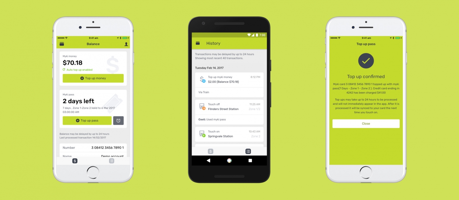
The app: unofficial myki app
As I take public transport every weekday, the app I spent about two weeks developing is called “mypal”. It’s an unofficial mobile app for myki – the contactless public transport ticketing system in Melbourne.
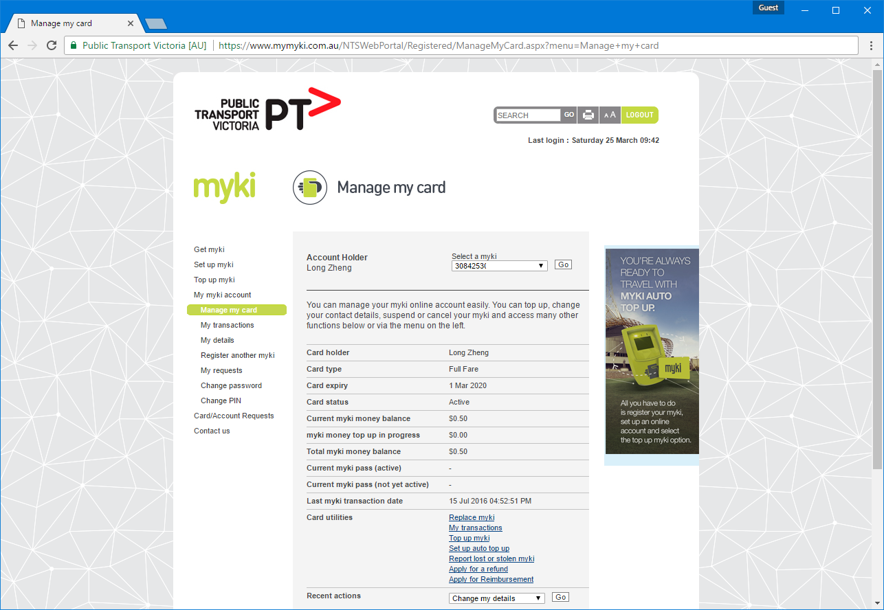
Without an official mobile app or even a responsive mobile site, I wanted to make a mobile-friendly interface to the archaic ASP-powered web portal with tiny form inputs, unintuitive menu options and 90’s web formatting.
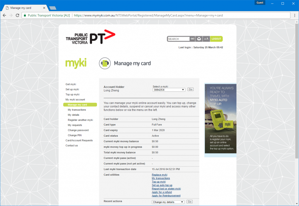
If you live in Melbourne, you’ve probably witnessed this atrocity
While there are a couple myki apps on Android and an app on iOS that lets you top up myki (among many services), none of them were designed very well. I wanted to make it beautiful.
Brute force scraping an ASP.NET site in Javascript
Security was one of my most important concerns when developing this app. I decided early on that I did not want to store or proxy any account logins or data on a server that could be vulnerable to security breaches. I wanted everything in the client on the phone, as if the user was interfacing with the myki site directly.
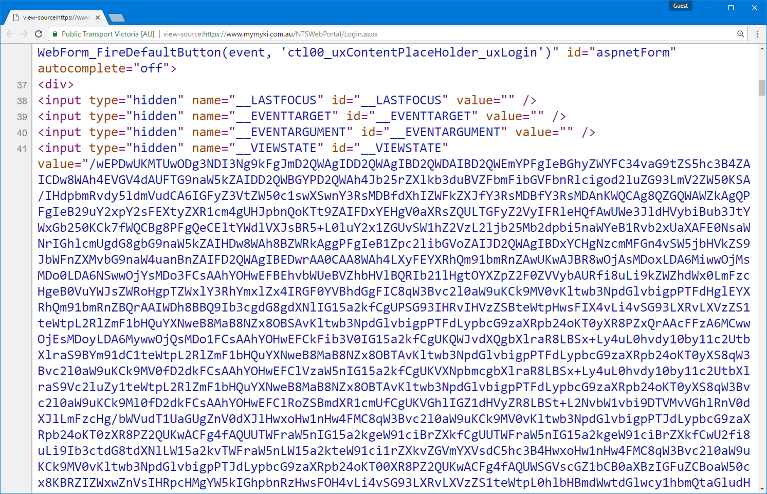
However the myki site doesn’t have a public API or even have any sort of API endpoint it uses internally. All the pages are served by ASP.NET postbacks with the hallmark __VIEWSTATE and __EVENTVALIDATION hidden form fields on the page. A large part of the complexity in the app’s codebase is actually dealing with maintaining page state.
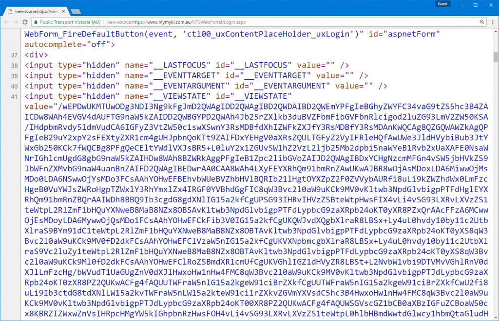
Figuring out how everything works is pretty much a case of brute force trial and error. I would look at what GET requests my browser was making and what subsequent POST requests was being made with what form fields. From there it was a process of elimination to figure out which were the minimum necessary form fields I needed to submit to get the pages I wanted. Here’s an example of the fields I needed to POST to start a top up request
Brute force debugging when live credit card payments are involved is not fun. At one point my credit card number seemed to have gotten blocked, but thankfully that appeared to be a temporary security measure after submitted invalid data nearly a hundred times.
Scraping HTML was actually the easiest part in Javascript. I could simply create a pseudo HTML document with just a string of the contents. And then I can use jQuery’s find method to target elements with selector.
In a world of mostly RESTful APIs and authentication tokens, brute forcing a live production site like a blind moth makes you appreciate good documentation a little bit more.
Ionic 2 has come a long way since PhoneGap
As a bit of a mobile app aficionado, I have a natural soft spot for using native apps. They’re suppose to be faster, have butter smooth scrolling and be more synergetic with the platform of choice.
However when it comes to creating apps, getting two native apps for the price of one is just too good to pass up. The time, learning and portability savings of having a single business-logic codebase and ideally a single design/layout codebase is a compelling offer for someone like me who isn’t competent at both native iOS and Android.
My impressions of PhoneGap (pre-Adobe) in 2012 were pretty poor. Buttons were bevelled, tabs were bevelled, in fact almost everything had a bevel or shadow. It was obvious at first sight when an app wasn’t native.
Fast forward 5 years, I heard some buzz around Ionic 2. Ionic is a hybrid mobile development toolkit built on Cordova (PhoneGap post-Adobe). While it still relies on Cordova’s webview wrapper and native-to-JavaScript API interface, Ionic 2 provides its own slick CLI and build system, Angular 2 routing and templating, native-looking UI components, iconsets and Angular-ised Cordova API interfaces. It has all the hallmarks of a hip and trendy app framework.
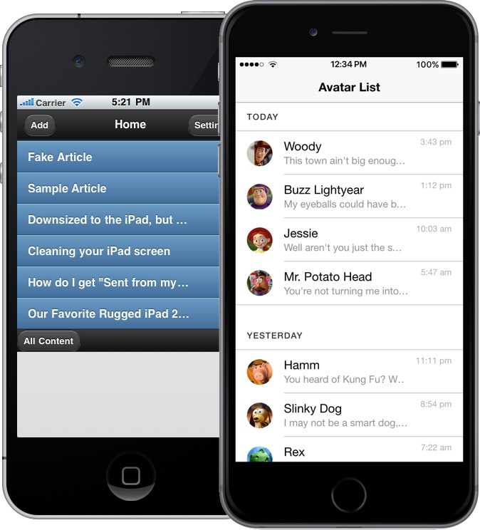
Left: an example PhoneGap app with default theme.
Right: an example Ionic 2 app with the default theme.
If nothing else, Ionic 2 does an amazing job at emulating a wide array of native controls for both iOS’s Human Interface Guidelines and Android’s Material Design with a single HTML component. I think most of the progress has only been made possible with the advancement and adoption of newer CSS standards that make some of emulated effects like animations, layouts and effects practical.
Of course there’s still some rough edges, like the alert dialog doesn’t look quite right and the select control is nothing like the iOS select picker. But if you were designing a generic line-of-business application, you get pretty damn close with just one frontend codebase.
Performance is also a bit of a non-issue. Both iOS and Android have significantly upgraded the performance of their web rendering engines and devices have also become a lot more powerful. App startup time is a bit longer on Android but nothing that should deter any users.
Developing a mobile app with HTML, CSS & Angular 2
The biggest draw for Ionic to me was HTML, CSS and Angular (and TypeScript).
And by HTML I actually mean HTML. While I’ve heard a lot of good things about React Native as well, writing pseudo HTML and CSS in Javascript (JSX) to me just seems like a recipe for a huge mess.
For me, HTML and CSS beats iOS’ storyboards and Android’s layouts by a huge margin. Especially since CSS flexbox have become much more mainstream, it’s now even easier to create adaptive layouts that change with screen size and proportions.
Ionic 2 is also dependant on Angular 2 which is nice hefty upgrade that makes Angular a bit more structured and performant. While the learning curve is steep (knowing Angular 1 probably makes it even worse), the native TypeScript support means everything is strongly-typed and documented. (TypeScript is easily Microsoft’s greatest contributions to the web development community)
Last but not least, I think debugging an Ionic 2 app is the cherry on top. Although I haven’t used Xcode and Android Studio extensively, from what I’ve witnessed the debugging tools in both leaves a lot to be desired.
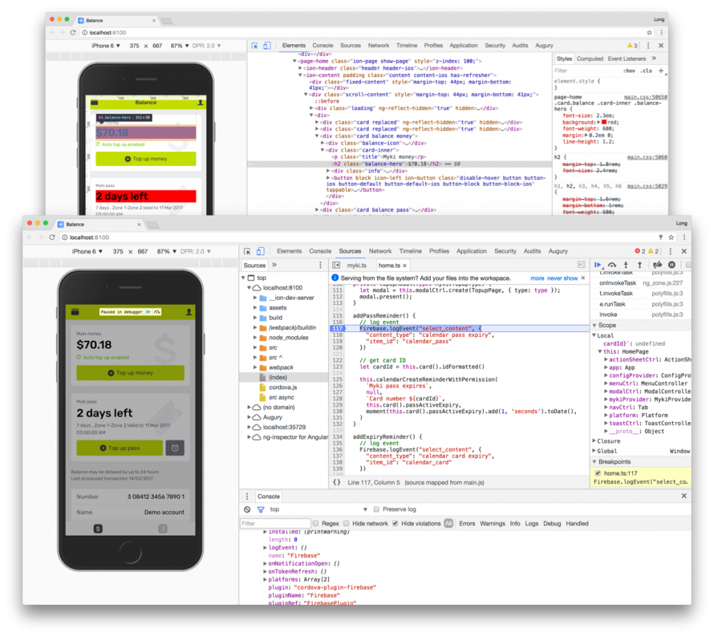
Debugging an Ionic app either running in the browser or running on a phone with Chrome’s DevTools is absolute bliss. Not only can I inspect and edit the HTML contents, CSS styles and Javascript live. The Ionic CLI also takes advantage of LiveReload to instantly refresh CSS changes without a new build or deployment. A pixel-perfectionist’s dream.
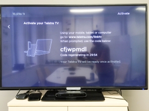
Publishing to Google Play
Although I don’t use Android day to day, it’s definitely enjoyable publishing Android apps.
I’ve helped publish apps to Google Play before so I knew it was easy – there’s no review process and you just have to fill out the bare minimum metadata and screenshots. But I was pleasantly surprised at just how intuitive the release management and beta organization process has become.
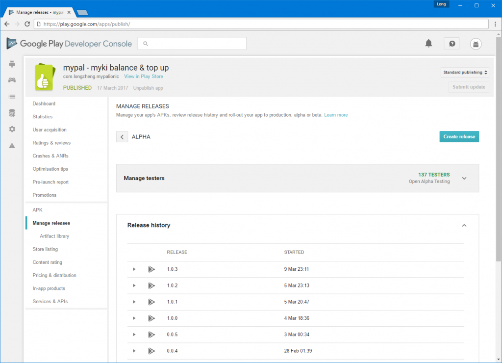
It was almost fun to upload new versions to testers.
Since i was eager for feedback, I uploaded an “alpha” release to Google Play and set it to an “Open Alpha Testing”. Lo and behold, over the next few days, dozens of people just randomly started installing my app. I never expected people actually installed random apps marked as “unreleased” from Google Play.
I even had 5 people submit beta feedback through the App Store, one of which actually reported and helped me debugged an edge-case scenario (with a special myki card type) I would have never encountered in my own testing. Thanks David!
Publishing (or unable to publish) to App Store
For better and worse, the App Store is a double-edged sword and I find myself on the wrong side of the sword.
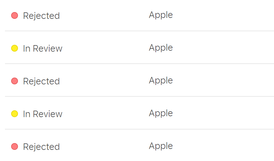
They say it gets easier with time, but it still hurts every time. (Screenshot edited for brevity)
After nearly a dozen emails back and forth with the App Store team as well as an half hour phone call with one of their representatives from HQ, it boils down to the fact that I’m not myki and Apple doesn’t want a third party to publish a myki app.
Specifically, Apple representatives have been quoting guideline PLA 1.2 which seems to be catching a few developers off guard.
The seller and company names associated with your app do not reflect the name “myki” in the app or its metadata, as required by section 1.2 of the Apple Developer Program License Agreement.
On one hand, I can sort of see where Apple is coming from. They don’t want any malicious apps that may be stealing people’s personal details claiming to be associated with a brand when in fact it’s not.
Having said that, there must be bucket loads of apps on the App Store that either uses APIs or similar scraping techniques to allow users to access private accounts in a third-party app not associated with the original organization.
In fact, there is actually an app called Pay24 already on the App Store that not only allows users to log in to their Myki account but also provides top up functionality by asking users to enter credit card details. Furthermore, the app also lets you access and top up a number of other service balances and I can only assume is not officially associated with all of them. When I asked the Apple representative why doesn’t this set a precedence, he said he couldn’t comment on other apps.
What’s even more confusing is that Apple themselves suggested me to remove the top up functionality which makes the app more “appropriate”.
It would be more appropriate to remove top up functionality from your App.
We hope you will consider making the appropriate revisions to your app and resubmit.
A few days later, without the top up functionality, it was rejected again. ¯\_(ツ)_/¯
Conclusion
I always love learning by building something practical. I’ve come to accept that hybrid mobile apps are not an alternative but more than good enough for a lot of line-of-business app requirements. Furthermore, Ionic 2 is a slick new framework that I would recommend to anyone looking to make a hybrid mobile app.
Although I doubt I’ll get anywhere, I’m going to see if I can get in touch with Public Transport Victoria (the government body that operates Myki) and see if they can give a seal of approval for my app to get it on the App Store. Regardless of the outcome, this was a fun, frustrating but overall rewarding learning experience.
If anyone wants to laugh at my (noobish) code, you can find it on GitHub.