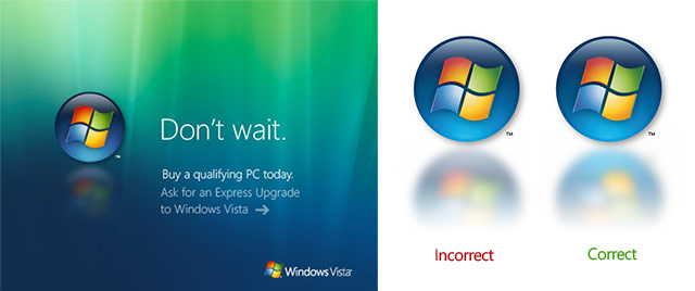
Reflections don’t reflect the image. Or maybe this is a sign of Aero Diamond, with internally reflected reflections. From an image just posted on Microsoft.com.
Just kidding. 😉
Reflections don’t reflect the image. Or maybe this is a sign of Aero Diamond, with internally reflected reflections. From an image just posted on Microsoft.com.
Just kidding. 😉
Comments are closed.
Hmmm, yep, you caught Microsoft out (again) nice! So, what’s Aero diamond?
It was a rumored ‘more eye-candy’ UI experience, a tier above Aero Glass.
Ok then…
(due to the length of the URL, click my name)
What’s with all these reflections these days? Apple does them (in their powerpoint equivalent ‘keynote’ and some of their product images), Office 2007 has them as a picture effect (done impressively); soon everyone will use them!
Well at least MS’ graphic department should get them right! Maybe its the effect of the Vista rush?
Good catch, Long!
Well, because I just noticed, http://i.microsoft.com/h/en-us/i/HP_13.5/Vista_S.jpg
is on the same page (litterly)
Oh, and Long, nice new site banner.
If the light source is shining through the gem onto the floor surface behind it (instead of reflecting directly off the logo and back onto the floor) then the reflection is accurate. A bit like glass shining through a stain glass window onto the floor beneath it.
Woah, sharp eyes!
Or maybe the light source is above and behind the logo and is infact shining off the back of the logo onto the floor behind it?. Either way its not clear, lol.
Btw, the menu is to select between devices – if you have two or more devices there’s a checkbox next to the device that’s selected.
It’s about branding. A non-reflected reflection give you 2 times to see the brand logo. 1 obvious, 1 subtle.
heh I’ve got another one, not MS, but still funny
https://webmail.netcabo.pt/exchweb/bin/auth/images/bg_webmail.gif
Wow MS did it right on their official Vista webpage:
http://www.microsoft.com/windowsvista/default.aspx
Look bottom left.
Being honest, from a design point of view, the incorrect one has to be used in some contexts, like dark backgrounds. Yellow should be the least obvious part of their logo, but it contrasts with the background too much. Having said that, nice find 😛