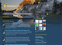
 One of the best blogs at Microsoft has just gotten better. The official Windows Vista team blog has just updated their blogging software and design to a brand new Vista-inspired look-and-feel.
Using the latest version of Community Server (version 2.1), an ASP.NET powered community solution, the blog now includes a gallery and ability to integrate multimedia content. Previously the blog was powered by the generic TechNet blogging engine, which has several limitations as many Microsoft bloggers have pointed out. The new Vista blog runs on its own domain and presumably server. The blog design has also been updated from a generic TechNet blogs template to a Vista-Bliss inspired theme with enough transparency to make Aero Glass look amateurish. Surprisingly, the design works almost flawlessly between Internet Explorer 7 and Firefox 2, something most Vista-related resources designed by Microsoft can’t do.
It is interesting to note that the new design portrays a darker theme with a white-text-on-black approach. Perhaps a sign of times changing, it was first the Windows Vista website turning dark, followed by the black taskbar, black Sidebar and now a dark blog. Perhaps Microsoft is attempting to appeal to the Gothic community.
It was no other than Windows Vista’s godfather Jim Allchin who announced the new Vista blog. An unexpected but not surprising approach as Jim has been working extremely close with the Vista enthusiast community, frequently communicating directly to key community leaders. Something that most other Co-Presidents or company executives can’t get their head around. It’s a shame that Jim doesn’t have his own blog.
Nick White has done a terrific job up-till-now aggregating and writing the best and most official Windows Vista news and resource. It could only get better, and it already has.
Couldn’t they have spent their time a little better? Like…I don’t know…working on Vista, for example? 😀
The TechNet blog site has always been based on Community Server and has been updated to CS 2.1 just recently too.
Ick, I simply refuse to use any Community Server sites, it has to be the most horrible ASP software this side of 2000. Blahhhg, I hate it!
Anyway, it looks great, except for the menu which looks ugly :/
I refuse to use any ASP based software for web, its horrible.
Anyways the site looks and functions the same in Firefox.