Vinny Pasceri, the Aero Program Manager for Windows Vista, has the daunting task of oversighting the user experience development project. Many people and especially Microsoft enthusiasts do not understand why Windows has so many legacy and conflicting user experience elements, and even why Microsoft will fail to address those issues in Windows Vista.
Vinny explains, “Many people don’t realize this but these changes come with a surprisingly high “tax” that goes into updating Icons, changing text, replacing a graphic, etc.”
Having said that, Microsoft designers are unofficially committed to redesign most of the icons in Windows to the new Aero interface standards. Now, with RTM just around the corner, how are they doing? Remember last time, I recorded 4562 icons in Windows Vista? Today I took the time to extract all the icons from the Windows Vista build 5728 resource files, and identified all the 256*256 icons. I’m happy to report there are nearly 350 new high-resolution icons in Windows Vista now. Have a look for yourself. Note: icon size reduced for ease of viewing.
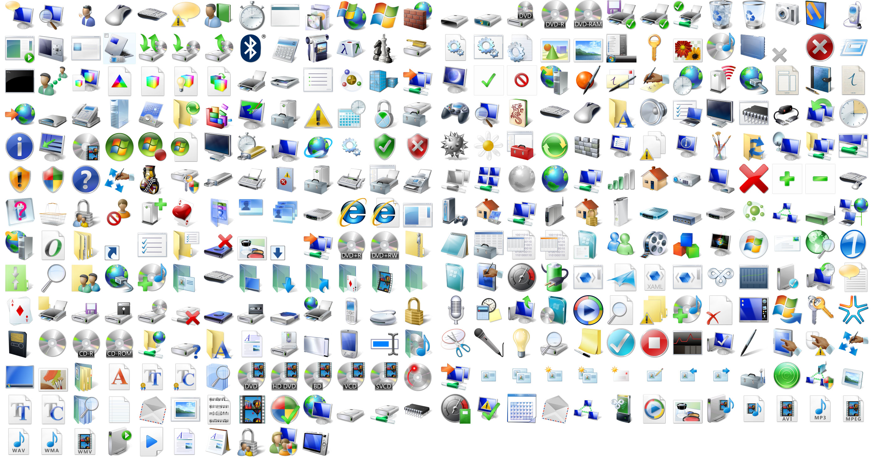
Download all the 256*256 icons in a ZIP (24.7MB) file for your own viewing pleasure and any other pleasures you may get out of high-resolution icons. Or, you might prefer the PNG version (ZIP, 14.9MB) for easy viewing.
And check this out, the fidelity and attention-to-detail for the Journal icon is amazing. Leather good enough to eat!

Windows Vista is looking better everyday. Even it won’t be the perfect operating system, or reach the level of ‘legacy-less’ in Mac OS X, hats off to the Microsoft designers.
Addition: Yes. I know Mac OSX 10.5 Leopard is going to have 512*512 icons, and they look amazing. But I’m only focusing on Windows for this post.
Icons… too… shiney 0_o
I think vista and OSX are = now. OSX has its litle UI burps too 😛
Okay, I’m convinced. You’re a mind reader. I was just going to request that you did this since you took time to extract all the ico’s. You’re great, Keep up the good work!
Thanks for the icons
Heh. I accidently extracted to my desktop:
http://hosted.thegroupofthey.com/oops-icons.png
I love the fountain pen beside the Journal, the fidelity is just amazing. Some icons still can’t make it to the 256 x 256 size, you can find those in the Windows folder. Surprisingly Office 2007 icons do no support the 256 x 256 size either.
@Nitz: Ctrl-Z! Ctrl-Z!
So beautiful especially the lickable leather! I only wish the icons were more consistent though it is a tremendous effort MS has put into them so far!
Hello
How do I add these icons, i mean how do i use these icons in windows xp.
please tell me guys
Thank You
karan
Hello Karan
I am from Indonesia
In my home i use tuneup utilities 2006
and my friend use winstyler
you can get it from http://www.tune-up.com
just search over the tabs and you will found a tab with many subtab that in there appear many icon (such dekstop, my computer etc.)
Sorry my english isn’t well
Ane
Thnks for Icons..
hi i have downloaded it and how its just an pdf page there are no icons. the icons are only like images in pdf file. what the heck should i do now??
Gracias, es una buena utilidad.
I want windowsvista icons.
I want to know how decrease resolution of these icons in ICO format, or how to turn the PNG picture of icons into ICO format? Which of programs can do that?
howw do i use the icons on my windows XP computer????? 🙂
if you want vista icons in xp
follw my steps;-
1.open this website http://www.askvg.com/vistavg-icon-pack-for-windows and click on download vista vg icon pack under the icons image.
2.then download stardock from here http://www.stardock.com/products/iconpackager/
3.Open “VistaVG.iconpackage” file in Icon Packager and Apply it.
If you have any other problem ask me on email [email protected]
iam youre friend
Yeah,
Icons are cool.
Hey how do u use these on ur desktop
HOw do you use these. Can they affect the computer. I had downloaded these from a different website before and they dident work. So i hope these work. thanks.
Excelente! Me ajudou muito… Obrigado!
THANKS man your awesome! great work!
Could you either extract higher-resolution folder icons or tell me how to extract them myself? The standard folder icon shows up really small on my Mac. Don’t ask…=P
Thank you, I was looking for the Official Windows Vista icons a long time.
And never buy Windows Vista until 2008, there are just to many bugs.
Thanks for the download!! This is the only place on the internet where i can find downloadable vista icons. Thanks again…but how do you apply them??
Reply to Lucas Jakubczak:
Get AveIconifier2 at http://www.vistaicons.com/software/i20s1/aveiconifier2.htm
It is very useful to convert ICO PNG via drag-n-drop.
man what a nice icons. actually iam windows vista maniac but i wanted to tell u that some of the icons are missing,
-my documents
-my picture
-windows media player 11
-windows photo gallery
-windows sidebar
-slideshow icon
-windows dvd maker
-windows movie maker
-windows meeting space
-windows mail
-windows calendar
-Microsoft office 2007 icons
Well i hope that is all
and also some of the icons are repeated
but at any rate nice icons and u r the only web i can easily find and download icons… great job and thanks
Do I have to replace EACH single icon at a time ??
Cant I just replace them all simultaneously ??
Thanks,
ZnZ
They got some great vista icons at virtuallink. You can find them in their freeware section. Anyone found any good flag icons in the vista style?
hey!!
can someone please explain to me hot to install these icons because i downloaded it and dont know what to do next…:( pleasee someone help me!
thank you everymuch!!
xx
i smell simply greatness in this…great work, I ve been searching for them for a long time… tahnku very much….
regards
Tks a lot!!!
Man! Thanks for doing this. I had been searching on Google for these. Appreciate it a bunch!
these vista icons are superbbbbbbbbbbbbb
this sucks!
hi
great job thanks for u r help
thaks for the icons
Thank you very much. I’m keeping XP SP2 in use with WindowBlinds 5.5 and IconPackager and this is a great way to give an even better look with out the RAM hogging Vista whale. Great work!
Thanks for the icons!
I know they are not really fighting each other, don’t care if they just cooperate or not, the design is getting better and better, well, for the purpose of nice fidelity and comforting zone is just really need to be adjusted with hardware upgrade things are just common, like other decade. 😀
Thanks for the icons
Where’s the blank file icon at?
Thank you so much for these, I am very grateful. 😀
Thanks for ripping the icons! You have icons that can’t be found elsewhere (like the sound/volume icon). I needed these!!
Wooow, very nice, thoug I can’t find the its i want. There are so much icons, that I can’t found the names!
It would be good if you put the names or make a TuneUp icons pack.
Thanks
these icons look cool
thank you, it’s very nice…
howw do i use the icons on my windows XP computer?
Nice icons. But how do you use them?
For those wanting to use them as icons in Windows use this:
http://www.convertico.com/
Hi this very good nice.. icons..
thanks so muchhhhhhhhhh !!
como se descarga la weaaaaa
verry gooooooooooooood thank’s for this great work
Nice icons but Windows XP i better!!
nice but how can i use that in win xp pro???
Oh, so YOU’RE the guy to blame then. Ever think about what purpose icons actually serve? They aren’t there to show the graphics capabilities of the latest operating system nor the skills and sensibilities of their designer. It is a GOOD thing to use the exact same icons year after year. Why? Because it allows people to find what they are looking for INSTANTLY, without having to even think about it. Now, with Vista, we need to relearn all that. Notice how it takes a second or so longer to recognize all these updated versions of old familiar icons. Sure, it’s not shaving days out of our lives, but it is a tangible and completely unnecessary nuisance. I don’t care if the icon for Word or Control Panel hasn’t changed since ’95. I just want to find what I need and get my work done.
I personally don’t care about Icons, but typically its good eye candy for sales. If people see a nice looking interface and good icons to polish it off, it’ll improve the chance of a sale. Honestly, after a day or two of using the new icons, it barely takes any time to realize “Oh, this is Photoshop” or word or whatever program it may be.
thanks for icons….
어떻게 가는거에요?
thank u for this ….
thanks for this icons
thanks for these cool free images.
what software was used to take the icons from the .dll’s or .exe’s ?
Thank you for these.
It’s so cool~
Really, really nice!!!
Can you please tell me the name and purpose of the icon in the third row from the left, third from the top?
Thanks
Good, i like it’s
Hmmm icons tooooooo good nice !!!!
thank. Icon good
Great work and exactly what i was searching for, Thank you very much
It’s not compatible with ios
hi
if you want to increase Your Window Performance or Computer and get some free Download PC optimization software from TunePRO360.
TunePRO360 – PC optimization software is very good Software for Computer
Please Suggest link where I can download TunePRO360 – PC optimization software
Hi Mike You can download this Software from this link http://www.tunepro360.com/
Hi Adam
I used this TunePRO360 optimization software and got satisfied performance.