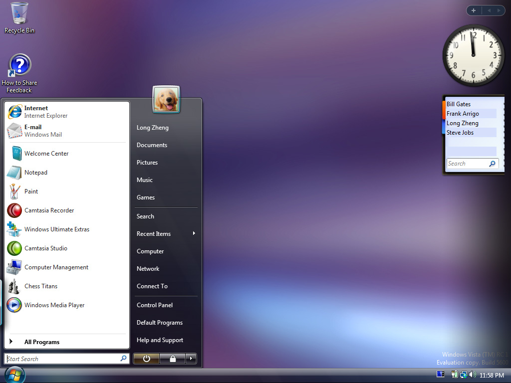
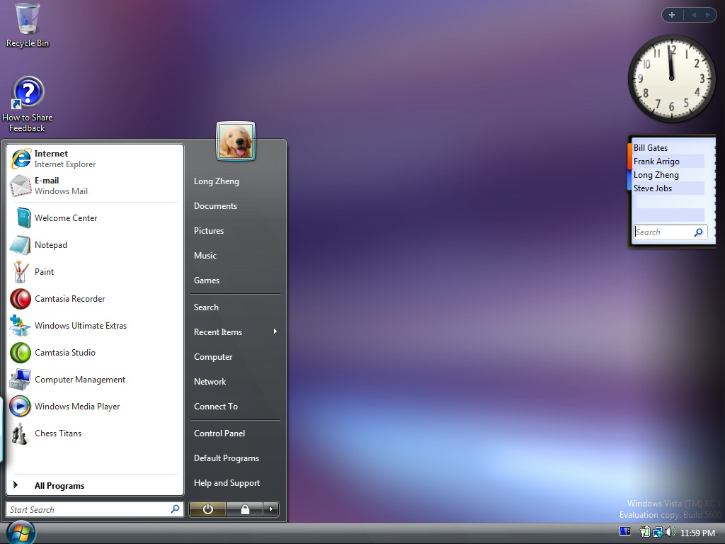
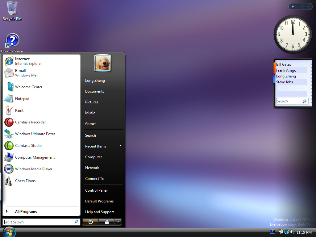
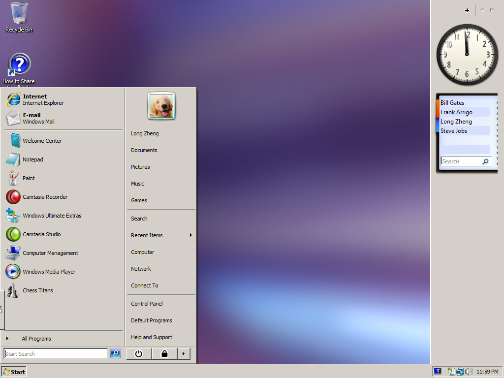
Some of you may, and some of you may not, (so that’s everybody) know Windows Vista has 4 tiers of user interface experience, from the best to worst: Aero Glass, Vista Standard, Vista Basic and Windows Classic. So why so many? Who knows, graphics designers unemployment at an all time low in Redmond? But regardless of whether you like it or not, these are the choices that will be shipping with Vista so let’s understand it while we can.
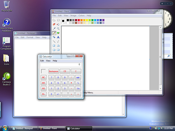
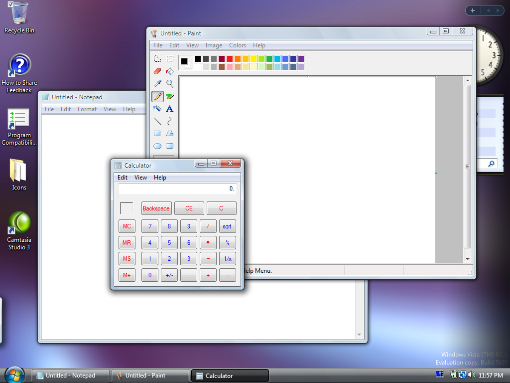
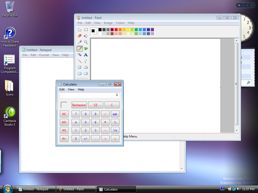
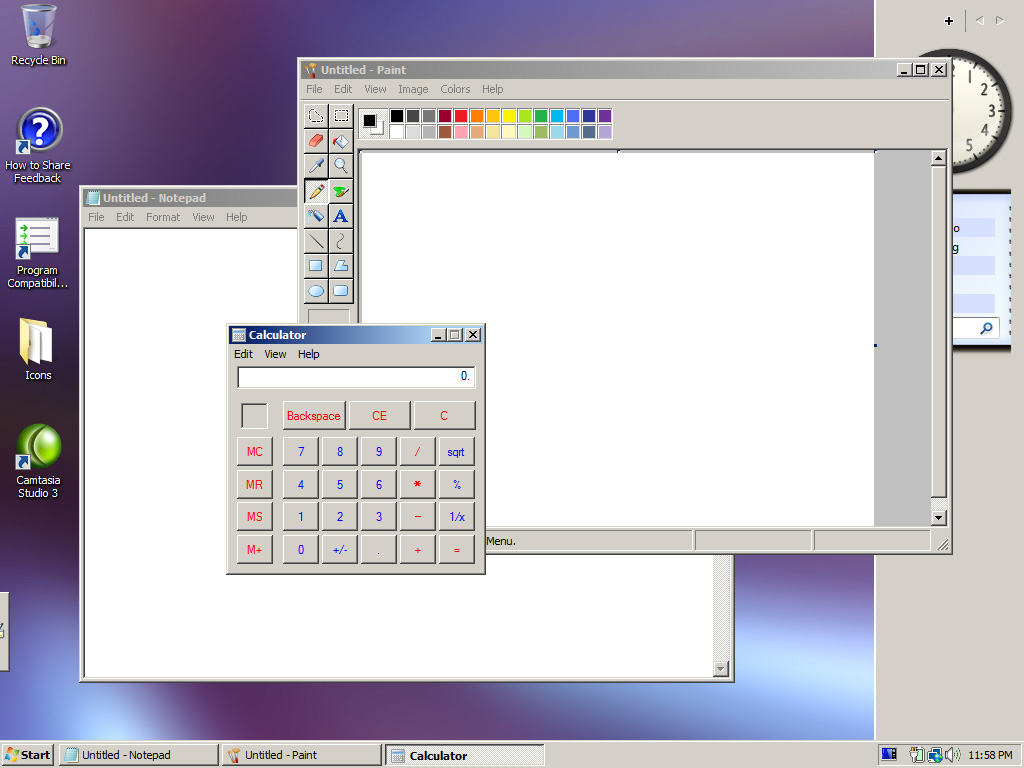
I have taken the liberty (because no one else is as bored as I am) of taking 28 screenshots to compare the 4 different interfaces. These were taken on the same applications and layouts to give you a feel of the exact changes it makes to an user experience. The default screenshot is always the Aero Glass interface, and hover over the buttons to reveal the selected interface. Click the button to reveal a full-screen version of the screenshot.
Please note: the images may take short while to appear due to the high quality and large file sizes.

Aero Glass | Vista Standard | Vista Basic | Windows Classic
Internet Explorer 7
Aero Glass | Vista Standard | Vista Basic | Windows Classic
Windows Media Player 11
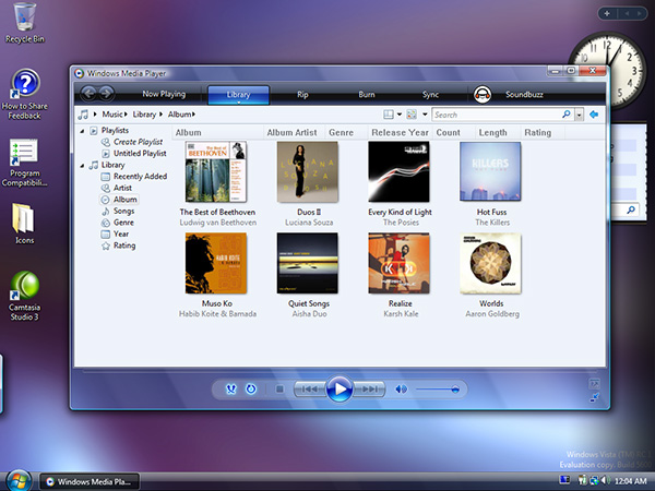
Aero Glass | Vista Standard | Vista Basic | Windows Classic
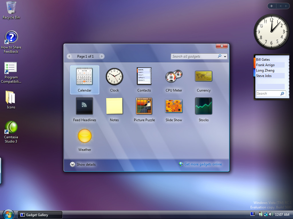
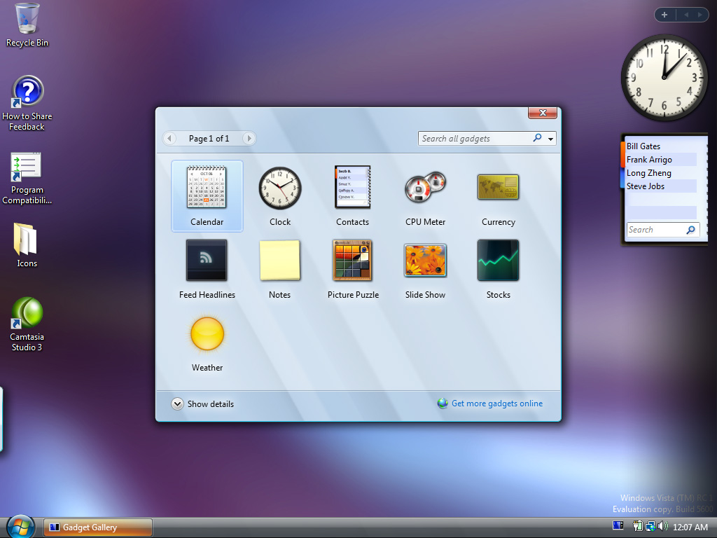
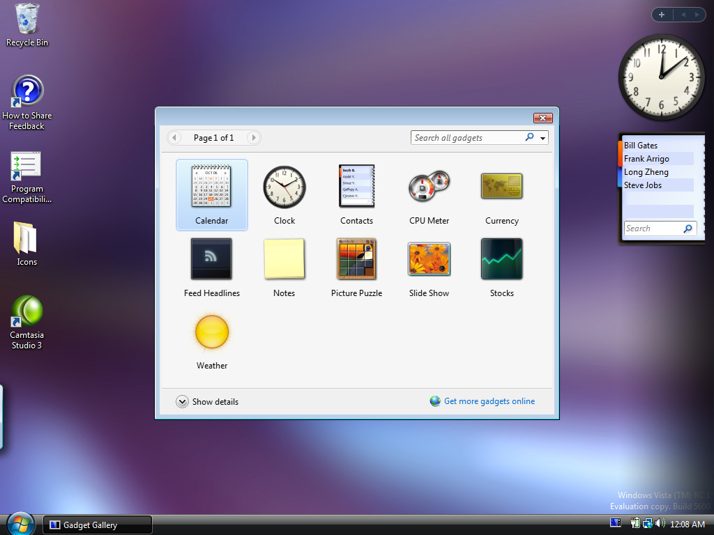
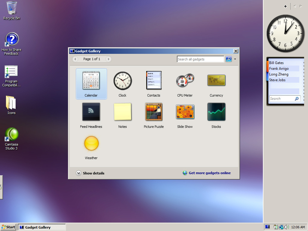
Sidebar gadgets control panel

Aero Glass | Vista Standard | Vista Basic | Windows Classic
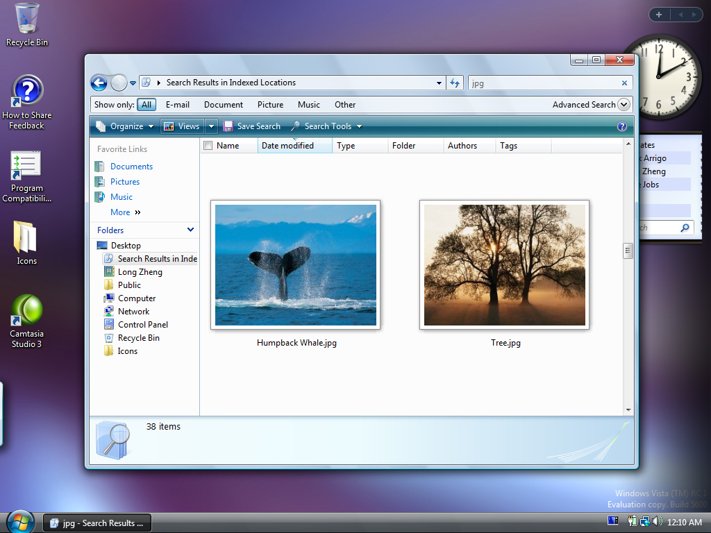
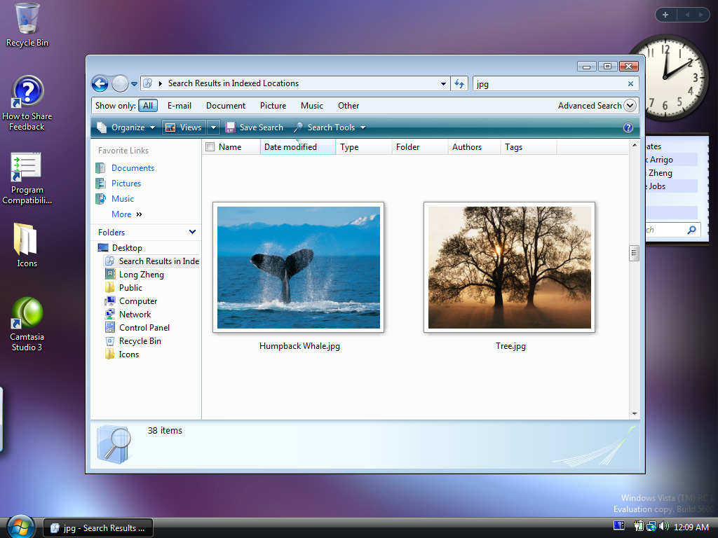
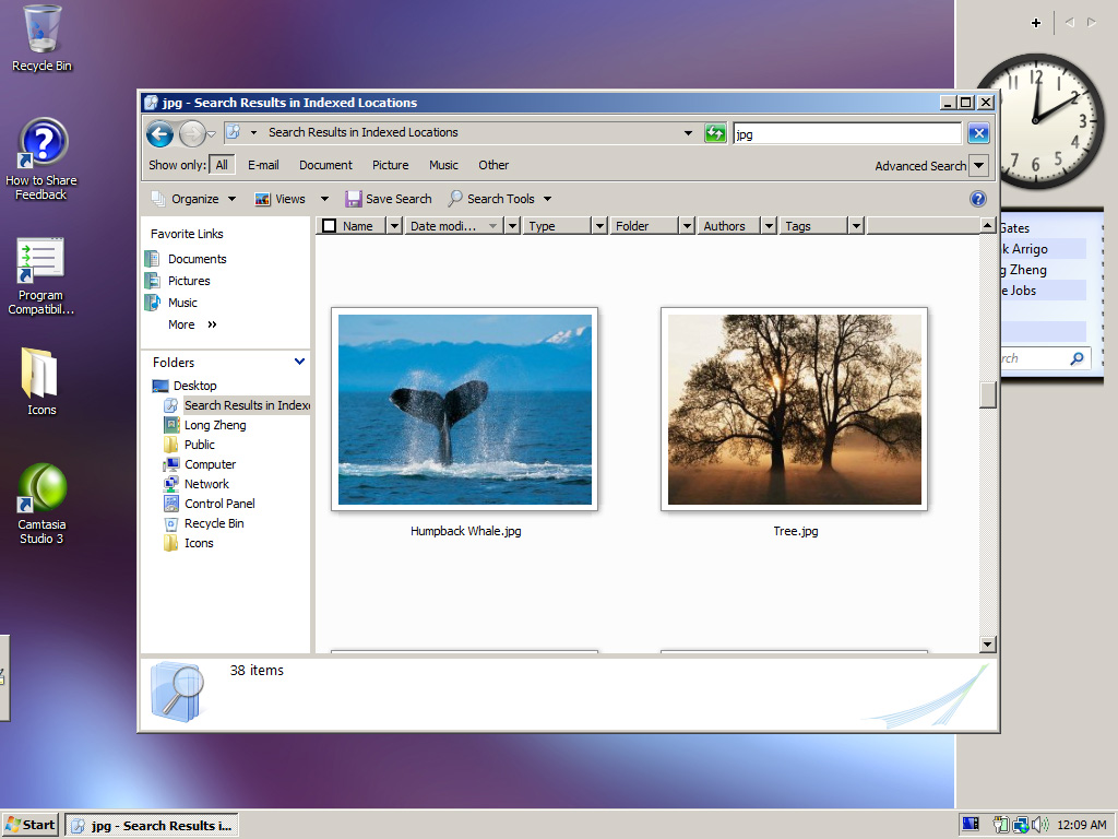
Search and Windows Explorer
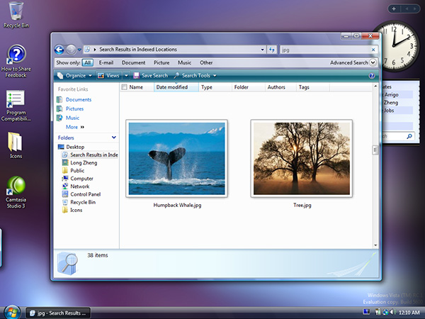
Aero Glass | Vista Standard | Vista Basic | Windows Classic
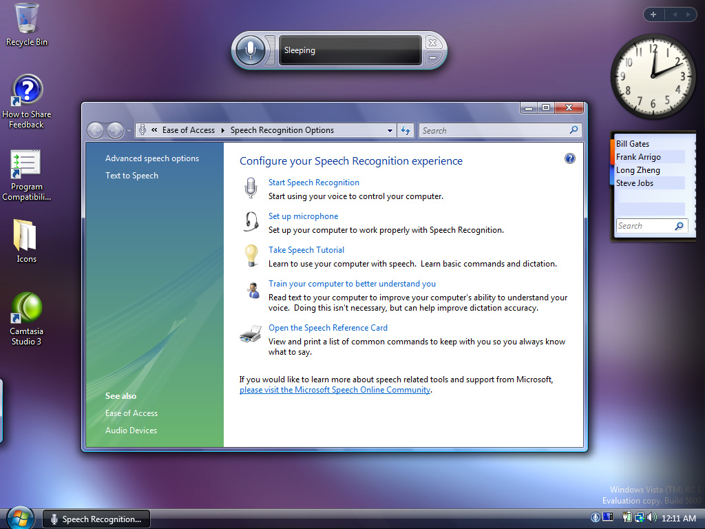
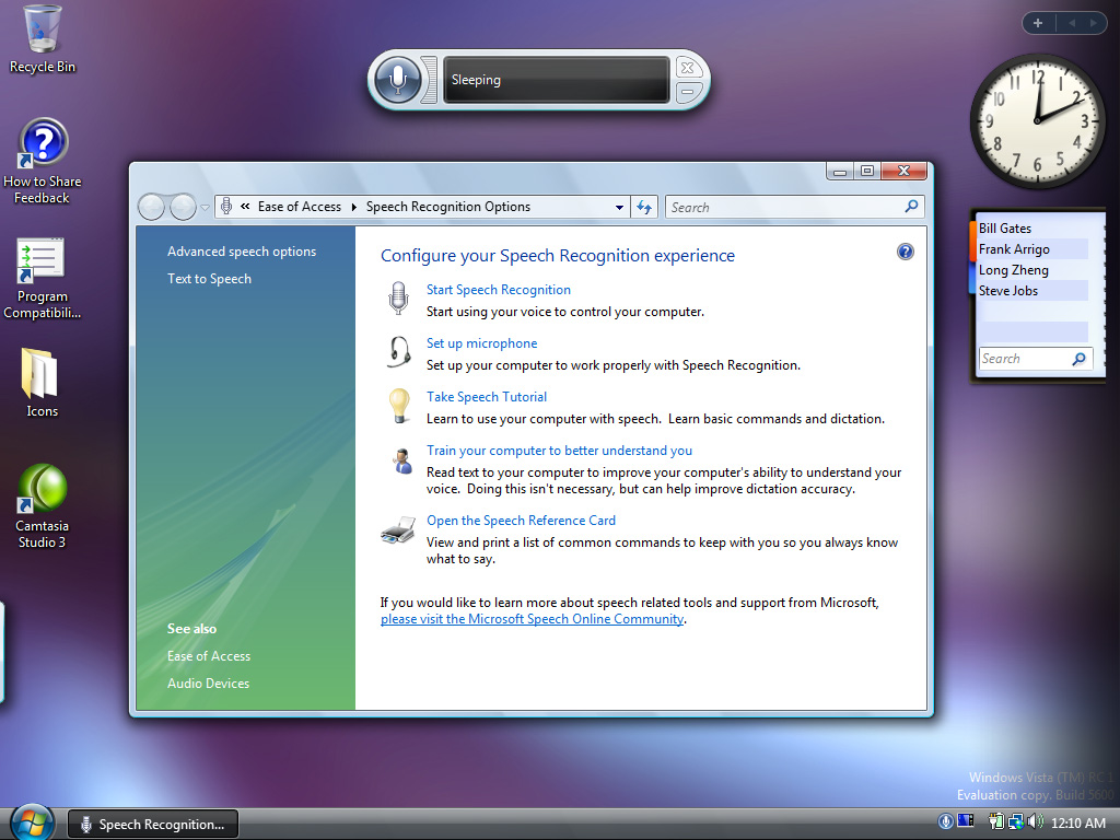
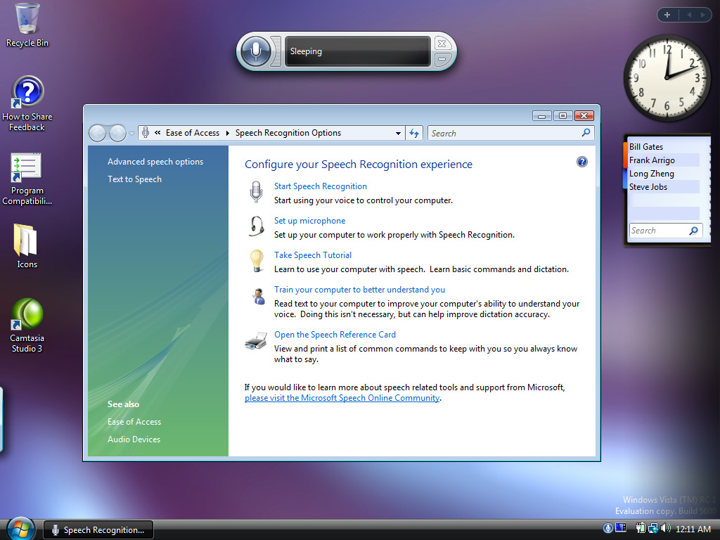
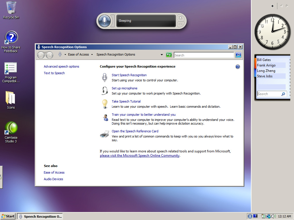
Speech recognition and control panel

Now each interface can be customized with limitless options such as colors, fonts and sizes. Therefore, you’ll never get bored of your Vista interface ever! Since you could probably change it every second and you still won’t see every shade of green by the time Windows Codename Vienna comes out.
i’ll post it on mydrivers.com later—in chinese
thank u for your great”boring”work!^_^
Awesome work you did with this blog entry, very intuitive and easy to understand, makes it simple to see the difference among the 4 tiers.
Classic’s not looking too bad in some of those scenarios, though the control panel could keep the colours on the links panel, and the info pane could keep the colour as well.
and wmplayer-like applications could also adopt the gui 3d colour for the main window’s controls like they did with the command bar in explorer.
2 cents…
It’s amazing how little effort they did to make classic look good. I use classic on XP and I really doubt I’ll be using classic on Vista. Not because Aero is better… but because classic is HIDEOUS in Vista. Classic makes Vista look like pre-beta software.
I eagerly await for people to be able to modify the Aero theme so that we can have a more classy theme going with the compositor.
Check It Here: http://news.mydrivers.com/pages/20060919153615_57551.htm
In Chinese ^_^
Tens of Thousands of people will apprecisate your “bored ” work
Would I pay more for this? No, I don’t think so. The first thing I do whenever I get a new XP computer is to reset the bloody GUI back to classic (Win2K) theme.
Why on earth does _everything but_ media player obey the system’s layout/skinning? Talk about ridiculous UI/HI guideliens.
What is the advantage of this over other operating systems? Looks like a copy of KDE or Apples OS X.
Long, love your address book. Nice to know Frank is up there with Bill and Steve.
Look at how the clock hands move, as you hover over the different images 🙂
I prefer Vista Basic to Vista Standard.
… Aero Glass? This is a great example of what happens when you poorly try to duplicate something else (Aqua). I like the idea transparency, but it’s just too much an poorly executed and in the end, ends up looking a bit muddy. Maybe “Stained Glass” or “Dirty Windows” would have been a better name.
Holy crap that is one awful looking UI. If this is how Vista is going to look in its final form, there is no way in heck I’m upgrading… I mean, it may be an update from XP… but, they’re just not trying hard anymore… it’s almost sad how ugly that UI is… They ought to fire whomever is in charge of that, and bring in the Office UI team… at least they know how to make something nice – and – useful.
Really? This is it? Five years? Wow.
Looks pretty good.
“Please note: the images may take short while to appear due to the high quality and large file sizes.”
If you were using Linux, you’d be able to resize all your images with a single command:
$ convert -size 320×240 *.jpg
That’s a simple example that shows how a command line and a brain can make you much more productive than any window manager.
Unfortunately Microsoft was too focused on the whistles and bells, and Vista won’t have a decent one. But, wait for the next version of Windows… lol
KDE had this “feature” (choosing different skins & effects) for ages… lol
Bad rip-off. Pointless OS. Microsoft have no idea of what’s “cool” anymore. I’d rather have Linux + Compiz + XGL, better eye-candy, better coded. Even works brilliant on a five year old computer.
The biggest crime of Aero is the jellyfish effect you get when every window has a strange transparent halo around it. Compare Aero to Vista Standard and you’ll see how hard it is to read the title of the document in Aero by comparison.
Of the four, Vista Basic is my favourite. But then, that’s like saying “I’d rather have a vasectomy with a rusty knife than a pair of bricks”.
In addition, how exactly is this a “choose your own adventure” UI? If by that you mean “woot you can choose your own skins [email protected]” then I’ll stick with Gnome/KDE/Linux. Here’s a hint; on Gnome, goto System -> Preferences -> Theme…then change the theme. Woo an adventure!
Why the hell is there a Classic option on Vista anyway! It’s UGLY! Why would you want to make your modern OS look like it’s from the Stone Age? It’s time to move on and burn Classic.
Well done. Now everyone can see they are all sh*t!
I wonder why the apple website is loaded????
Thanks, this was the first useful Vista “eyecandy review” I’ve seen yet. Also, the comments it gets are just hilarious.. especially the people who seem to think that the user interface has to look pretty. Sure, it’s nice to gawk at eye candy but when I have to get work done I’d rather be able to read the titlebar of the window and not be distracted by a lot of fancy-shmancy effects. That’s one thing I hope Linux/XGl gets over, and something I wish Apple would let me customize away from OSX. All “modern” desktop OSes seem to be racing towards the least usable, most Hollywood-friendly junk I could imagine. I hope they at least get resolution-independance right.
Does microsoft think their tarket market is 12 year old girls, this stuff is bogus.
Keep it clean, efficient, it is an OS not a video arcade.
idiots.
Basic is the least ugly, distracting, pathetically embarrassing one.
(Hint: this is faint praise. I’m damning all of them.)
I don’t know what possessed them to do a throwback Classic rather than an XP look. Not that I love the XP look or anything, but this Classic looks like it’s from the 20th century.
My theory is that they are keeping the real new look and feel under wraps. They must be. Apple did it, and it was a smart thing to do. Why stop copying at the software level? The announcement strategy is ripe for it as well.
BTreeHugger, you COMPLETELY misunderstand our criticisms. You obviously haven’t used KDE or Gnome in a while, because your criticisms are unfounded. Creating a UI is not about eye-candy, it’s about creating something that WORKS and feels natural. My Gnome desktop happens to be fairly sparse in the visual-effects department, but positively shines in the usability department. I have NO drop shadows. I don’t need them. I have no translucent window borders. I don’t need them. I use Windows XP at work, and guess what, I use classic theme. I’m a simplist; I like to get work done on my computer; I could care less how much fancy shit’s going on.
BTreeHugger, you have a warped view of the world. It is MS who is trying to cater to the eyecandy crowd, not anyone else. The default Gnome desktop (and KDE) is conservative, compared to the Vista “aero” travesty. And as for mentioning Apple…holy shit, that’s funny. Because it’s MS who is emulating Apple here… to suggest that it’s us (the UNIX crowd) who are obsessed with eyecandy…well, that’s just funny.
Because it’ll make people ask “Why is the Apple website loaded?”
Luke D – I’ve got to take issue with that. Every time I take a look at a windowmanager homepage, the screenshot gallery is full of…what? Translucent windows, shadows, transparent terminals, etc etc. And that’s assuming it’s not an XGL demo…
Now I haven’t actually *tried* XGL as I don’t run linux as a general desktop OS. I don’t know whether it improves the user experience *as well* as looking pretty good. But BTreeHugger made a good point, which I think you might have missed when you thought s/he was blasting the Linux desktop: *all* desktop OS’s (substitute window manager or desktop environment if you prefer; you know what I mean) have increasingly concentrated on making the user experience “friendly” and “pretty”, frequently at the expense of “efficient” and “fast”.
Disclaimer: I do have a xubuntu-based mythbox (xfce wm), and a headless file/print/stuff server running clarkconnect.
OMG, How ugly can an UI be!!!!
Microsoft, so sorry to tell ya but… now you just shot your very own foot
Gee, even if I owned an extremely powerful video card I’ll never use its GPU’s horse-power for rendering an UI such as this “candy-crap”. I would use its power, instead, to process my application’s graphics needs only
Now I wish you look, I’m serioes, for the sake of Office product family existence
All these -ve comments (except few) about Aero are because the images on this website are static. Check out the actual Vista installation with Aero for “real” stuff. MS has gone in for quite an animation there, popping up windows from taskbar, fading them in and out, etc. All this has been developed using DirectX. Ya ya I now hear people whining that DirectX has gone deeper down somewhere near the kernel … hmmm does that kick the ass of OpenGL off MS platform … !!!
Windows Classic : Plain old windows 95 look
Vista Basic : Skins as used in XP
Vista Standard : 2D texture splatting, pixel shaders
Aero Glass : Manipulation of Z-buffer, use of alpha channel, blending operation, pixel manipulation at GPU pipeline (vertex / pixel shader programs)
… ya the terms are from OpenGL nonetheless!
no windows classic~~
For years we have been told by various Microsoft fanboys “this is not the final UI, wait for beta two” as if some hugely radical design was going to be unveiled that would blow us all away.
So here we are at RC1 and apart from some transparency (which makes things far harder to read) and some slightly altered window buttons the interface is virtually identical to that of XP.
The graphics processing requirements are enormous for Aero and yet it can’t even draw decent Z level dependent shadows (that adapt if they cross other windows).
As other have said above “5 years? …… for this?”
For shame. Quite franly it’s pathetic.
people arguing for argument’s sake …
so what if micro$oft is copying apple …
so what if the “four flavours” of the GUI are akin to the four horsemen of the apocalypse …
to each one’s own …
people will either like, or not like it …
if someone has the ability to change anything, then change it, otherwise stop complaining …
M$ will still make money regardless …
I am having a really hard time telling between the three vista types. So then what’s the point of Aero Glass? All definitely nicer than Windows Classic or Windows XP default for that matter.
Another great one Long! This is the best side-by-side of the different UI choices out there. You’re the MAN!
Why is whoever posted these pictures intentionally trying to make Vista look bad? I mean running it in 800×600 with notepad and paint open showing white blankness, plus a calculator? The ugliest clock, and i dont know what you did to the feed gadget but it doesnt look like that. Then opening up an apple website. Hmm where does your loyalty lie? Ya i can make any os look bad if i want too as well.
I can’t believe you can still get classic mode, they should just put that sick old thing out of its misery.
Its 1024*768.
It’s the default clock. And that’s not the feed gadget, but the contacts gadget.
It’s a joke.
This is not to show how pretty Vista can look. This is to show what the interface styles are available in Vista.
So this is Microsoft’s top secret interface suite that they were afraid everyone would copy? Nice work with the comparisons, as for the look of the UI itself I am underwhelmed. NASA puts a man on the moon … Microsoft, um, well, I dunno – but they reportedly spent as much money as it took to put a man on the moon.
I’m sorry but this is very very misleading topic.. Since there is only a few color choices you can use… Even if ur messing around with the hue/brightness etc… The color doesn’t even change… But there might only really be like 10 to 15 color choices tops.. I’ve tested this out on the RC1 build and alot of other builds before it…
Is this an operating system or an amusement park? Having somewhat a slick interface and cool look is great and adds to usability, but why does my operating system’s interface have to be ridiculously “skinned” as if it’s some cool toy? And I have to watch through those stupid UI transisions and have a harder time reading text and working with applications.
The classic is the most tolerbale, and it’s uglier than Windows 2000 and XP. Microsoft: let’s just scrap the last 5 years and go back to 2000 😛
Thanks for the UI comparisons, but where is a comparison of a maximized 3rd party app? And most importantly, what are the memory usage differences with the different UI’s?
I run Windows XP, it’s not a bad OS, although, most people would become sick in 1st few hours of running the default appearance. The problem with Vista….Consistancy. What is with the green and blue backdrops in Control panel…they look out of place. Some of the windows have black bars, some have blue. Maybe they’re keeping the “cool” interface under wraps until RC2, or RC3? Maybe Microsoft will still impress us, otherwise, I’m if Vista hasnt changed, I’m heading to the nearest Apple store and picking up one of those sweet little MacBooks.
Search button painted with lots of glitches in Classic Mode: neither app has the same look of this one.
My feeling is, “Vista Basic” may become the new “Classic”. At least for KDE ppl, it will not be a shocker.
http://www.kde-look.org/content/preview.php?preview=1&id=44376&file1=44376-1.png&file2=&file3=&name=Tweaking+Konqueror+tabs
I don’t see what the big deal is guys. Aero is no big breakthrough, but it sure beats classic.
Oh, and if you don’t use windows, or think Linux is so much better, please don’t reply to my comment. Most PC users are not savy enough to use a command line to install a program much less pull libraries and all kinds of crap. Linux in my experience is just not user friendly enough. I managed to get XGL setup on Suse, but cannot get a usb net adapter running on it, so blah. I’ve tried, guys, and Im no fool, but its just not my thing.
Now since this is a Vista discussion, here what I think about Microsofts new baby. Note: I’m not MS fanboy, but at the same time, I have been using it for years and it’s basically the most intelligent option out there so there.
The glass edges to me are kinda weird, but usable and is less distracting than the blue Luna TitleBar. The shadows on the windows make the active window stand out so I give it usability points. Unlike almost everyone else who posted here, I don’t like to work on an ugly desktop, I like the pretty “hollywood’ UI. Personally the Active window title is ugly, unreadable, and should do away with the transparency and leave that to the in-active windows. Some of the cool features though can’t be seen on a still photo, and the best things Vista has to offer is the HW Accelerated gui. So to all the haters, Don’t go buying vista when it comes out, stick to xp or better yet Windows ME.
cli said :
If you were using Linux, you’d be able to resize all your images with a single command:
$ convert -size 320×240 *.jpg
That’s a simple example that shows how a command line and a brain can make you much more productive than any window manager.
Unfortunately Microsoft was too focused on the whistles and bells, and Vista won’t have a decent one. But, wait for the next version of Windows… lol
AND IF YOU WERE USING LINUX , YOU’D STILL HAVE TO MOUNT YOUR CD OR DVD DRIVE, CHECK YOUR KERNEL etc etc. GO BACK TO BEING A DICKHEAD
IT TRULY AMAZES ME HOW LINUX IS AN OPEN SOURCE OS WITH BILLIONS OF PEOPLE MAKING IT BETTER , YET IT HASN’T GOT TO A POINT AND CLICK STAGE AFTER ALL THESE YEARS.
GOES TO SHOW HOW MANY USELESS PROGRAMMERS ARE IN THE WORLD
Good screenshots and a great way to show the differences between the different UI modes. As an addition Win+Tab/Alt+Tab or the app preview in the task bar may would be interesting to your readers, since that is where Aero scores.
That’s a good point Thomas Wenzl. But it’s one of those things you can’t really show by a screenshot. It needs practical examples and applications. Or shown in a video.
I just love how Microsoft gives these fantastic UIs
Who cares how it looks. How much space / RAM does all the pretty require? And how does it perform? If there are no improvements other than pretty, why update?
I personally don’t care if its pretty security And speed is whats important to me And so far I find it slow plus it takes to long to boot. If its slower than my xp
why would I want to spend my hard earned money on it.
I’ve been using RC1 for about as long as its been out and Beta for only a short while before RC1. This site summary does a nice job of capturing the basic differences between having a DirectX driven desktop and not. And that is the point. Mouse-over it and preview. But as has been said, you don’t get to see the animation and what not. I think one thing the g33ks aren’t considering is that Vista is a monumental effort that MS has had to market for in terms of support from vendors. They even have vendor kits recommending exterior looks to Vista PCs hoping to unify the PC market. The sheer amount of compatibility and capability hurdles that must be met to marketed as Vista “capable” is much more than any of the previous OSs have demanded. For once the OS itself is moving beyond RAM and CPU dependencies… its spanning into the realm of utilizing GPUs directly. MS hasn’t had control over the hardware that Apple enjoys in their own market to even bravely want to push to such a gpu intensive OS. This “look” along with Apple’s and linux stuff is all headed down the same path pretty and useful equates to something more in the future. With the advancement of PC technologies and their respective decline in prices makes this all more possible, however. Yet, there will always be the utility of command prompts as well as the need to satisfy the hardcore g33k contingent but spacial representations that look nice better suits the mass populous. Is anyone surprised? And so, like it or not, the underlying premise and foundating for Aero is a big deal for Windows. Remember also, that Microsoft doesn’t quite have the luxury of just saying “oh we’re redoing the OS and your old crap won’t work as it won’t be backwards compatible” even if MS proponents would much rather they do (unlike, for instance, Apple’s move into OSX). So lets stay focused… for Windows this is a big step forward 😀 I think had they coupled it with the DB linked filestructure WinFS I would have been even happier but, -shrug-. If we’re considering only looks over underlying technology shift, then I should say that I much prefer this look over older versions for the same reason I enjoy my late model Infinity G35 over the similarly -spec’d- older ones.
I guess I am way old-skool.
A pretty GUI does not necessarily make for a good OS… even if (big IF) all the bloat can possibly be trimmed to make it look oh-so-spiffy! Not yet the case with WinVista (Betas + RC1). And definitely not yet the case for some of the older hardware.
I can tolerate any one of these 4 UI options, as long as MicroSoft promises me that the new WindowsExplorer (aka FileManager) is not allowed to be so drastically (and dramatically) different in the core of it, than the previous releases of WinOS. What I have witnessed with WinExplorer, thus far, with WinVista WinExplorer is anything but trustworthy! It is also a hog that seems to continually be munching on the HDDs without relent.
MicroSoft has seen fit to change some of the de-facto standardization of (even) how the files (alphabetically) will be enumerated and displayed in WinExplorer. The worst part of these core changes is anything but consistent thru-out the whole OS. In some panes/windows, a file name (eg: those that may start with numerals, underscores or dollar sign symbols) can be shown at the very top of the displayed list or at the bottom without consistency. I am not trusting most of the results displayed upon a Search (Ctrl+F and/or F3), as what the results (Local Search) are not accurate at all. Even with the indexing (@#$%) enabled, this Search functionality is a hog and takes to darn long!
A huge undertaking but still a buggy OS… but only the official release date will tell the truth!
As I read all the negative replies concerning Vista on this board, what amuses me is that all these guys are going to be using Vista in a couple years, and trashing the next OS update from MS, complaining that it’s not more like Vista.
Whatever, people. Use it. Don’t use it. Whine about something you’ve never seen or used. Whatever.
microsoft can do no wrong. when will you people realize that? fools.
I’m sure you can modify the classic view.
Make the background is a solid color, trim and organize the start menu,
Make everything look like XP’s classic view. But can you turn off or autohide the big screenwasting bar or the right side of the screen? Who needs two clocks?
For comparison purposes, it would have been good if you had put up the screen shots on the same page rather than links to go to screenshots of individual User Interface experiences.
Good usage of Apple site…
@Nitin Kataria: You obviously didn’t read the instructions.
greta job. i like your site, its great.
hope to hear something from you about “windows vienna”..
seems to me that you are well informed!
I think the Windows XP version of Media Player 11 looks better than the Vista version! The least they could have done with the Vista version is retain continuity with the rest of the operating system.
although vista is a better version compare to perivious versions but still have some short comes E.g microsoft is a very relible company and a faithful to all world consumers thats why every one use their softweres but they (think tank) of ms sould think that this is the right time to think their version they should realse their version quoit slowly and wisely ( all r my personall views)
any body differs it.
I found this article very interesting, as prior to reading it I was unaware that Windows Vista had four different user interfaces. Also, I very much like the simplicity of comparing the different user interfaces.
Hi Starky, looks like you started a rant here… I guess I like to customize my UI and like all the toys, most PC have Good 3dFX cards so why not use them imo… if you want pure power I guess you whould prefer DOS. 🙂
I must be missing something here, but I don’t get it why there has to be Vista Basic, and Vista Standard – I particularly cringe at the sight of the Minimize, Maximize and Close buttons of Vista Basic (they’re squashed, difficult to focus on with the cursor, not ergonomic, ugly). If all they wanted was take out the glass windows for video systems that can’t handle the translucencies (which Vista Standard handles well enough), what’s the point of Vista Basic at all? I’d like to know what I’m missing here…
I must compliment you on the work you do on your website for knowledge and news hungry people like us I am in many forums and I appreciate your work, Now as favour I was looking for this javascript which you used for these mouseover image changers.
See I am a web developer and I really liked the idea I am putting up something for my photographer friend and Would request you to please give me details of the javascript on my email.
Thanks
P.S I tried to find out from many sources but haven’t found something except here, I don’t want to rip off from your site so I am asking.
@Manish: It’s a simple piece of Javascript code you can apply to any object, and in this case, a link.
onmouseover="document.getElementById('image629').src='http://istartedsomething.com/wp-content/uploads/2006/09/start_1.jpg'"Basically, on mouse over, get an element (in this case an![]() ) with the ID of ‘image629’ and tell it to load from a new image source.
) with the ID of ‘image629’ and tell it to load from a new image source.
Let’s face it. Windows 3.0 would install in the memory space and cpu requirements of most hand-held computers and even cell phones. But what did MS do? They came out with bloated Windows Mobile that barely runs…
XP is a solid, good OS. In the classic mode, with all the gubbage turned off, it is very fast and reliable, plus it stays out of the way of the most important part – the applications I use. All the stupid goodies of eye candy just get in the way, and get very tiresome after the first few views. Why can’t MS just let people who want entertainment buy a gaming box and then have done with it? They came out with all the versions to confuse the buying public, but no “stripped down” business and power-user version. A stripped-down, clean power-user version, with an XP style interface would outsell Aero-based stuff 100 to one.
The REAL issue here is that we’re bumping up on conent that needs more than 4 gigs of RAM, and the future of XP64 is not certain – partly because of Vista in the wings. Needing more RAM because the typical pocket camera in a few years will make 30MB images, and because cell phones in a decade might do HDTV well enough is more the upcoming need. An OS is supposed to be solid, efficient and host applications – it’s not supposed to be an entertainment center in itself. MS’s latest approach is like having a 400hp Corvette with a mandatory 100×100 concrete block attached to the back of it. It helps sell new hardware, that’s for sure.
One thing that NOBODY seems to mention however, is that MS will win in the end. While most people who can avoid updates will never update, they will force the issue. HOW? Even XP is subscription software. Sooner or later, a hard drive will fail. And when they don’t “support” XP anymore, do you think they will have their validation site running? Ha! They’ll say that your license is no longer valid or make up some excuse, and your XP won’t run. Worse, imagine if Microsoft has to tank after going the way they are going – then the future holders could just turn off the validation service altogether, thus effectively shutting down all computers that run XP or Vista. If you’ve bought shareware that had the publisher sell to another company, you know exactly what I’m talking about.
Make a user interface that an idiot can use – only a fool will use it, and neither one will understand why.
My intent was not to flame anyone; but I’ve been using the web too long to think that I can avoid people mistaking my words as flamebait. The only point I was making was something that others here are echoing.. resources are being used for nothing here. There’s a definite fine line between “barely usable because it’s so ugly” and “wow, this is beautiful; what the heck does it do?”.
Unfortunately, none of the modern DE’s hit the middle ground. Subtle effects are meant for feedback, but not everyone appreciates the same feedback that the “lowest common denominator” themes offer us. I would rather get my work done without a lot of flashy and gaudy shading, fading, and animation going on. The visual indication of what I’M doing isn’t necessary; I know what I’m doing 99% of the time. I do appreciate subtle effects that don’t break my train of thought. Many programmers agree, and thus their Windows XP desktop looks like Windows 2000 (insert a similar analogy for other OSes).
Linux tries to offer choice, Apple tries to offer subtlety, but what does Vista try to offer exactly?
It is so sad to see how all the “smart” losers come out and say, “oh that is Apple like”, “oh that is ugly”, “oh that is blah blah blah”. LAMERS! You seem to think you are smarter than everybody else just because you use programs that the minority uses. It is the same as piss artists on forums that rubbish others by saying stupid comments like, “IE? Never heard of Firefox? Newbie!”. What a bunch of egoistic losers! I like FF but different people like different things.
I have been a computer engineer for over 15 years and I like practicality too but the eye candy in Vista is nice too. YES! Both CAN co-exist at the same time IDIOTS!
Stop whining like 12 year olds (oops sorry, you are 12?) and get a life. I have been using Vista Betas, RCs etc. for a while now and it is very stable and looks good. Just because you can’t get to grips with the new OS then just stick to DOS you boring tossers! Believe me I hate Microsoft’s pushy policies too but give credit where credit is due. Can you do better? YES? Well F****** do it then!!!
This is not meant for the decent non-judging folks here but for the egoistic losers who always think their dick is a mm longer than the other guys.
It humors me to read about so many wanting to revert back to the classic windows interface. It raises the question: where do you draw the line with keeping a simple, high performing UI? What if Windows still supported a very raw interface like we saw in the earliest days of windows (i.e., Windows 1.0, you know, the old DOS-based “windowing” you still see in very old apps). Would some of you be reverting to that interface if you could to reduce the amount of “visual distraction” and/or increase performance? It seems a bit rediculous. I haven’t used the classic theme since Windows 2000-it was very refreshing and appealing to see the new theme(s) and skinning potential in XP. My only annoyance is that MS didn’t really open up theming as a real offering- it’s really lame that it has to be patched in order to apply third-party themes. Dumb.
I personally like the idea of themes and different skins. It keeps my life interesting, and allows me to find a choice that suits MY tastes and helps me to find an interface, be it minimal, or super-flashy, or whatever-whatever works best for ME. The point is that while Aero may not necessarily hit the mark for all of us, the new Windows PF stuff gives us a basis for even more flexible and more advanced themes that may really hit the spot for particular users. Let’s just hope MS will get smart enough to allow other innovative developers and designers to exploit this new feature this time around! I’m probably dreaming…
Well, I for one have been around since Win 1.0 as well, and actually well before that using comps in one form or another. My thoughts are this on eye-candy. I currently – through the use of add-ons – run quite a mix on my home brew super pc. I have had the so-called glass interface for months and love it. But, when it comes to start menus and folders I use the classic interface. Why? Well, when I want to find something, or tweak something, it is way faster and easier to see. I do not want my folders and files to populate as slow as I have seen with all the garbage turned on. Now some of you will say build a faster more powerful machine to handle all this entertainment, but let me assure you that I am running a machine that most users will never see, ain’t no dell, lol. Anyhow, let’s face it the UI in Win 2K was built for one thing, and that’s for us folks who actually USE our PC’s as workhorses. If all you do is watch videos, or listen to music then all the bells and whistles may be just what you are looking for. Those of us who need an OS for working it to death and back need only one thing – A STABLE OS. I have been running XP for over 6 months with everything scaled back and still have brought it to it’s knees many, many a time. So, aside from the eye-candy and all the other junk, just give us who care an OS that is rock solid. All of the rest of you, enjoy the UI for what it’s worth. The PC will never be an integral part of a home entertainment system, move past that and get back to real computing.
What’s a skin?
Why not use Linux, far more stable than any pathetic windows system & with superior “eye candy” windows is yet to compete with ???
“Why not use Linux?”
RTFM
Compared to Linux, with compiz fusion, Vista aero is really lame, not to mention a memory hog. Check out this video of compiz fusion.
http://www.youtube.com/watch?v=E4Fbk52Mk1w
Five years and this is thew best Redmond can come up with? pathetic.
I don’t know a lot about computers, but I’m not clueless. I don’t program; I don’t play high-def games. Most people don’t.
What most average people care about isn’t memory. We want to look at our pictures, surf the Internet, watch low-quality YouTube films, make Word documents, etc. These tasks are WAY less performance-demanding than playing the latest 3D MMORPG.
That’s why Aero exists. It’s pretty, yet friendly enough for average people. I don’t care how much RAM it uses up. I’m not using it all nonstop anyway.
Why does Classic exist? It’s for people like you, who need more power to do more powerful things.
I’m not on Linux because I like easy-to-use computers. I used a Linux once at a friend’s and was confused. So why not switch to Mac? I plan on it…when I can afford to. A Mac’d cost almost three times as much as the Vista laptop I’m using now.
To me, this is common sense. Pick what you feel like. Don’t demean other’s choices; they aren’t forcing you to use Aero, so don’t try to force them to use Linux.
I don’t mind having options, but I am extremely frusterated with the poor implimentation of the Classic interface.
The cartoony style is visually easier to read and comprehend. The photorealistic icons drive me crazy.
I want all of my applications to be consistent. I want the same skin and set of, always visible, organized drop down menus. I DO NOT want less frequently used commands to be hidden and sure as hell don’t want a fully featured and usable menu system replaced with a limited set of commonly used commands turned into indistingushable icons on a bar or ribbon. Shortcut bars should ALWAYS be secondary to a menu system and should be customizable and hidable. and why can’t i get a music program that doesn’t look like it is going to fly into outer space (WMP, iTunes, my Creative drivers)? Just make the basic WMP style look like Access 2003 and offer skins for the rest of you.
I want my settings dialog boxes back. I don’t need a wizard to explain every little step along the way and turn a 3 click task into 25 clicks with multiple paragraph explinations, animations, and confirmations every step of the way.
I think it is a computer user’s RESPONSABILITY to learn the basics of how to use their computer, not for Microsoft to dumb down and slow down every task to meet the needs of the lowest common denominator. For example, user’s should know what a file system is and how it works, be cognisant about where they are saving their files, and know not to install obviously harmful programs from porn sites!
Wow! I think i made myself angry.
Well, after a year or so, I have to say, I didn’t get tired of it…
Can I use this link and data for educational purpose. Please reply….
Отличный сайт,я добавил его уже в закладки!!