New taskbar style
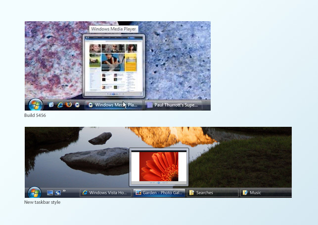
Image: (Top: Winsupersite) (Bottom: Microsoft Design)
The new taskbar is a thinner and has a far more transparent background. The application buttons are thinner and wider, with a faint white border. The ‘hover’ state sports a trendy blue gradient button that reminds me of the new Vista Media Center style, also the Live Preview no longer reports the name of the application on top. Overall, a subtle change over the current design, but makes the taskbar more aesthetically pleasing and cleaner. Also on a side note, there are two new icons on in the Quick Launch bar, Show Desktop (left) and Flip 3D (right).
New button styles
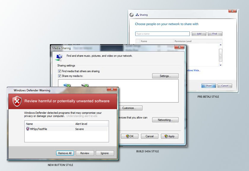
Image: (Left: Microsoft Vista) (Middle: Winsupersite)
It has a softer border with some outer shadows, as well as a lighter gradient on the back. The default select state has a cool blue inner glow. It is another subtle change, but makes the buttons far more attractive than before.
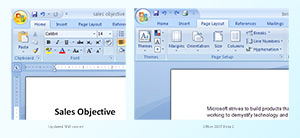
Updated start menu style
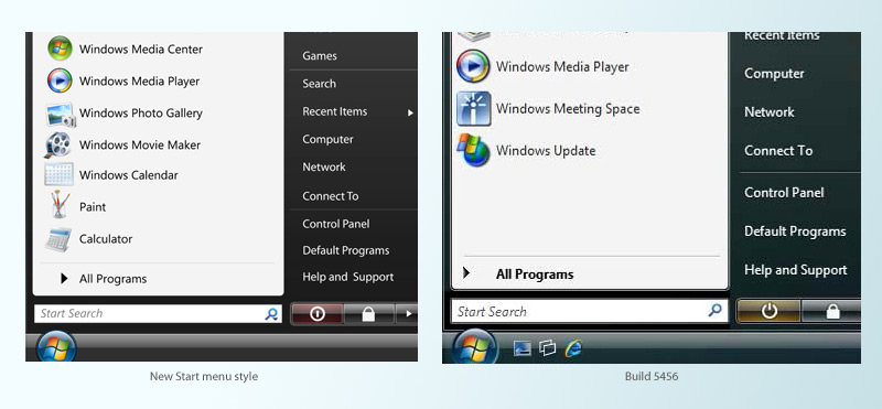
Image: (Left: Microsoft Design) (Right: Winsupersite)
The differences here is pretty big. The text is a lot smaller, thus allowing them to fit more into less space, as seen on the right. Also the search bar is thinner with a dropdown-enabled search icon. The power icon has been changed, and background changed to red. Also, various application’s icons has been updated.
New Office 2007 icons
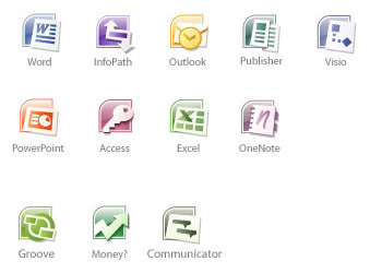
Image: (Microsoft Design)
Color-coded glossy icons with a curved edge on the top left, featuring fairly recognizable icons for each of the products. A nice move away from the big square we have today.
If this is a sign of whats to come in Vista RC1, then I’m extremely enthusiastic about how polished it may be!
Also check out: Updated Office ‘north-west’ corner UI.
Loving the new Office icons!
Wow, this is looking nice… although the changes (except the O12 icons) are subtle.
your unknown office icon would appear to be the icon for Groove
The icon labeled ‘SharePoint’ will be for Groove 2007, I think,and the ‘Unknown’ will most likely be Communicator.
Why are the older screenshots (esp. the start menu) lower quality than the new ones. Can we get an unbaised comparison w/o cheap tricks like a blurry “old” image and a sparkling new one?
The sharepoint icon is probably groove.
The Unknown icon looks like a gannt chart. Project perhaps?
I agree that the unknown icon is most likely Project. I also like the new Start bar; as it looks a lot cleaner and smoother than the previous build release one
I don’t think the Power buttons have been changed? The “Yellow” one simply is the icon for “Standby” or “Hibernate”, and the Red one is “Shut Down”. There is no changes between the new and the old in terms of colour and the actual button. You can change it in any build by going to Power options in Control Panel.
Hello Dude,
I like to correct you for the Power Icon, the one you have put ofr build 5456 is the same for the new start menu.
I am on one 😉
Hold it right there. What you’re writing about is a bunch of concept artwork for Vista, not actual screenshots, I’m afraid. My guess is we won’t be seeing these changes happen.
No, these are actual screenshots from an interim internal build of Windows Vista. These are changes that have been already applied.
The icon labeled “Money?” is more than likely Small Business Accounting. Especially since Money is not an office application.
Fair enough Long – I hope you’re right then!
Looks like the icon on the Quick Launch bar on the right might be the new icon for Media Center.
Oops never mind, Flip 3D it is.
Does anyone knows where I can download these icons (office 12)
@Maregt
Unofficially people have been reproducing them as ICO files straight from the JPG posted on the website, however these are lower quality and unpolished.
I would presume the new icons will make an appearance in the next beta build of Office 2007.
nice post man, but the power button thing is a little different than you suggest.
the states and colours of the power button changes depending on how it’s configured.
if it was setup as a shutdown, it will appear red with the full circle, but as hibernate it will appear as the broken circle. this can be adjusted in power management.
Notice that the curved-box behind the applications look very much like the packaging design for the Windows Vista versions.
Is there download of these office icons, help please.